|
Technische
Angaben
-
56 S., 30,5x21,5 cm, ISBN/ISSN 9788896501610
mit Kunststoffumschlag, geklammert
ZusatzInfos
-
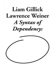
This publication documents the monumental collaborative work which Liam Gillick and Lawrence Weiner produced for the Antwerp museum of contemporary art MuHKA in the spring of 2011. Tellingly titled A Syntax of Dependency:, the project could be viewed as the outcome of a twenty-year dialogue between artists, artistic practices, generations. This giant floor piece, consisting of an abstract linoleum pattern containing an array of phrases, took up the museum's entire first floor - its site-specifity meaning that the end of the exhibition also entailed the work's irreversible destruction. This photo novella - complete with fragments of a conversation between both artists and a short text by exhibition curator Dieter Roelstraete - captures the work in its unique desolate splendor
|
Titel
-
environment - the voice of many waters
Technische
Angaben
-
15,2x23 cm, keine weiteren Angaben vorhanden
Einladungskarte zur Ausstellung im PS 1 first floor, room 101
|
Titel
-
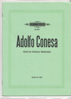
Suite for Ordinary Machinery - music for cello
Technische
Angaben
-
[4] S., 28x20,3 cm, Auflage: 500, ISBN/ISSN 9788493695613
Drahtheftung, in transparenter Kunststoffhülle, verschweißt,
ZusatzInfos
-
Musical score written through the transcription of a daily occurrence. The composition was written from the translation –to musical language– of an elevator's movement for ninety minutes. Specific parameters (tempo and tone) were assigned to the passengers' variants (floor and age).
The score is meant to be performed on a cello because of the similarity between this string instrument and the mechanism that makes the elevator work.
Text von der Verlagswebseite
|
Titel
-
The order of time and things. The home studio of Hanne Darboven
Technische
Angaben
-
2 S., 21x14,8 cm, keine weiteren Angaben vorhanden
Infoblatt,
ZusatzInfos
-
Ausstellung 26.03.–01.09.2014 Sabatini Building, Floor 3
|
Technische
Angaben
-
[20] S., 29,7x21 cm, Auflage: 100, keine weiteren Angaben vorhanden
Leporello mit kleinem Heft, Fadenheftung, Cover mit Aufkleber, Offset
ZusatzInfos
-
The »About Series« is a mobile space exhibiting visual artists. Each issue consists of a leporello with four pages like a room with four walls and a small booklet with texts and a »floor plan«. It is the first periodical artzine published by Gloria Glitzer.
Text von der Webseite
|
Technische
Angaben
-
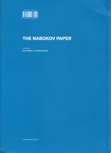
144 S., 30x22 cm, Auflage: 350, ISBN/ISSN 9781907468209
Broschur mit Klappeinband
ZusatzInfos
-
The Nabokov Paper is an experiment in novel-reading. The project takes as its starting point a now famous class taught during the 1950s by Vladimir Nabokov at Cornell University, New York State, entitled Literature 311-312: Masters of European Fiction. Nabokov’s approach to teaching literary reading was notoriously idiosyncratic. Convinced that one must teach the books themselves, not ideas or generalities, Nabokov would make diagrams of the floor plans of fictional buildings, map the routes taken by characters through the spaces of the novel, and draw items of clothing or furniture, he would also propose to track the course of a single letter, offer a visual representation of a stylistic device, and uncover what he called the mysteries of literary structures. His methods are striking for the range of gestures they call for in the name of good reading. The published Lectures on Literature (New York: Harcourt, 1980) concludes with an appendix of sample exam questions. Responding to those questions some sixty years after the fact offers a means to explore what Nabokov’s take on how to read might have to teach us today: about the novel, about how reading works across practices and disciplines, and about the past, present and future forms of literary criticism.
Text von der Webseite
|
Technische
Angaben
-
36 S., 30x25,5 cm, Auflage: 2.500, keine weiteren Angaben vorhanden
Gedruckt mit Extrapool Ricoh priport JP8500 auf 150 gr Munken Artic White mit 12 Farben, in bedruckter Papiertüte
ZusatzInfos
-
The daily magazine of the international arts festival Wereld Van Witte De With. De With is the daily paper full of news, interviews, reviews and secret tips. An exciting cooperation between dutch art blog Trendbeheer.com and the Letterproeftuin. Editing, writing, designing, printing and distributing from the festival floor, the project became a self-sustaining magazine
|
Titel
-
More than a Catalogue - The catalogue-boxes of the Museum Abteiberg-Mönchengladbach (1967-1978)
Technische
Angaben
-
2 S., 42x29,7 cm, keine weiteren Angaben vorhanden
Farblaserkopie nach PDF, einmal gefaltet
ZusatzInfos
-
Ausstellung October 15, 2015 - April 4, 2016, Nouvel Building, Library and Documentation Center. Space D, Floor 0
|
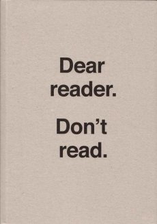
Titel
-
Ulises Carrion - Dear reader. Don't read
Technische
Angaben
-
2 S., 29,7x21 cm, keine weiteren Angaben vorhanden
Farblaserkopie nach Webseite
ZusatzInfos
-
Ausstellung vom 16.03.-10.10.2016 im Sabatini Building Floor 3
|
Technische
Angaben
-
4 S., 21x14,9 cm, 2 Stück. keine weiteren Angaben vorhanden
Einladungsflyer, beiliegend ein beidseitig bedrucktes Informationsschreiben zur Ausstellung
ZusatzInfos
-
zur Ausstellung vom 21.05.-04.06.2016 im Neo Toum - Neoterismoi Toumazou, Nikosia, Zypern.
He was dancing steadily. He could see the backs of people’s heads moving in the darkness and was aware of the shifting spaces between their bodies. He did not register the music except as a sort of vibration. He felt as if he was dancing in perfect silence. He saw the already dim room growing ever darker around him. He became less conscious of his surroundings and more aware of himself. His introspection grew but his body was now moving automatically, softly cycling through a short loop of set motions. He noticed dust under his feet, and soon the realisation reached him that he was slowly wearing a shallow hole in the wooden floor. His body was locked in an efficient cycle. Before too long he was six inches below floor level, his head parallel with some of the shorter dancers. Yet he could not stop. Gradually he sank deeper into the ground until his face was level with people’s waists. No one noticed, below the eye level of the crowd, he was almost invisible. Presently his eyes came level with the soles of dancing shoes. He could see shards of coloured light flashing through a forest of legs casting jagged shapes across the floor. There were points where soft reflected light shone through looming figures like sunlight into a clearing. Eventually he was entirely submerged. He could look up through the hole and see foreshortened bodies moving above him oblivious to his plight. Still his feet moved, wearing away damp, pungent earth. The vibrations from the music lessened until the dull thump of the kick drum was all that he could feel. When it stopped he realised he too was still, and looking up he saw the sphere of light was gone.
Text von der Webseite
|
Titel
-
Ulises Carrion - Dear reader. Don't read.
Technische
Angaben
-
272 S., 26,9x19 cm, keine weiteren Angaben vorhanden
Broschur
ZusatzInfos
-
Ausstellung vom 16.03.-10.10.2016 im Sabatini Building Floor 3.
A key figure in Mexican conceptual art, Ulises Carrión (1941, San Andrés Tuxtla, Mexico – 1989, Amsterdam) was an artist, editor, curator, and theorist of the post-1960s international artistic avant-garde.
Texts by Guy Schraenen, Felipe Ehrenberg and João Fernandes, among others, illustrate all aspects of his artistic and intellectual work. From his early career as a young, successful writer in Mexico to his numerous activities in Amsterdam where he cofounded the independent artists' run space In-Out Center and founded the legendary bookshop-gallery Other Books and So (1975–79), the first of its kind dedicated to artists’ publications.
Text von der Webseite
|
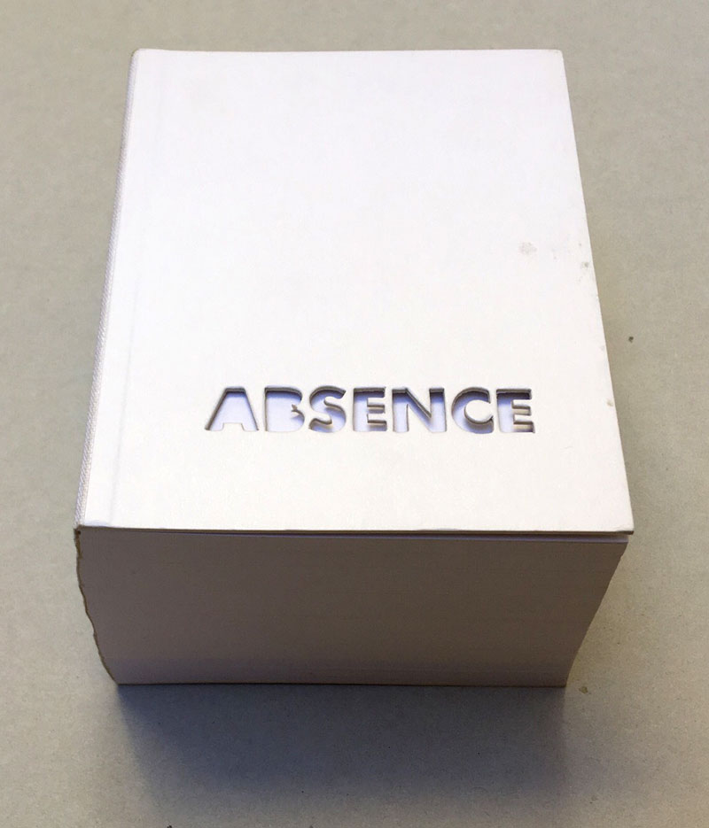
Technische
Angaben
-
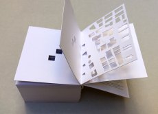
240 ca. S., 12,5x10 cm, Auflage: 2.000, ISBN/ISSN 0894390139
Umschlag aus Karton mit Leinenstreifen, ca. 120 Seiten gestanzt
ZusatzInfos
-
2004 winner of I.D. Magazine's Design Distinction award, Absence is the third book to come out of Printed Matter’s Publishing Program for Emerging Artists, a program made possible through the generous support of New York City's Department of Cultural Affairs, The Andy Warhol Foundation for the Visual Arts, the Elizabeth Firestone Graham Foundation, and the Heyday Foundation. The generosity of Whitney trustees Melva Bucksbaum and Raymond J. Learsy was instrumental to the Museum’s participation in the publication of this exciting new work.
Both a book and a sculptural object, Absence is a memorial to the twin towers of the World Trade Center. Yoon, an architect and designer who is currently an Assistant Professor of Architecture at the Massachusetts Institute of Technology, chose not to produce a traditional design proposal for the World Trade Center Memorial Competition. Instead she created a non-architectural, non site-specific space of remembrance: a portable personal memorial in the form of book.
At almost two pounds, Absence has a considerable physical presence, but it is in every way the ghost of a presence, and it is this ghostliness that gives it its particular emotional weight. A solid white block of thick stock cardboard pages, the book’s only "text" consists of one pinhole and two identical squares die-cut into each of its one-hundred-and-twenty pages – one for each story of the towers including the antenna mast. These removed elements lead the reader floor by floor through the missing buildings towards the final page where the footprint of the entire site of the World Trade Center is die-cut into a delicate lattice of absent structures.
Of all of the proposed monuments and grand designs for the twin towers to emerge in the last two years, Absence is remarkable for its employment of an under-used strategy: restraint. The simplicity of Yoon’s materials and her use of repetition speak, without words, about unspeakable loss. Quiet, respectful, mournful, the book does not aim to represent the magnitude of the disaster. Instead it appeals to the vastness of the reader’s imagination and capacity to grieve. The human scale of her memorial operates on a personal level – it delivers the memory of lives lost into the reader’s hands. At the same time, as a scale model of a vanished architectural site, it operates on a larger cultural level by commemorating the site itself.
Text von der Webseite. Fotos Xenia Fumbarev
|
Titel
-
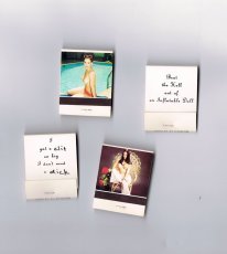
Streichholzbriefchen – I got a clit
Technische
Angaben
-
4,8x3,8 cm, 4 Teile. keine weiteren Angaben vorhanden
Konvolut aus vier bedruckten Streichholzheftchen, teils handbeschrieben.
ZusatzInfos
-
Teil einer Installation, die in der Ausstellung "Marlene McCarty – Mund Verkehr: In die Hose gegangen" in der NGBK Berlin, 6.06.–12.07.1992 gezeigt wurde. Aus der Pressemitteilung zur Ausstellung:
Marlene McCarty’ (1957) Interesse gilt dem Machtgebaren und den patriarchalen Strukturen, der von ihnen geprägten männlichen Umgangssprache. Die alltäglichen Sprüche die ihr, einer Frau, auf den Straßen New Yorks zugerufen werden, die unverstellten oder unverschämten Aufforderungen mit denen sie konfrontiert wird, sind das Ausgangsmaterial für ihre künstlerischen Strategien wie für ihre Kunstobjekte.
Marlene McCarthy zur Installation: “This is a floor sculpture and it’s 15,000 matchbooks. They’re standard matchbooks you can order from a catalog. On one side they have pinup girls on them, and on the other side I had them print, ‘I got a clit so big I don’t need a dick.’ If you’ll notice, clit and dick are handwritten. The company had called me up and were like, ‘Ummm, we have a problem. We can print dick but we can’t print THAT OTHER WORD.’ She wouldn’t even say the word clit. So I said OK, take the mechanical—this was in the olden days—and just slice the dick and the clit off. Then I got some friends together and we wrote them all in by hand. I’m reproducing these for the retrospective, but the curator is worried about whether we can have NYU students writing dick and clit 15,000 times. Maybe the seniors can do it.”
Texte von den Webseiten.
|
Technische
Angaben
-
104 S., 20x13 cm, Auflage: Print on Demand, keine weiteren Angaben vorhanden
Broschur
ZusatzInfos
-
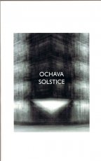
In the early part of the 20th century, the Buenos Aires government mandated that buildings on corners have a diagonal edge. The goal was to improve visibility at intersections for cars. The beveled cut is referred to as an ochava, in reference to the octagonal shape the four corners of an intersection form when viewed from above. The law only applies to the ground floor, however. From the 1960s onwards, the economic imperatives of real estate development demanded maximum square footage, which meant square edges for the buildings on all floors above the ground floor. This combination automobile safety and construction efficiency results in a triangular shadow which tracks the progress of the sun, much as a sun dial does.
Text von der Webseite
|
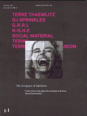
Titel
-
MONO.KULTUR #39 Terre Thaemlitz - The Arrogance of Optimism
Technische
Angaben
-
48 S., 20x15 cm, ISBN/ISSN 18617085
Drahtheftung, auf verschiedenem Papier gedruckt, von rechts nach links zu lesen
ZusatzInfos
-
Politics and the dance floor make for uneasy bedfellows, and it is this uneasiness that drives most of the work of Terre Thaemlitz, confronting head-on issues that are usually off limits in electronic music. Thaemlitz is a producer and DJ, also known under their monikers of DJ Sprinkles, Social Material, and K-S.H.E, among others. But they are also a writer, educator and activist of sorts, with very fluid notions of gender, switching continuously between male and female drag. Born in 1968, Terre Thaemlitz left the rigidly conservative and violently homophobic environment of their home state, Missouri, in the mid-1980s for New York. They became involved in the queer and transgender scenes both socially and musically at a time when house music was not a genre but simply the wide open sound of a specific social and political space. As New York’s underground queer music scenes dissolved under gentrification, Thaemlitz eventually relocated to Tokyo at the beginning of the ’00s. In a challenging interview with mono.kultur, Terre Thaemlitz talked about the politics of sexuality, his disillusion with the music industry, and why roller disco was so amazing. Visually, the issue is a dark affair, steeped in a dirty, gritty black. Printed on no less than six different paper stocks and juxtaposing several grids and graphic systems, it creates its own visual logic – only to disturb our most fundamental habits of reading and navigating a magazine by opening backwards, from right to left.
Text von der Website.
|
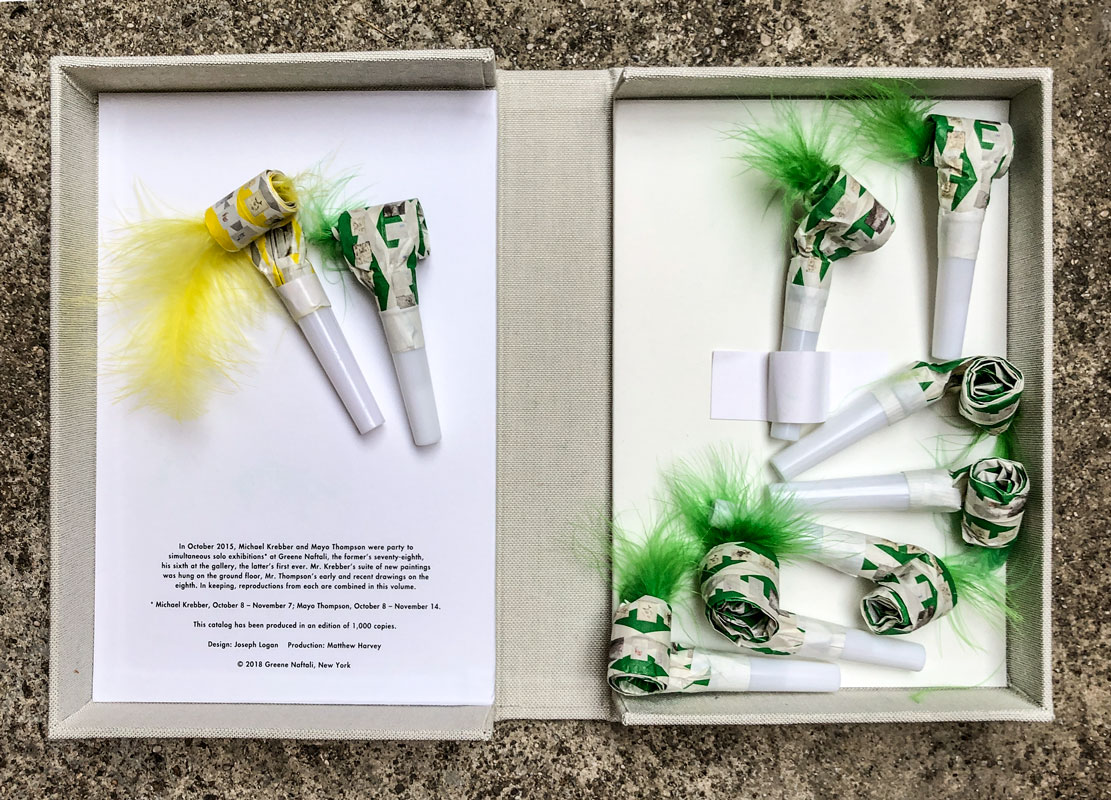
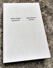
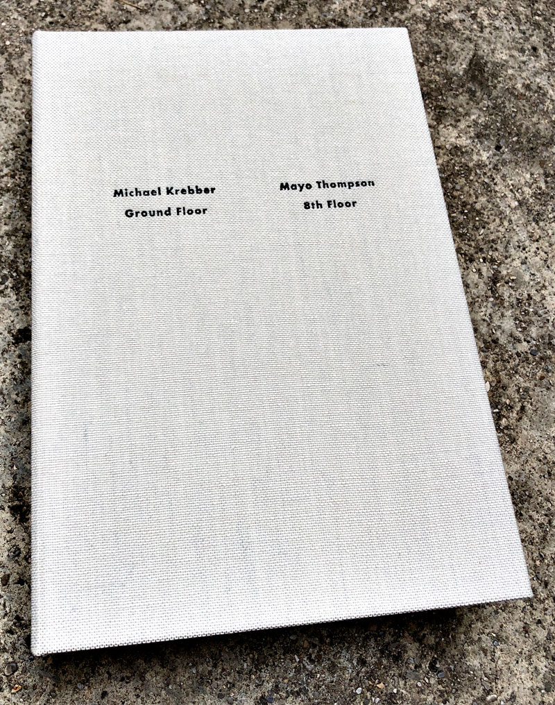
Technische
Angaben
-
23,7x16x4 cm, Auflage: 1.000, keine weiteren Angaben vorhanden
Klappschachtel aus Hartpappe, mit Leinen überzogen, eingelegt 9 Partytröten mit farbigen Federn, 8 Stück mit grünem Druck und grüner Feder, eine in Gelb, Deckel und Rücken mit der Schachtel Prägedruck
ZusatzInfos
-
Katalog zur Ausstellung 08.10.-07.11.2015 in der Galerie Greene Naftali. Die Ausstellung mit Gemälden und Zeichnungen ist im Miniformat auf den Tröten abgebildet
|
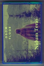
Technische
Angaben
-
10,8x6,8 cm, Auflage: 25, keine weiteren Angaben vorhanden
MusikKassette in grüner Plastikhülle
ZusatzInfos
-
Split Kassette der Künstler*innen Osom Floor und Nidum Teras.
|
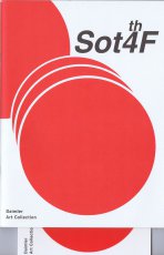
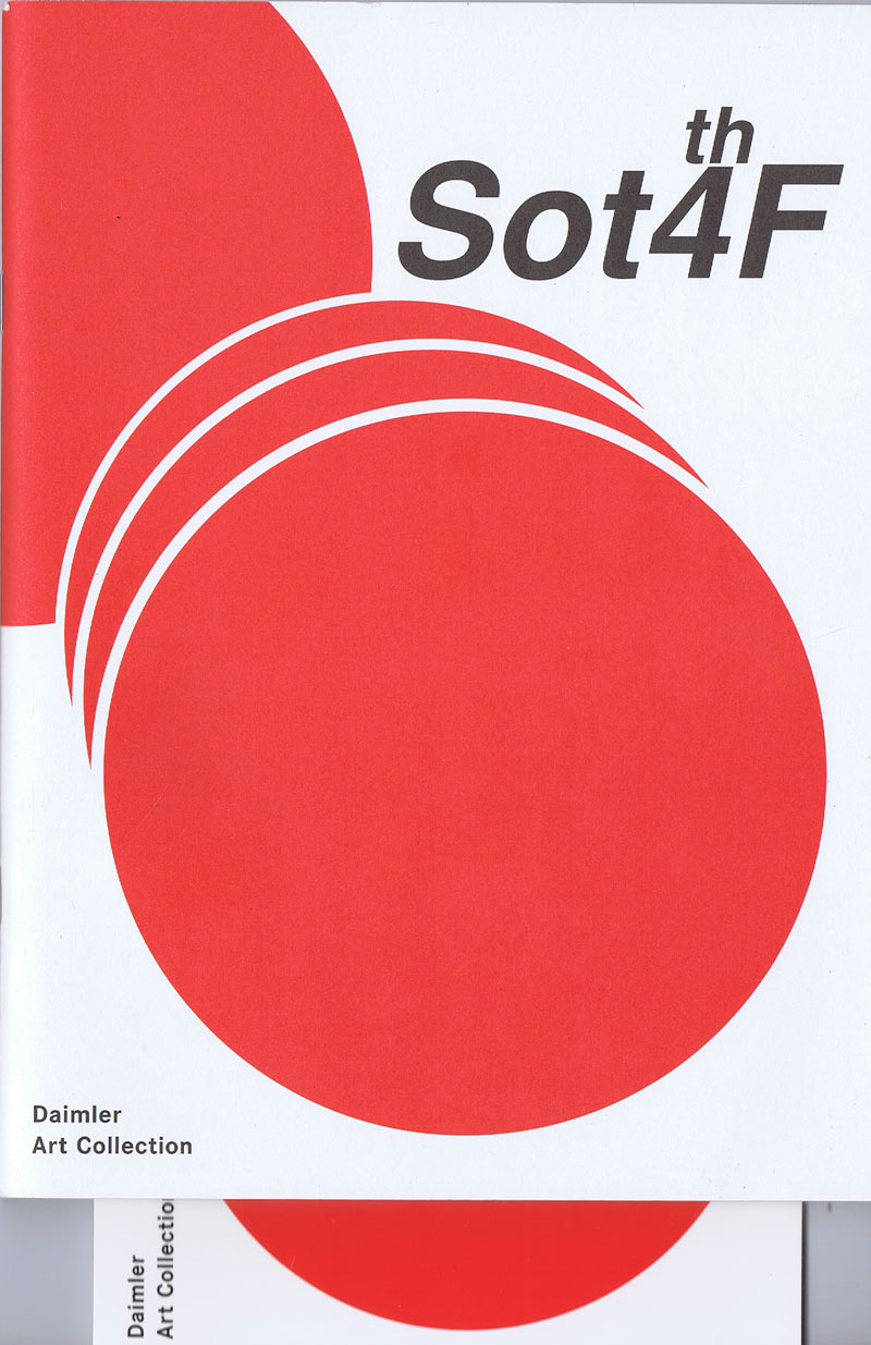
Titel
-
Sot4thF (Sound on the 4th Floor)
Technische
Angaben
-
25x18,5 cm, keine weiteren Angaben vorhanden
Drahtheftung, Umschlag und Karte enthalten
ZusatzInfos
-
Videos, Audio- und Soundarbeiten, Soundskulpturen, Bilder, Grafiken
|