|
Titel
-
Medium: Photocopy, canadian and german copy art
Technische
Angaben
-
keine weiteren Angaben vorhanden
Entwurf für einen Katalog mit Originalbrief von Jürgen Olbrich, Farb- und Schwarzweißkopien, geklammert
|
Titel
-
German Drawing of the 60s
Technische
Angaben
-
keine weiteren Angaben vorhanden
|
Technische
Angaben
-
keine weiteren Angaben vorhanden
Musikkassette,
|
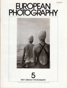
Titel
-
European Photography Nr. 05
Technische
Angaben
-
56 S., 28x21,5 cm, ISBN/ISSN 01727028
Drahtheftung,
ZusatzInfos
-
Volume 2, Issue 1, Thema New German Photography
|
Titel
-
Journals of German Publishers, German Bookfair New York 1983
|
Titel
-
Zeitschriften - Germanic Collections
Technische
Angaben
-
4 S., 29,7x21 cm, keine weiteren Angaben vorhanden
Liste, Recently Acquired, 27.6.2005
|
Titel
-
Künstlerbücher - Germanic collections
Technische
Angaben
-
5 S., 29,7x21 cm, keine weiteren Angaben vorhanden
Liste: Recently Acquired, 27.6.2005
|
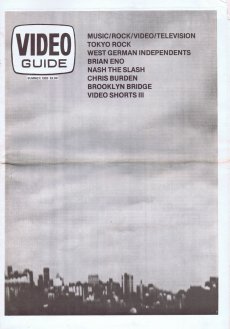
Titel
-
Video Guide Issue 23, Volume 5, Number 3 Vancouvers Video magazine
Technische
Angaben
-
16 S., 42,5x29 cm, keine weiteren Angaben vorhanden
Blätter lose ineinander gelegt,
ZusatzInfos
-
Mit Artikeln über Tokyo Rock, West German Independents, Brian Eno, Nash the Slash, Chris Burden, Brooklyn Bridge
|
Titel
-
Vogue special Biennale - Isa Genzken - Oil - German Pavilion - Venice 2007
Technische
Angaben
-
16 S., 27,7x21,2 cm, keine weiteren Angaben vorhanden
Einmalige sonderveröffentlichung zur 52. Biennale Venedig
|
Technische
Angaben
-
48,5x36,7 cm, keine weiteren Angaben vorhanden
Kunststofftüte zum German Pavilion - Venice Biennale 2007, beidseitig farbig bedruckt
|
Technische
Angaben
-
21x1020,5x9,3 cm, keine weiteren Angaben vorhanden
Drahtheftung
ZusatzInfos
-
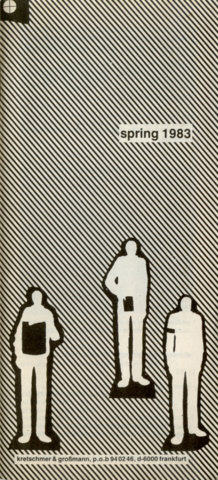
Lieferverzeichnis der Distribution für die German Bookfair New York 1983, Titelgestaltung unter Verwendung von Grafiken von Christoph Mauler
|
Technische
Angaben
-
48 S., 14,7x21 cm, 2 Stück. keine weiteren Angaben vorhanden
Französische Broschur/Klappbroschur, ein Ex. mit eingelegter Einladungskarte
|
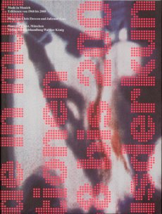
Titel
-
Made in Munich. Editionen von 1986 bis 2008
Technische
Angaben
-
368 S., 24,8x19,5 cm, ISBN/ISSN 9783865606624
Katalog zur Ausstellung im Haus der Kunst 2009, mit Installationsansichten von Wilfried Petzi und Objektfotografien von Jann Averwerser, Schutzumschlag aus gefaltetem Plakat
ZusatzInfos
-
Vorwort von Chris Dercon. Essay von Julienne Lorz.
"Ich bin interessiert an der Verbreitung von physischen Vehikeln in Form von Editionen, weil ich an der Verbreitung von Ideen interessiert bin." Joseph Beuys, München gilt als heimliche Hauptstadt von Editionen und Multiples. "Made in Munich. Editionen von 1968 bis 2008" bietet einen anderen Blick auf die Geschichte des Münchner Kunsthandels. Im Vordergrund stehen die Produzenten von Multiples und Editionen, die über einen Zeitraum von 40 Jahren in und um München entstanden sind. Darunter sind Editeure wie die Galerie Heiner Friedrich, Galerie Fred Jahn, Galerie Bernd Klüser, Sabine Knust und ihr Maximilian Verlag, Galerie van de Loo und Edition Schellmann, sowie Aktionsraum A1, ECM Records, edition x, Kunstraum München, P.A.P. Kunstagentur Karlheinz & Renate Hein, s press tonband verlag und zehn neun. Neben Druckgraphiken finden sich Editionen und Multiples verschiedenster Art nebeneinander: von fotografischen Mappenwerken, Plattencover Skulpturen, Videos und Tonkassetten, 16 mm-Filme, bis hin zu eigens an den Raum angepassten Kunstwerken.
"I am interested in the circulation of physical vehicles in the form of editions, because i am interested in the circulation of ideas." Joseph Beuys, Since the beginning of the 1970s, Munich along with New York and London, was leading with regards to editions and multiples. This catalogue shows works from 1968 to today, which were initiated and produced by a.o. dedicated munich galleries and "editeurs". "Made in Munich" shows outstanding works by international as well as german artists a.o. by Georg Baselitz, Joseph Beuys, Marcel Broodthaers, Dan Flavin, Lucio Fontana, Richard Hamilton, Carsten Höller, Jeff Koons, Hermann Nitsch, Blinky Palermo, Gerhard Richter, Dieter Roth and Andy Warhol.
Text von der Webseite
|
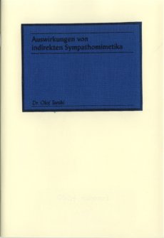
Titel
-
Auswirkungen von indirekten Sympathomimetika
Technische
Angaben
-
24 S., 19x13 cm, Auflage: 60, numeriert, keine weiteren Angaben vorhanden
Risographie und Siebdruck, aufgeklebter bedruckter Stoff auf dem Cover
ZusatzInfos
-
Dr. Olof Tarski, not yet widely known to the public, illustrated the effects of sympathomimetic drugs in his first booklet for Taube. For this cause, he uses slightly manipulated imagery and hidden short poems (in german) for which the reader needs to rub on the pages in order to read them.
Just like sex, indirect sympathomimetics almost cause the same symptoms. A frightening but yet fascinating fact in these days is that every physical symptom may also be produced artificially. The intention behind this work is to show how much drugs and medications are in a position to control our physical sensation.
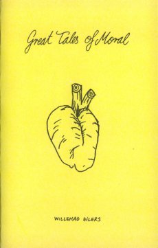
|
Technische
Angaben
-
28 S., 18x11,5 cm, Auflage: 50, numeriert, keine weiteren Angaben vorhanden
Drahtheftung, Risographie auf gelben Karton
ZusatzInfos
-
Drawings and text in german and english including an illustrated short story about apes in leather suits.
Willehad EIlers (1981, Peine) lives and works in Amsterdam. He is tirelessly working in all kinds of media including film and sculpture always looking for obscure situations inside incomplete stories. Great Tales of Moral was released accompanying to the exhibition with the same title at
self service open art space stuttgart
|
Titel
-
Libri d’arte, passione di una vita
Technische
Angaben
-
keine weiteren Angaben vorhanden
Artikel über Reinhard Grüner,
ZusatzInfos
-
Reinhard Grüner is a collector from Monaco. His passion is art books, which he collects – and sometimes exhibits – since the 1960s.
His website, www.buchkunst.info is a real “online museum”, where international artist books are catalogued and photographed. Amongst the artists there are Marc Chagall, Anselm Kiefer, Henri Matisse, Pablo Picasso and Andy Warhol. Books, but also works of art made of images and text, created by the artist often in collaboration with a writer and a publisher. For the high artistic quality – original graphics, unique designs, paintings and collages – these works are different from the usual picture books. Their manifestations are multiple: books with graphic effects, objects-book, artist’s books, sometimes printed in offset or illustrated by works of artists.
At the centre of Grüner’s attention there are Eastern German and Eastern European books (mainly Russia, Hungary, Lithuania). many of these works were created in response to specific social, political and cultural issues, with unimaginable insights into the culture of modernity.
Reinhard first came in contact with the art in book form with the English Edition, printed privately, of “A Dissertation Upon Roast Pig”, printed in 1975 by Shoestring Press on paper of the legendary Chiswick Press: from here begins a life of a book maniac among thousands of books. As Grüner states in an essay, the acquisition of artist books is more than a simple purchase: the artist, the life as a collector and thoughts are tied together, they influence each other, and a network of contacts with other collectors begins. With nearly all the books in his collection Grüner forms a symbiotic relationship: each of them describes, explains, and gets to the heart of some chapters of his life.
Download the pdf file with the essay on the collection of Reinhard Grüner (in English)
|
Titel
-
... a Dim REflection of Art - Memories of a (West) German Collector
Technische
Angaben
-
6 S., 29,7x21 cm, keine weiteren Angaben vorhanden
Übersetzung Cornelia Göbel, Ausdruck nach einer PDF-Datei
|
Titel
-
Buch 10 - I am a confident liar
Technische
Angaben
-
28 S., 14,8x14,8 cm, ISBN/ISSN 9783940548283
Drahtheftung, in Transparenthülle
ZusatzInfos
-
´I am confident liar´ is a sneak peek into the sketchbooks of german born, globetrotting artist Ivonne Dippmann.
Drawings at different stages mixed with short notes, words and sentences present an insight view into Dippmann´s world of characters and composed situations or interactions
|
Technische
Angaben
-
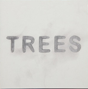
16 S., 14,8x14,8 cm, ISBN/ISSN 9783940548092
Drahtheftung, in Transparenthülle
ZusatzInfos
-
´TREES´ is a series of tree drawings from 2008 and 2009 by the german artist Stephane Leonard.
Different trees without any leaves captured at their most naked, most fragile moment right in between life and death. The pencil describes sceleton like structures giving the trees an airy transparency leading one towards their momentary state of existence
|
Technische
Angaben
-
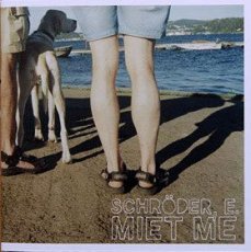
28 S., 14,8x14,8 cm, ISBN/ISSN 9783940548078
Digitaldruck, Drahtheftung, in Transparenthülle
ZusatzInfos
-
´MIET ME´ is a series of pictures by the german photographer Schröder E..
The focus of this series is on various events around Germany seen through the eyes of an outsider who is standing right in the middle of the scene. Schöder E. is part of the event, documenting what is happening in front of him without actually participating and thereby creating humorous and composed, almost staged moments
|
Titel
-
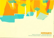
NASU 05 - Artists 2006 (compilation)
Technische
Angaben
-
13x13 cm, keine weiteren Angaben vorhanden
Musik-CD in KlappPapphülle, transparenter Kunststoff, in transparenter Kunststoffhülle, cover art: Stephane Leonard & Martin Eichhorn
ZusatzInfos
-
all done by stock11.de, mastered at ICEM.
A compilation of four brilliantly composed, arranged and performed pieces by the young german composer and performer collective stock11.de
|
Titel
-
Young, Fresh and Relevant Issue 2
Technische
Angaben
-
32 S., 21x14,8 cm, Auflage: 200, keine weiteren Angaben vorhanden
Laserprint, Drahtheftung, material 314
ZusatzInfos
-
'Young, Fresh and Relevant' is an ongoing, open submission journal exploring the concept of artist writing. The journal is in English and is partly translated into German
|
Technische
Angaben
-
48x33 cm, 2 Stück. keine weiteren Angaben vorhanden
Plakat, vermutlich beschnitten
ZusatzInfos
-
Atem Books is an independent publishing house based in Catalunya focused on photography & illustration, contemporary drawing and thinking created by emerging artists from around the world. Our aims are: to help emerging artists to get their work more known, create a collection of contemporary works, to gather illustrators, photographers & art lovers. Atem Books has been publishing Carpaccio Magazine since April 2009. Atem Books is a non-profit organization, so all the money earnt is always invested in new publications.
Why ‘Atem’?
‘Atem’ stands for “wind, breath” in german. This word is inspired by an illustrated poetry book published by Paul Celan (poet) and Gisèle Celan (illustrator) called Atemkristall.
Who we are
Atem Books curators are María Cerezo and Emma Llensa. We both do all the works involved with mantaining Atem Books.
What we can do
We’re also offering our services to help you self-publish your book (both digital -pdf, epub, mobipocket-, Ipad and Iphone apps and print). Whether if you need advise on how to start self publishing a book or you need our services as curators, designers, layouters and image retouchers, just ask us what we can do for you.
We’re also offering our services to help you create your own website and, if you need one, how to create an e-commerce to sell your own goods. And, of course, we can give you marketing and self-promotion advises and guidelines.
Atem Books is 100% independent!
We don’t receive any external money. This project survives with the earns we do selling our publications.
Von der Webseite
|
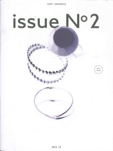
Titel
-
cocii-jewellery issue No 2
Technische
Angaben
-
16 S., 28x21 cm, keine weiteren Angaben vorhanden
Drahtheftung, Gestaltung Julia Hartmann
ZusatzInfos
-
Cocii is a young German designer, Claudia Lassner, whose delicate, restrained jewellery is inspired by a broad variety of cultural and aesthetic influences: from the everyday to science fiction to the glamour of the 1920s. Cocii’s jewellery explores the interplay between tradition and modernity, reinterpreting classic shapes and materials to create stunning pieces of contemporary jewellery
|
Titel
-
Foundations of a theatre / Concept.Foto. Drawing 1990/91/93/94
Technische
Angaben
-
11x15 cm, keine weiteren Angaben vorhanden
Spiralbindung
|
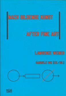
Titel
-
NACH BILDENDE KUNST / AFTER FINE ART Works presented in the German Language / Arbeiten vorgestellt im deutschsprachigen Raum
Technische
Angaben
-
200 S., 24,1x16,7 cm, ISBN/ISSN 9783775729796
Broschur
ZusatzInfos
-
Edited by Gabriele Wix, By Gabriele Wix, graphic design by Lawrence Weiner, Anja Lutz.
Most of his oeuvre, which comprises more than a thousand language-related works, has already been presented in the German-speaking world—some of it either translated by Weiner himself or conceived using German as a basis. Featuring over 350 works, this is the first list of the English/German works. The artist assumed responsibility for the typography and cover design, as if the publication were one of his own works. Accompanying text and visual documents shed light on the creative process, in-situ installations, and Weiner’s way to work with text.
Text von der Webseite
|
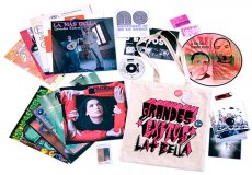
Titel
-
La Más Bella 15 - Grandes Exitos
Technische
Angaben
-
42x37x2,4 cm, Auflage: 1.000, keine weiteren Angaben vorhanden
beidseitig bedruckte Schallplatte in Schutzumschlag, 11 Schallplattencover und Booklet in transparenter Kunststoffhülle. Plakat, Video-DVD, Feuerzeug, Tüte Kopfschuppen in transparenter Hülle, in Stofftasche mit Siebdruck und 3 angebrachten Ansteckern und eine Papierfahne
ZusatzInfos
-
La Más Bella Grandes Éxitos se encuentra contenida en una bolsa de tela de 37×42 cm con asas, serigrafiada con una imagen de Toño Camuñas. En su interior puedes encontrar colaboraciones de unos 100 artistas que han trabajado sobre el tema propuesto: EL ÉXITO, en muchas ocasiones utilizando la imagen de los propios editores de La Más Bella.
El disco contiene temas musicales y piezas de arte sonoro de los siguientes autores:
CARA A: 1 Grandes Éxitos del Kabaret Obert. Mezclados por Merz Mail. (duración: 2:12)
2 Bassturbación para contrabajo y vibrador, de Pablo Martín-Caminero. (3:13)
3 Canto boca som, de Fernando Aguiar. (00:58)
4 El Precio del Éxito (suite en tres partes), de Víctor Nubla. (3:40)
5 Film seguit de Je parle, de Eduard Escoffet. (2:28)
6 Amsterdam, de Nilo Gallego. (1:29)
7 El café no viene de América, de Loreto.a. (2:11)
8 Boom Boom Bit, de LCDD. Los Caballos de Dusseldorf. (2:07)
9 Quiero un conejo, de Hot Fritanga (Circo Interior Bruto). (8:30)
CARA B: 1 No tengo miedo, de Videoartista (2:48)
2 Lágrima, de Pregúntale al Castor (4:01)
3 Le Non Amour, de Oscar Abril Ascaso + Sedcontra Avec Des Ex-Ivo Naïf. (3:08)
4 La Caja Bella, de Carlito’s Circus. (2:06)
5 Ser Actriz Material Refix, de Yogurinha Borova + Material. (3:58)
6 Remix electoral, de Freak Paradise. (4:14)
7 Salar, de Cambalache. (3:20)
8 Mensajes altimétricos espaciales, de DJ Ramírez. (2:14)
El disco va acompañado de un cuadernito (32 páginas, 16×16) con información de los contenidos del vinilo, además de obras de Nel Amaro (Taller de percusión para desempleados), Roxana Popelka (P y su relación con el éxito), y La Más Bella + Toño Merinero (No cantamos ni en la ducha)
Cartel Poético: Cartel desplegable de 50×70 cm realizado por La Más Bella en colaboración con Alonso Liuyi. En el reverso del cartel figuran poemas de Gerard Altaió, M. Paz Cornejo, Belén Cueto, Gonzalo Escarpa, María Fenández Salgado, Maria Jesús Fuentes García, Tiago Gomes, Germán Labrador, Luis Luna, Elena Medel, José Luis Piquero, Jesús Salceda Obregón, Alfonso Salzar, Ana Santos Payán y Eva Vaz.
Text von der Webseite
|
Titel
-
Die schönsten deutschen Bücher 2014 / The Best German Book Design 2014
Technische
Angaben
-
304 S., 24,3x17,7 cm, ISBN/ISSN 9783981429138
Hardcover mit Leinen, 2 Lesebändchen
|
Titel
-
American and German Libraries and Archives & the Contemporary Artist’s Book / A Transatlantic Colloquium
Technische
Angaben
-
12 S., 21x15 cm, keine weiteren Angaben vorhanden
Farblaserkopie nach PDF. Programm und Referentenverzeichnis,
ZusatzInfos
-
Organisiert von Initiative Fortbildung für wissenschaftliche Spezialbibliotheken und verwandte Einrichtungen e.V. in association with ARLIS/NA and the Deutsches Buch- und Schriftmuseum
|
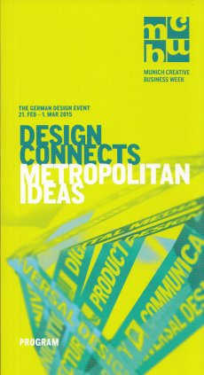
Titel
-
MCBW 2015 - Design Connects - Metropolitan Ideas
Technische
Angaben
-
14,8x10,5 cm, keine weiteren Angaben vorhanden
Werbekarte zur MCBW
ZusatzInfos
-
the German Design Event 21.02.-01.03.2015
|
Titel
-
MCBW 2015 - Design Connects - Metropolitan Ideas
Technische
Angaben
-
246 S., 21,4x11,6 cm, keine weiteren Angaben vorhanden
Broschur mit Ota-Bindung, eingelegt ein Kurzprogramm mit Stadtplan
ZusatzInfos
-
Programmbuch zur Munich Creative Business Week, The German Design Event vom 21.02.-01.03.2015
|
Technische
Angaben
-
31x31 cm, Auflage: 300, keine weiteren Angaben vorhanden
Schallplatte, LP, in 2 Hüllen, Infoblatt und gefaltete Grafik
ZusatzInfos
-
Hans Rudolf Zeller (b. 1934 in Berlin) is best-known for being a music theorist, essayist and writer on contemporary music. His essays on Dieter Schnebel, Iannis Xenakis, microtonality etc., often published in the German journal "Musik-Konzepte", are deemed being among the best ever written on new music. Apart from that, he has since the 1960s maintained his own artistic work, most of which has not been published or only seen the light of day in private micro-editions. Zeller's work often involves combining multiple dimensions (texts, vocals, visual projections) into one cinematological literature.
Text von der Webseite
Side A: 1. Tesa-Klänge, 2. Vokalphantasie, 3. Scriptophonie, 4. Musiktext
Side B: 1. Parallelität, 2. Stimmimprovisation
|
Technische
Angaben
-
3,4x10,4 cm, 2 Stück. keine weiteren Angaben vorhanden
Sticker
ZusatzInfos
-
zwei unterschiedliche Motive
|
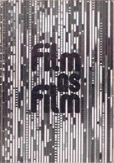
Titel
-
Film as film - formal experiment in film 1910-1975
Technische
Angaben
-
152 S., 29,7x21 cm, ISBN/ISSN 0728702002
Softcover, Fadenheftung
ZusatzInfos
-
Ausstellung vom 03.05-17.06.1979. Veranstaltet vom Arts Coucil of Great Britain.
Part 1. 1910-40: Birgit Hein: Futurist Film, Herzogenrath: Light-play & Kinetic Theatre, Documts on German Abstract Film, LeGrice: German Abstract Film, Christie: French Avantgarde Film in the 20s, Weibel: Eisenstein, Vertov & Foormal Film, Dusinberre: Other Avantgardes, Moritz: Nonobjective Film: 2nd Generation.
Part 2: 1940-75: Hein: Structural Film, Weibel: Viennese Formal Film, Le Grice: The History We Need, Group Statement: Women & the Formal Film, Lis Rhodes: Whose History? Maya Deren: The Artist as God in Haiti, and Statement of Principles, Writings by Alice Guy and Germaine Dulac, Filmographies 1940-75
|
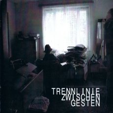
Titel
-
Trennlinie Zwischen Gesten Nr. 03
Technische
Angaben
-
24 S., 21x21 cm, 2 Stück. keine weiteren Angaben vorhanden
Drahtheftung
ZusatzInfos
-
Zum Teil mit kryptischem Nonsense. Finally - after a long break - Munich's Best Underground Magazine Trennlinie Zwischen Gesten is back again with Volume 3. The artwork changed from A5 format to a sexy square-like individual cutting. This time the magazine is even "more arty" and includes several great german product reviews of the super-special kind. Still very obscure Pasing-scene stuff. Forget Berlin - the dead corpses walk around the Pasing Arkaden in Munich's worst district. Surely nothing for industrial listeners or other narrow-minded people. This one is for true aliens.
Text von der Webseite
|
Titel
-
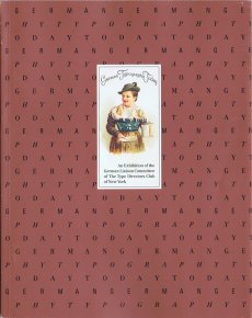
German Typography Today. An Exhibition of the German Liaison Committee of The Type Directors Club of New York
Technische
Angaben
-
64 S., 23,7x18,8 cm, Auflage: 5.000, keine weiteren Angaben vorhanden
Klappbroschur
|
Titel
-
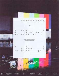
Gute Aussichten - Junge deutsche Fotografie 2015/2016
Technische
Angaben
-
16 S., 25,5x20 cm, keine weiteren Angaben vorhanden
Drahtheftung, Beilage in brand eins
ZusatzInfos
-
Im zwölften Jahr von gute Aussichten wählte die Jury neun Arbeiten aus, die unser Welt-Bild radikal hinterfragen.
gute aussichten - junge deutsche fotografie - new german photography 2015/2016 – die neun Preisträger/innen und ihre Arbeiten: Quo vadis, Welt? – Reflexion und Utopie
|
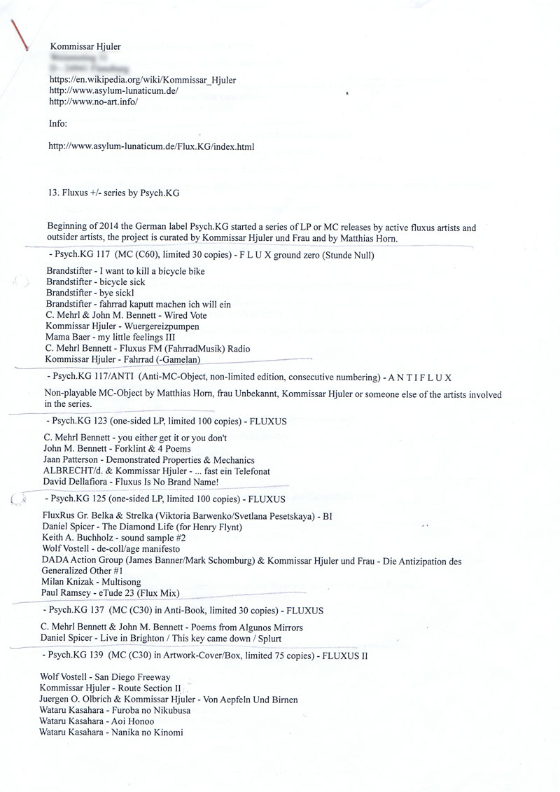
Titel
-
13. Fluxus +/- series by Psych.KG
Technische
Angaben
-
14 S., 29,7x21 cm, Auflage: 1, signiert, keine weiteren Angaben vorhanden
geklammert, Auflistung der Schenkung vom 01.12.2015 (Schallplatten), bedrucktes weißes Normalkopierpapier, auf letzter Seite handschriftlicher Gruß mit Unterschrift
ZusatzInfos
-
Beginning of 2014 the German label Psych.KG started a series of LP or MC releases by active fluxus artists and outsider artists, the project is curated by Kommissar Hjuler und Frau and by Matthias Horn.
Text von Liste übernommen
|
Technische
Angaben
-
22x14 cm, Auflage: 9, numeriert, keine weiteren Angaben vorhanden
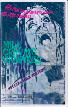
VHS-Schachtel mit eingeschobenem Cover, innere linke Seite: schwarze Farbspritzer, Teelöffel, kleine Spritze, verschlossenes Glsröhrchen. Rechte Seite: Zwei zusammengeklebte Bilder, aufgeklebter Stoff mit Musikkassette (1h 26 min)
ZusatzInfos
-
Beiträge von:
Hate Poem - Blood In The Park
Hate Poem - Children Play With Corpses I
Hate Poem - Children Play With Corpses II
Hate Poem - Children Play With Corpses III
Hate Poem - Murder Minds
Hate Poem - Lullaby By Three Drowned Children
Kommissar Hjuler Und Frau - Gretchen Part 1
Kommissar Hjuler Und Frau - Gretchen Part 2
The New Movement (2) - Rejection
Split tape between the relatively new Swedish project Hate Poem and the prolific German duo Kommissar Hjuler Und Frau.
ANTi-X.x..x...-Mas Edition
Unterstützung durch Bandcamp
|
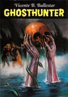
Technische
Angaben
-
[28] S., 20,6x14,5 cm, ISBN/ISSN 9783940907202
Drahtheftung
ZusatzInfos
-
Katalog zur Ausstellung im In:Surgo!, Berlin. Vicente B. Ballestar, born in Barcelona in 1929, is a Spanish illustrator known worldwide for his genre-defining dark pulp and supernatural realist illustrations. Throughout his long career, he has been beloved by aficionados of the genre worldwide, especially for his cover illustrations for Geisterjäger, John Sinclair (Ghosthunter, John Sinclair). From the beginning of the series in the 70s to his retirement in 2007, Ballestar created almost one thousand striking scenes in his preferred medium watercolour, giving the adventures of John Sinclair their unmistakable graphic character and certainly greatly contributing to its cult status. In the horror detective fiction series, published weekly since 1973, Scotland Yard chief inspector John Sinclair is the eponymous protagonist of the German pulp fiction written by Helmut Rellergerd under the pen name Jason Dark.
Text von der Webseite
|
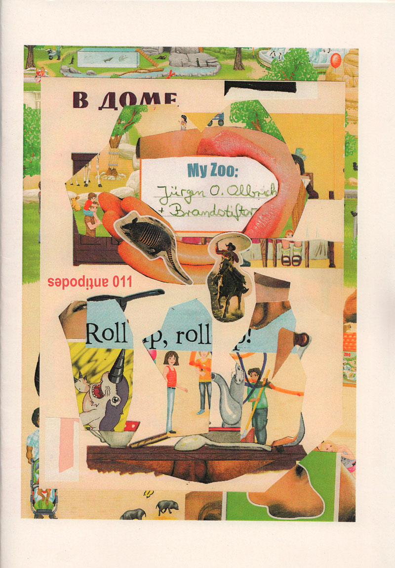
Technische
Angaben
-
[24] S., 21x14,6 cm, Auflage: 100, numeriert, signiert, keine weiteren Angaben vorhanden
Drahtheftung
ZusatzInfos
-
My Zoo is a postal collage collaboration by Jürgen O. Olbrich and Brandstifter.The two German ZOO directors first met in the Eternal Network, the funny mail art circus of the 90ies. Both of them juggle with collage, copy art, fluxus, found paper, visual poetry and performance.
Text aus dem Heft
|
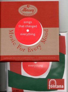
Titel
-
songs that changed everything
Technische
Angaben
-
46 S., 17,5x17,5 cm, Auflage: 200, numeriert, 2 Stück. keine weiteren Angaben vorhanden
Drahtheftung, mit Pergamentpapier, 2farbige Risographie und Farblaserkopie, in transparenter Kunststoff-Schutzhülle,
ZusatzInfos
-
We all have songs that left a mark, that changed the way we thought about music, about life, that helped us make new friends, that set something in motion. We wanted to collect these songs, and especially the stories behind them, from people that we know and like. This zine contains written pieces (in Englisch and German), as well as images, done by 13 wonderful people.
Text aus dem Heft
|
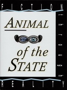
Titel
-
Animal of The State, Fiction through Reality
Technische
Angaben
-
218 S., 22x16,5 cm, Auflage: 1.000, 2 Stück. ISBN/ISSN 9783932934360
Klebebindung, Umschlag mit Prägung, eingelegte Kunstpostkarte
ZusatzInfos
-
The publication “Animal of The State, Fiction through Reality” reflects on the process of the Survival Kit’s three-year existence. Individually and collectively written texts by the participants intertwine with guest contributions by companions who have been involved in the experiment in various ways. This book considers itself to a lesser extent as documentation of this experiment’s history but rather as a medium of visualisation of the mutual learning process.
The educational and artistic research program Survival Kit was funded by the German Academic Exchange Service DAAD through the programme “Partnerships with Greek Institutions of Higher Education 2014 – 2016”.
Text von der Webseite
Design: Stefanie Hammann, Maria von Mier
|
Titel
-
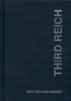
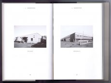
Third Reich - Bavaria Trilogy Part I
Technische
Angaben
-
[96] S., 20.5x14.5 cm, ISBN/ISSN 9789491047039
Hardcover, fadengeheftet, Cover Leinen mit Silberfolien Prägung
ZusatzInfos
-
Mit 91 Schwarz-Weiß Fotografien. Third Reich is a collection of photographs of buildings and constructions that were erected during the Nazi period in Bavaria, Southern Germany. The sites that Van der Weijde photographed include Hitler-Jugend Heime, Schools, Government Buildings, Bridges, Tunnels, Private homes, Farms, SS-Barracks, Museums, Factories, etc.
This series of photographs offers a view of how the cultural landscape must have influenced German society in the 1930's.
Text von der Website
|
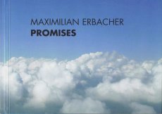
Technische
Angaben
-
40 S., 14,8x21 cm, keine weiteren Angaben vorhanden
Broschur, Digitaldruck
ZusatzInfos
-
The Pepsi Challenge
Oversized ‘promises’ in the form of real estate advertisements are promoting the new city along the lines of global real estate and living standards. ‘The perfect union to all you desire’ and ‘We believe luxury is best served in small quantities’ first seen along Varthur Road in Whitefield, Bangalore, caught my attention. The second one leaves a particularly ironic, tangy, protestant-flavoured impression, seen from the German point of view.
Questions emerged about the Indian caste system, the sense of community, modesty and personal goals.
The design of this urbanity also reminds me of earlier journeys to the United Arab Emirates and Shanghai. The new urbanity becomes exchangeable, custom-tailored and its ‘ultra-luxurious villas’ accessible ‘for the chosen few’ of the Pepsi Generation.
But what happens to the majority of a city’s population and its needs, uncertain ownership and neglect of basic amenities? Can it withstand the pressure flashed on every corner of the city? Do these promises affect social cohesion? ...
Text von der Webseite
|
Titel
-
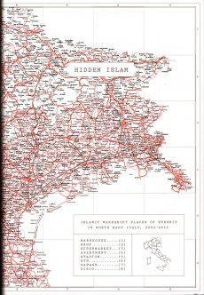
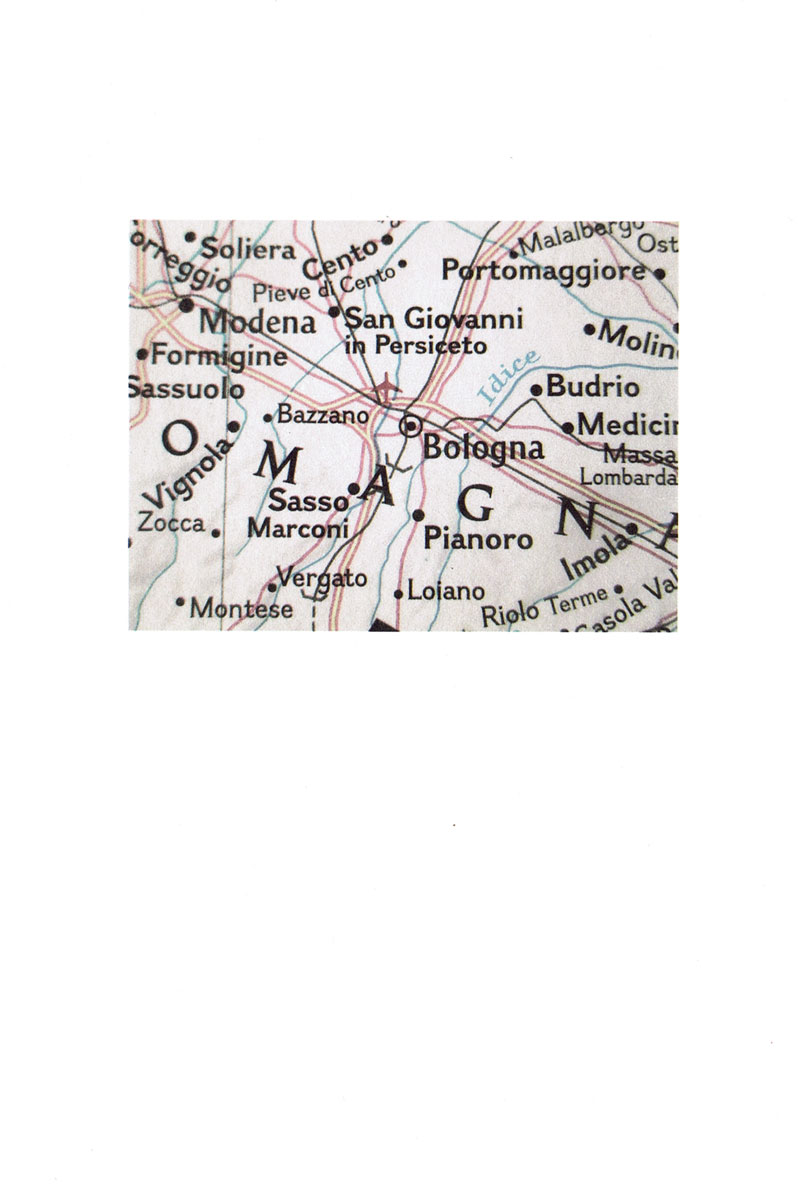
Hidden Islam - Islamic makeshift places of worship in North East Italy, 2009-2013
Technische
Angaben
-
90 S., 24,8x17 cm, ISBN/ISSN 9788890981708
Hardcover mit festgeklebtem Schutzumschlag. Jede Seite aufklappbar.
ZusatzInfos
-
Dritte Auflage.
Consider these facts. In Italy the right to worship, without discrimination, is enshrined within the constitution. There are 1.35 million Muslims in Italy and yet, officially, only eight mosques in the whole country. One consequence is that the Muslim population have accumulated a huge number of makeshift and temporary places of worship. These are housed in a variety of buildings including lock ups, garages, shops, warehouses and old factories. This shortage of places to worship is particularly acute in north east Italy – where the photographer Nicolò Degiorgis lives – home to many anti-Islamic campaigns headed by the right wing party Lega Nord. The dull images of the many and diverse buildings that house the makeshift mosques are printed on folded pages. You open up the gatefold to reveal the scenes inside the mosques, shot in full colour. The size of the gatherings varies, from large crowds who sometimes pray outside to a small room full to bursting, or to intimate groups of two or three Muslims. Degiorgis provides a fascinating glimpse of hidden world and leaves the conclusions about this project entirely in our own hands.
In 2014 Hidden Islam was awarded the Gold Award - Deutscher Fotobuchpreis, First Book Award - Paris Photo/Aperture Foundation and Author Book Award - Les Rencontres des Arles.
Text aus dem Vorwort von Martin Parr.
|
Technische
Angaben
-
18x12 cm, keine weiteren Angaben vorhanden
Postkarte
ZusatzInfos
-
Anlässlich der gleichnamigen Austellung in der Galerie P420, Bologna, 26.09.-14.11.2015. Zur Ausstellung erschien das Künstlerbuch "Viareggio in Italia".
After the exhibition Where the trees line… curated by Chris Sharp, which featured the work of three young artists, P420 presents the first solo show in Italy by the German artist Joachim Schmid (Balingen, 1955), already seen at the gallery in 2013 in the exhibition Lumpenfotografie curated by Simone Menegoi.
Text von der Webseite.
|
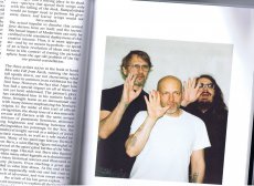
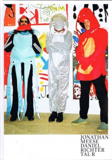
Titel
-
The men who fell from earth
Technische
Angaben
-
[128] S., 33,5x23,5 cm, Auflage: 1.300, ISBN/ISSN 9783902835482
Hardcover
ZusatzInfos
-
Anläßlich der Ausstellung »The Men Who Fell From Earth« im Kunstmuseum Holstebro von 16.09.2017–07.01.2018, im Kunsthaus Stade 2018 und im EMMA Espoo Museum of Modern Art.
Three international heavyweights in contemporary painting will join forces when Danish Tal R and his two German colleagues and friends, Jonathan Meese and Daniel Richter, hold a joint exhibition at Holstebro Kunstmuseum, under the title ‘The Men Who Fell from Earth’. In recent decades, with an almost unrestrained energy, these three artists have made a name for themselves as significant innovators of the painting tradition. ...
Text von der Webseite
|
Technische
Angaben
-
25x19,2 cm, ISBN/ISSN 9783943514605
Softcover, fadengeheftet, mit Schutzumschlag aus drei Papierbögen, verschiedene Papiere
ZusatzInfos
-
Makulatur, a German word that derives from lat. maculatura ’something stained’, refers to misprinted paper that is discarded at the beginning of the printing process as use- and worthless. In 2010, the graphic designer Manuel Raeder started to collect and preserve misprinted sheets of all the publications he designed not only for his own publishing house BOM DIA BOA TARDE BOA NOITE but also for fellow artists and institutions.
Text von der Website.
|
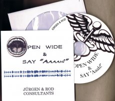
Titel
-
open wide & say Aaaah! - Jürgen & Rod Consultants
Technische
Angaben
-
13x13 cm, Auflage: 20, numeriert, signiert, keine weiteren Angaben vorhanden
CD in einseitig bedrucktem Papierumschlag in PapierHülle in Briefumschlag
ZusatzInfos
-
Vec Audio CD 0064. an audio collage collaboration. 2 Tracks (7:23 und 4:45). Soundcollage und Lesung einer Anleitung für Ärzte zu einer LP mit Medical English for German Doctors
|
Titel
-
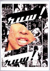
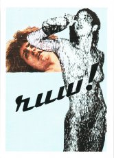
Dutch Issue of RUW! 01 - Unbekannterweise
Technische
Angaben
-
[28] S., 33x23,5 cm, Auflage: 50, numeriert, signiert, keine weiteren Angaben vorhanden
geklammerte Einzelblätter in Hartpappe-Umschlag Digitaldruck, verschiedene Drucktechniken auf verschiedene Materialien: Papiere, Stoff, Collage
ZusatzInfos
-
A magazine which consist of only handmade prints. RUW! is the combination of the word ‘raw’ , as in the American magazine ‘RAW’, founded in the 80’s by Art Spiegelman and Francoise Mouly and the German word ‘rau, pronounced as the Dutch word ‘ruw’. It emphasizes madness as the madness in ‘Tales of ordinary Madness’ by Charles Bukowski.
Text von der Website.
|
Technische
Angaben
-
106 S., 21x14,8 cm, Auflage: Print on Demand, keine weiteren Angaben vorhanden
Broschur
ZusatzInfos
-
Schwarz-Weiß-Drucke
Jens Schwarz was born 1968 in Berlin and studied history of arts in Paris and photography in Munich. He works in the field of portraiture and reportage on german and international assignments. In his personal projects he focuses on sociopolitical issues that often deal with questions of both personal and collective social identity. 2014 his first monograph ›Beirut Eight Thirteen‹ has been published documenting a photographic long-term project on social instability in Beirut. His projects received several grants throughout his career and his work has been nominated, among others, for the German Henri-Nansen-Prize.
|
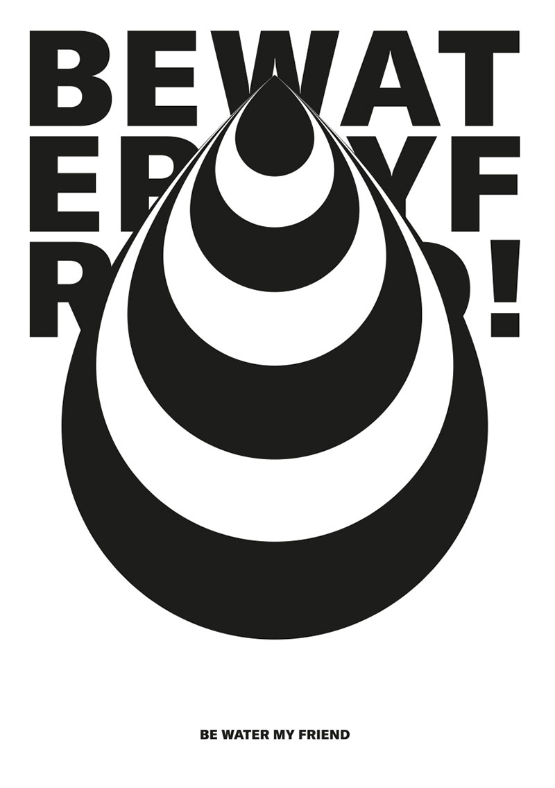
Technische
Angaben
-
106 S., 21x14,8 cm, Auflage: Print on Demand, keine weiteren Angaben vorhanden
Broschur
ZusatzInfos
-
Schwarz-Weiß-Drucke
Rafael Bernardo is a German-Brazilian graphic designer and art director specializing in the field of brand communication. With his personal and ongoing project „BE WATER MY FRIEND“ he started a typographic journey to express and explore his fascination for type, illustration, black and white.
|
Technische
Angaben
-
106 S., 21x14,8 cm, Auflage: Print on Demand, keine weiteren Angaben vorhanden
Broschur
ZusatzInfos
-
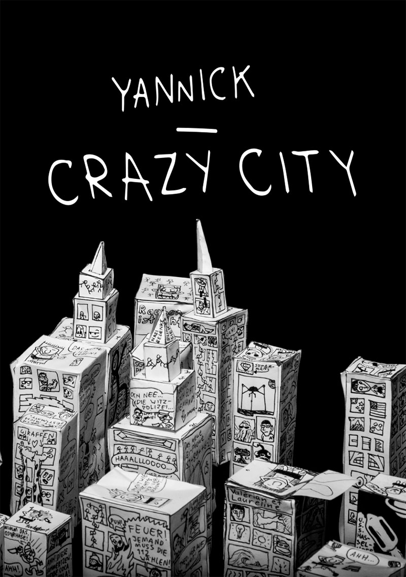
Schwarz-Weiß-Drucke
Born 2005, Yannick won his first art contest at the age of 2 in New Zealand. That’s where he lived until he moved to Munich, Germany with his family. Drawing is his passion. He illustrated a children’s book, published quite a few of his drawings in magazines and creates constantly. The preferred equipment he uses is a black fineliner. His Crazy City reflects a pessimistic German City. It should rise awareness of social miseries.
|
Technische
Angaben
-
106 S., 21x14,8 cm, Auflage: Print on Demand, keine weiteren Angaben vorhanden
Broschur
ZusatzInfos
-
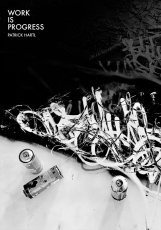
Schwarz-Weiß-Drucke
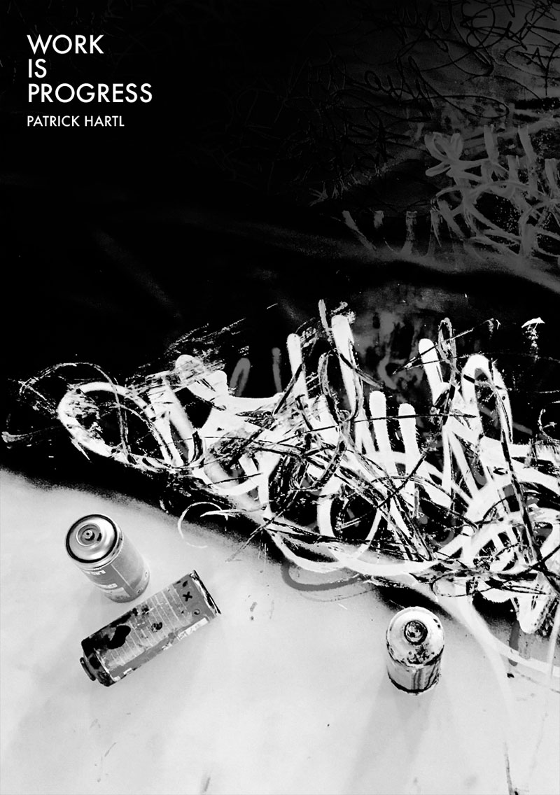
Patrick Hartl (*1976) is a German contemporary artist with a passion for handwriting and lettering. As of age 15, he was painting Graffiti and learning the ropes of art within the urban sphere. His graphic studies revealed a love for calligraphy and stylised writing with deep roots in the gothic script of his native Germany. Patrick Hartl connects old craftsmanship with modern street style. On closer inspection, Hartl’s seemingly monochrome works turn out to be the result of a multitude of layers of paint and a colourful diversity. His favourite canvas is a ten-years-old wall, which has been bombed, cleaned, bombed again, crashed, washed, damaged, but which always tells a new and unique story. As a master of handcrafted designs and analogue works, and one of the foremost urban calligraphers, Patrick Hartl has been involved in making art for more than two decades. An avid collaborator, Hartl belongs to the “CALLIGRAFFITI AMBASSADORS” and, in addition to exhibiting in traditional galleries from New York to Buenos Aires to Tokyo, and he has painted murals across Europe and beyond.
|
Technische
Angaben
-
968 S., 24x17 cm, ISBN/ISSN 9788837085667
Hardcover, Titel mit partieller Lackierung
ZusatzInfos
-
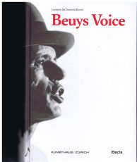
Erscheint anlässlich der Ausstellung “Joseph Beuys – Difesa della Natura”, 13.05.-14.08.2011, Kunsthaus Zürich, herausgegeben von der Züricher Kunstgesellschaft/ Kunsthaus Zürich. 3 Ausgaben, italienisch, deutsch, englisch.
12 May 2011 is the 90th anniversary of the birth of Joseph Beuys (1921-1986), one of the key figures in the artistic scenario of the last century. The Kunsthaus in Zurich is paying tribute to the German master by staging an important international event that forms an integral part of the exhibition entitled “Joseph Beuys – Difesa della Natura” (Joseph Beuys – Defense of Nature), curated by Lucrezia De Domizio Durini and Tobia Bezzola. This book marking the birthday of this German painter and sculptor, who was one of the most authoritative and innovative voices of post-war society, is also being published in English and German. The book, about 1,000 pages long, containing more than 200 illustrations from the historical archive of De Domizio Durini, describes the Living Sculpture which made Beuys famous, together with the historical background that is fundamental to comprehending his thinking and work.
Text von der Webseite
|
Titel
-
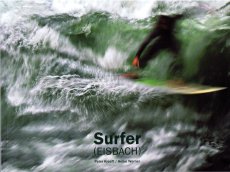
Surfer (EISBACH). A Photographic Sketchbook by Heike Werner with Philosophical Meditations by Peter Kreeft
Technische
Angaben
-
112 S., 19,5x26 cm, ISBN/ISSN 9783980947169
Broschur, Digitaldruck
ZusatzInfos
-
Surfer (Eisbach) ist ein ungewöhnlicher Bildband zum Thema Surfen. Es ist ein fotografisches Skizzenbuch, das mit seinen experimentellen Aufnahmen einen überraschend neuen, geradezu poetischen Blick auf das Surfen zeigt. Begleitet werden die skizzenhaften Bilder der Eisbach-Surfer von den philosophischen Betrachtungen des amerikanischen Autors und „surfanatics“ Peter Kreeft, der über das einmalige Surferglücksgefühl und die mystische Seite des Surfens schreibt. Der Text der vorliegenden Ausgabe ist zweisprachig, auf Englisch und Deutsch.
Surfer (Eisbach) is an unusual collection of pictures on surfing. With its experimental pictures, it is a photographic sketchbook that shows a surprisingly new and refreshingly poetic view of surfing. The sketch-like pictures of the Eisbach surfers are accompanied by philosophical considerations of American author and “surfanatic” Peter Kreeft, who writes about the unique sensation of joy experienced by surfers and the mystic side of surfing. The text of this book is bilingual, appearing in English and German.
Text von der Webseite
Vergriffen lt. Webseite
|
Titel
-
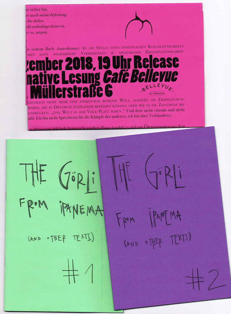
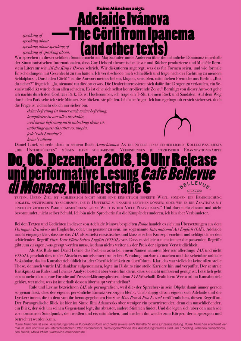
ruine 06 - The Görli From Ipanema (and other texts)
Technische
Angaben
-
36 S., 21,6x15,3 cm, Auflage: 90, numeriert, 3 Teile. ISBN/ISSN 9783947250196
2 auf farbige Papiere fotokopierte Hefte, Drahtheftung, ineinander gesteckt, zusammen in gefaltetem Blatt A3 mit Prägedrucken
ZusatzInfos
-
Zum Release und zur performativen Lesung im Café Bellevue de Monaco in München am 06.12.2018 um 19 Uhr.
Adelaide Ivánova (1982, Recife/Brazil) is a journalist and political activist working with poetry, photography, performance, translation and publishing. Her poems were translated into German, Galician, English, Spanish, Greek and Italian. Her texts and photographic work were printed in publications such as The Huffington Post (USA), Marie Claire (BR), Clinic (UK), alba londres (UK), Lateinamerika Nachrichten (GER), artiCHOKE (GER), modern poetry in translation (UK). Her photo reportage are part of the collection of Kunst Museum Dieselkraftwerk (Germany), L’arthotèque – Museum of Fine Arts (France) and Galeria Murilo Castro (Brazil). She edits the anarco-feminist zine “MAIS PORNÔ, PVFR!” (proudly not online) and is co-founder of RESPEITA!, a coalition of Brazilian female poets and slammers. She lives in Berlin, where she tries earn a living as baby-sitter, life model, waiter and other alienating jobs.
Text von der Webseite
|
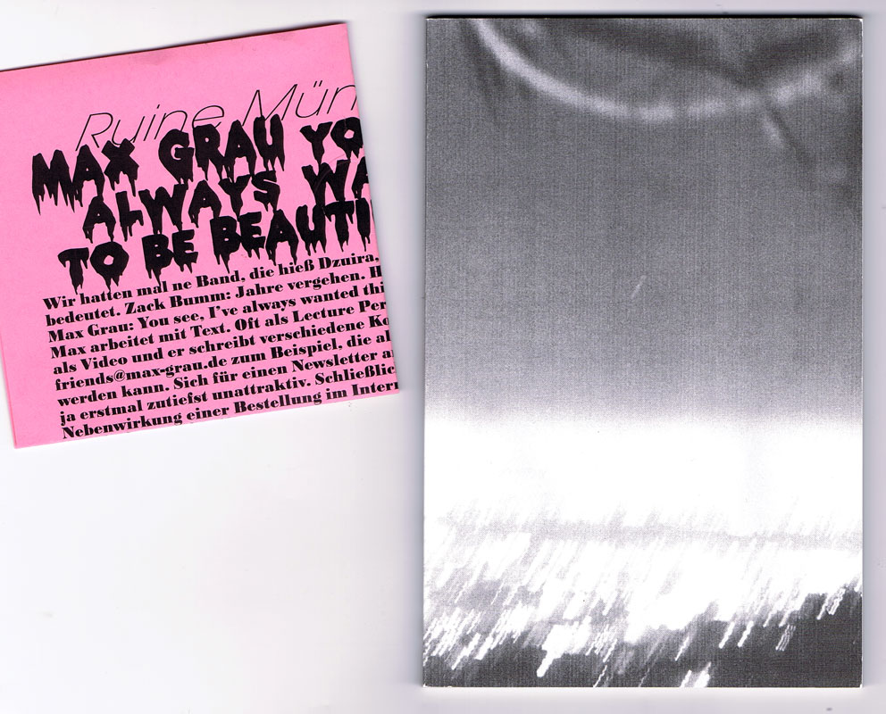
Titel
-
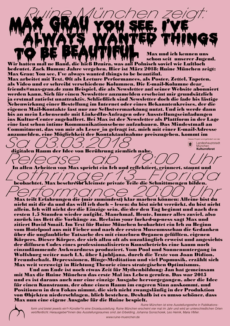
ruine 03 – You see I've Always Wanted Things To Be Beautiful
Technische
Angaben
-
84 S., 18,3x13 cm, Auflage: 70, numeriert, 3 Teile. ISBN/ISSN 9783947250103
Broschur, Schwarz-Weiß-Digitaldruck, beigelegt ein gefalteter Flyer, zusammen in gefaltetem Blatt A3 mit Prägedrucken
ZusatzInfos
-
Zum Release und zur performativen Lesung in der Lothringer 13 florida in München am 01.03.2018 um 20 Uhr.
Ruine München is happy to presents Max Grau's first artist book ever. In his words: "I’m really happy with how the book turned out. It looks and feels pretty. It has 84 pages and contains 53.260 characters (incl. spaces). There’s 25 images spread out over six chapters (which have names of varying length). The whole thing is titled after a line from a Frank O’Hara poem that I really like (although I’m not quite sure if I »get« it). There’s footnotes and page numbers and even a topic (optimism. Sort of). The text is written in English and the book is covered in a beautiful sleeve, designed by Maria (I think). It (the sleeve) contains a very flattering text (in German) about… uhm… me, written by the whole RUINE gang. Every issue is numbered and since there wasn’t a ton of money (why is there never an actual ton of money?), we only printed an edition of 70."
Text von der Webseite
|
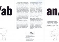
Titel
-
an/ab - Eine Ausstellung im Wartesaal der Bahnhofsstation Walleshausen
Technische
Angaben
-
[6] S., 21x14,8 cm, keine weiteren Angaben vorhanden
Faltkarte, in 2 Briefumschlägen
ZusatzInfos
-
Zur Ausstellung im Wartesaal der Bahnhofsstation Walleshausen 03.08.-29.09.2019
|
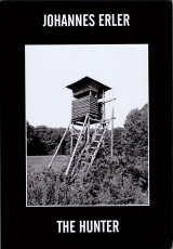
Technische
Angaben
-
106 S., 21x14,8 cm, Auflage: Print on Demand, keine weiteren Angaben vorhanden
Broschur
ZusatzInfos
-
Schwarz-Weiß-Drucke, Nr. 035 aus der Reihe 100for10
Johannes was born, will die in Hamburg/Germany. After graduating at the Musthesius Kunsthochschule in Kiel he designed for several studios (Lo Breier, Neville Brody, Meta Design) before he co-founded FACTOR DESIGN in 1993. Erler stood there for 18 years as partner and creative director. After the breakup in 2010 he co-founded EST (ErlerSkibbeTönsmann) in Hamburg. In 2012 he relaunched famous german magazine STERN and stood there as the art director for three years. Since 2014 he’s back at EST. For his work in corporate design and editorial design Erler received numerous national and international awards. He also is a type designer and an author.
Text von der Webseite.
|
Titel
-
To Be Determined - According to the Situation
Technische
Angaben
-
184 S., 24x16,5 cm, ISBN/ISSN 978 88 6749 351 7
Broschur mit Klappen; Einband mit aufgeprägtem Foto, Papier Einband mit textilähnlicher Struktur, Vorsatz/Nachsatz bedruckt mit Foto schwarzweiß, innen verschiedene Papiersorten für Fotos, Texte und Zeichnungen. Druck: Tipografia Valdostana
ZusatzInfos
-
Erscheint zur Ausstellung im S.M.A.K., Gent, Belgien,11.03-04.06.2017.
"Welcome to the world of Dirk Zoete. Because that’s what his work is: a conceived universe. The way someone leaning over a table makes a plan and imagines the world. While technology takes us into several intangible dimensions with virtual reality and other applications, Zoete makes us believe the world is still flat. Everything seems to have only a front and a back. As if we still believed that the earth is just a disk, and we can fall off. Zoete’s drawings are clumsy, intermittent, naive, adventurous, simple. It’s like a child’s imagination, depicting in a heap what you otherwise cannot fit on a piece of paper." Philippe Van Cauteren. Published in occasion of his first major solo exhibition in a Belgian museum, To be determined. According to the situation, held at S.M.A.K. in Gent in 2017, this catalogue explores Dirk Zoete’s peculiar practice. Enriched by essays and texts by Philippe Van Cauteren, Stephan Berg, Koen Peeters and Ann Hoste, the book is a journey through the artist’s process—who, starting from a drawing, generates models, sculptures, architectural constructions, photos, films. An all-encompassing approach that makes the Belgian’s work outstand as a natural successor of the German Bauhaus and Russian Constructivism, but with a more human touch.
The catalogue features a wide selection of images, presenting the many different stages of transformation of a drawing into a three-dimensional piece, and the hybrid nature of the exhibition set-up, a mix of a museum show and an artist’s studio, both essential characteristics of Zoete’s art."
Text von der Webseite
|
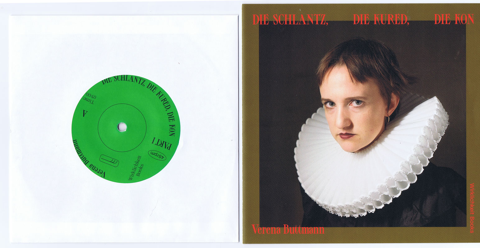
Titel
-
DIE SCHLANTZ, DIE KURED, DIE KON
Technische
Angaben
-
19x19 cm, Auflage: 200, ISBN/ISSN 9783948200022
Schallplatte (7 inch) in Hülle mit Umschlag und Beiheft, geklammert, in Klarsichthülle. Mit beigelegten Zetteln mit aufgedrucktem Downloadlink
ZusatzInfos
-
”Hhhh Minne, off you go, she’s coming! The deadline is in 5 minuties. If the Mayonnage hears that I’m only just starting. Woah my heart is catching fire. Close the curtain, yes.“ As the mayonnage approaches, the excitement grows. Without ever taking on a tangible form, her presence in Verena Buttmann‘s audio piece „Die Schlantz, die Kured, die Kon” (The Slutch, The Khored, The Quee) lies above everyday events. The mayonnage is many things: the object of fear, the last salvation, the state of oppression, the bridge to a remote world or a dreamlike projection. On her record, the artist Verena Buttmann creates a social cosmos between theatre-like staging and private space. A dialogical poem and a scenic piece of music reveal a narrative that follows a peculiar temporal dimension and linguistic logic. Verena Buttmann takes language to the edge of meaning, where its musical quality unfolds. The publication contains a 7‘ inch vinyl record, a brochure with the original text in German and the English translation, as well as a download link.
Text von der Webseite
|
Titel
-
Die Notwendigkeit der Notwendigkeit
Technische
Angaben
-
31,2x31,4 cm, keine weiteren Angaben vorhanden
Schallplatte in schwarzer Papierhülle und beidseitig bedrucktes gefaltetes Poster mit Liedtexten in LP-Hülle
ZusatzInfos
-
Running by the name of PAAR, three German artists forged their public personae to one sonic canvas to paint their musical visions in sound. Soaked in layers of New Wave and post-punk, swathed by modern electronic sounds and experimental punk, PAAR have created a musical body consisting of beats and synths, refined with steady textures of guitar and bass, sanded with distinctive lyrics and vocals.
Text von der Webseite
|
Technische
Angaben
-
60,5x41,8 cm, keine weiteren Angaben vorhanden
Offsetdruck, beidseitig bedruckt
ZusatzInfos
-
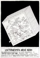
Im Theaterstück "Unternehmen Arche Noah", geht es um den Überlebenswillen und Ängste des Kleinbürgertums in den 80er Jahren.
|
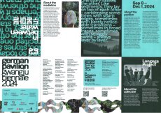
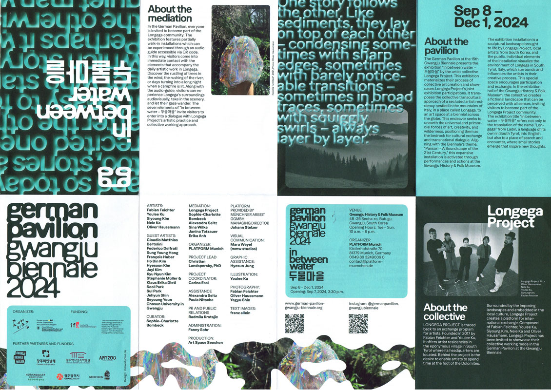
Titel
-
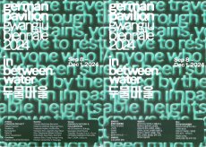
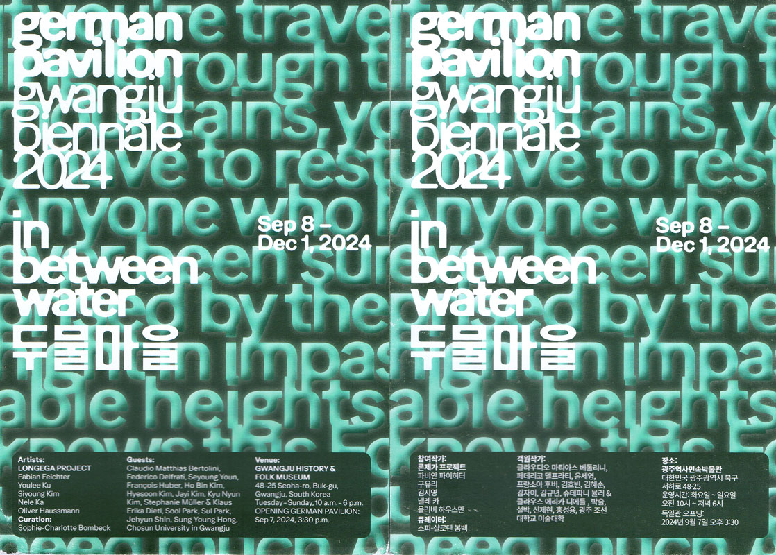
German Pavilion Gwangju Biennale 2024 - in between water
Technische
Angaben
-
[16] S., 14,8x10,5 cm, 3 Teile. keine weiteren Angaben vorhanden
Flyer, mehrfach gefaltet, 2 Karten, Englisch und Koreanisch
ZusatzInfos
-
Gwangju Biennale in Südkorea 08.08.-01.12.2024.
Da Kunst als dynamischer Austausch verstanden wird, der durch kontinuierliche Transformation und Interaktion gekennzeichnet ist, liegt der Fokus auf den kollaborativen und kommunikativen Prozessen des Schaffens im weiteren Sinne.
Die Idee des Pavillons „in between water - 두물마을“ ist es, konventionelle Ansätze der Kunstproduktion und ihrer Präsentationsformen zu überdenken. Da Kunst als dynamischer Austausch verstanden wird, der durch kontinuierliche Transformation und Interaktion gekennzeichnet ist, liegt der Schwerpunkt auf den kollaborativen und kommunikativen Prozessen des Schaffens im weiteren Sinne. Durch die Schaffung eines gemeinsamen Raumes durch die Einladung von Gastkünstlern und die Zusammenarbeit mit der lokalen Kunstszene in Gwangju initiiert das Longega-Projekt (Fabian Feichter, Youlee Ku, Siyoung Kim, Nele Ka und Oliver Haussmann) im Deutschen Pavillon einen transnationalen Dialog. Durch künstlerische Forschung und ästhetisches Denken werden Formen politischer und sozialer Verantwortung ausgelotet, Grenzen zwischen Kunst und Alltag verwischt und soziale wie erkenntnistheoretische Potenziale der Kunst genutzt. Kollaboration und Austausch spielen dabei eine entscheidende Rolle, denn künstlerische Praxis ist keine isolierte Tätigkeit, sondern in soziale und kommunikative Netzwerke eingebettet. Das Verständnis von Kunst als Prozess rückt den Wert des Experimentierens und Erforschens, des Unbekannten und des Unfertigen in den Vordergrund. Die Gwangju-Biennale mit ihrem Thema „Pansori - Eine Klanglandschaft des 21. Jahrhunderts“ bietet einen geeigneten Rahmen, um einen solchen Raum der Erkundung zu schaffen.
Text von der Webseite, übersetzt mit DeepL
|
Titel
-
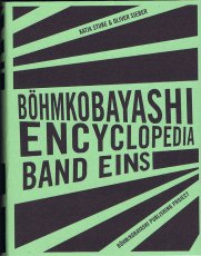
The BöhmKobayashi Encyclopedia Band Eins
Technische
Angaben
-
288 S., 15x11 cm, Auflage: 150, keine weiteren Angaben vorhanden
Broschur, Klappumschlag
ZusatzInfos
-
“Böhmkobayashi Encyclopedia” is an almanac covering the A to Z of Boehm/Kobayashi, from the projects they’ve done, places they’ve been, artists they’re connected to, books they’ve read and more. Entries appear in German or in the language in which they originated, including English, Japanese and French.
Text von der Webseite.
|
Technische
Angaben
-
[28] S., 33x23 cm, Auflage: 50, numeriert, signiert, keine weiteren Angaben vorhanden
geklammerte Einzelblätter in Umschlag Digitaldruck, verschiedene Drucktechniken auf verschiedene Materialien: Papiere, Collage, Malerei
ZusatzInfos
-
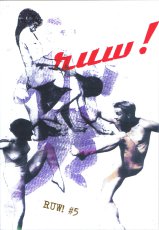
A magazine which consist of only handmade prints. RUW! is the combination of the word ‘raw’ , as in the American magazine ‘RAW’, founded in the 80’s by Art Spiegelman and Francoise Mouly and the German word ‘rau, pronounced as the Dutch word ‘ruw’. It emphasizes madness as the madness in ‘Tales of ordinary Madness’ by Charles Bukowski.
Text von der Website.
|
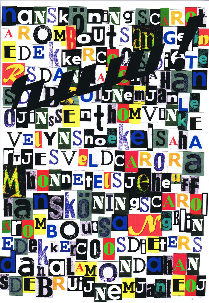
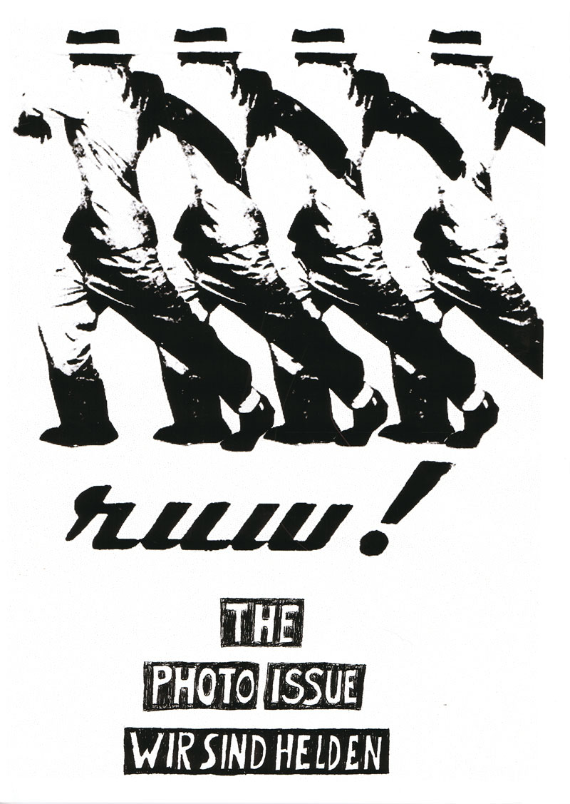
Titel
-
Dutch Issue of RUW! 03 - The Photo Issue - Wir sind Helden
Technische
Angaben
-
[28] S., 33x23 cm, Auflage: 50, numeriert, signiert, keine weiteren Angaben vorhanden
geklammerte Einzelblätter in Umschlag, digitale Fotodrucke auf verschiedenen Papieren, beigelegt ein Anschreiben von Hans Könings
ZusatzInfos
-
A magazine which consist of only handmade prints. RUW! is the combination of the word ‘raw’ , as in the American magazine ‘RAW’, founded in the 80’s by Art Spiegelman and Francoise Mouly and the German word ‘rau, pronounced as the Dutch word ‘ruw’. It emphasizes madness as the madness in ‘Tales of ordinary Madness’ by Charles Bukowski.
Text von der Website.
|
Titel
-
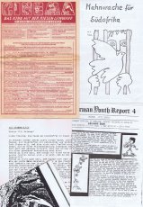
Diverse Faltblätter und Flyer (Punksammlung)
Technische
Angaben
-
29,7x21 cm, 5 Teile. keine weiteren Angaben vorhanden
5 Faltblätter bzw Broschüren auf unterschiedlichem Papier, Din A5 geschlossenes Format
ZusatzInfos
-
Mahnwache für Südafrika, German Youth Report 4 (deutsches Fanzine in englischer Sprache), Tausend Jahre - 55 Millionen, Die großen Alten - Aktion 13. Oktober, Cinema Programmkino (Programm Nov.-Dez. 84)
|
Technische
Angaben
-
90 S., 24,5x21,4 cm, ISBN/ISSN 8478220607
Broschur, 56 Farbabbildungen
ZusatzInfos
-
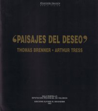
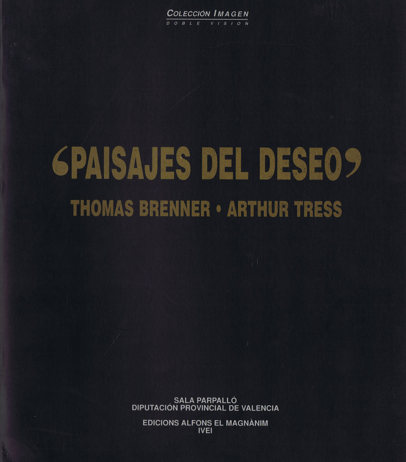
Der Katalog mit dem Titel Wüstenlandschaften zeigt Arbeiten des Fotokünstlers Thomas Brenner (geb. 1961 in Wiedenbrück) und Arthur Tress (geb. 1940 in New York) aus den 80er und 90er Jahren. Opulent, starr, verstörend und dennoch nah an der Wirklichkeit - durch Verdichtung und die Kunst der Bildsprache, die ihre Inspiration an den Orten findet, an denen die Werke in Szene gesetzt werden.
Es ist der Katalog Nummer 20 aus der in Valenzia beheimateten Sammlung Colección Imagen, Sala Parpalló Valencia Colección Imagen.
Mit den beiden Fotokünstlern öffnet die Fotosammlung eine neue Sparte namens Doble Visión.
|
Technische
Angaben
-
[44] S., 21x10 cm, keine weiteren Angaben vorhanden
Drahtheftung
|
Technische
Angaben
-
[72] S., 30x22 cm, signiert, ISBN/ISSN 9782350461977
Fadenheftung, Klappumschlag, mit Widmung
ZusatzInfos
-
Teufelsberg (mountain devil), is an artificial hill located southwest of Berlin, overlooking the city. Amusement park very popular with young Berliners, this hill was built after the Second World War with the remnants of the city after the Allied bombing. An estimated 30 million cubic meters of rubble piled mass there, the equivalent of 400,000 buildings. The hill rises on the site of the University of Nazi war which had been designed by the architect of the Third Reich, Albert Speer, and half done. As after the war, it was difficult to totally destroy the building riddled with underground bunkers, the German authorities decided to bury him and make him disappear under an artificial hill. The hill was then covered with trees, and used during the winter ski run in the 60s and 70s. During the Cold War, was built at the top center of U.S. espionage radar to listen to communications of the Soviet bloc in East Berlin.
Text von der Webseite
|
Technische
Angaben
-
[20] S., 29,7x21 cm, 2 Stück. keine weiteren Angaben vorhanden
Drahtheftung
ZusatzInfos
-
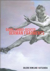
Publikation zur Ausstellung "German Fragments" von Daniel Sambo-Richter, 31.05.-06.09.2008, in der Galerie Rowland Kutschera.
|
Titel
-
Dutch Issue of RUW! 04 - Contorted
Technische
Angaben
-
[32] S., 33x23 cm, Auflage: 50, numeriert, signiert, keine weiteren Angaben vorhanden
geklammerte Einzelblätter in Umschlag, digitale Fotodrucke auf verschiedenen Papieren, beigelegt ein Anschreiben von Hans Könings
ZusatzInfos
-
A magazine which consist of only handmade prints. RUW! is the combination of the word ‘raw’ , as in the American magazine ‘RAW’, founded in the 80’s by Art Spiegelman and Francoise Mouly and the German word ‘rau, pronounced as the Dutch word ‘ruw’. It emphasizes madness as the madness in ‘Tales of ordinary Madness’ by Charles Bukowski.
Text von der Website.
|
Titel
-
Dutch Issue of RUW! 05 - MUD
Technische
Angaben
-
[30] S., 33x23 cm, Auflage: 50, numeriert, signiert, keine weiteren Angaben vorhanden
geklammerte Einzelblätter in Umschlag, digitale Fotodrucke auf verschiedenen Papieren; Zeichnungen, Gemaltes, Geschriebenes, Collagen, C/Prints, Linoldruck, Kugelschreiber, und andere Techniken auf Fotokarton, handgeschöpftem- und anderem Papier.
ZusatzInfos
-
A magazine which consist of only handmade prints. RUW! is the combination of the word ‘raw’ , as in the American magazine ‘RAW’, founded in the 80’s by Art Spiegelman and Francoise Mouly and the German word ‘rau, pronounced as the Dutch word ‘ruw’. It emphasizes madness as the madness in ‘Tales of ordinary Madness’ by Charles Bukowski.
Text von der Website.
|
Technische
Angaben
-
[8] S., 21x14,8 cm, numeriert, keine weiteren Angaben vorhanden
Blätter lose ineinander gelegt, Schwarz-weiß Kopien
|
Titel
-
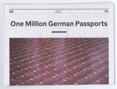
One Million German Passports
Technische
Angaben
-
24 S., 46,8x31,5 cm, 2 Stück. ISBN/ISSN 9783981924077
Blätter lose ineinander gelegt
ZusatzInfos
-
Begleitpublikation zur Installation in der Rotunde der Pinakothek der Moderne in München, 29.03.-27.08. 2023
Am 28. März wurde „One Million German Passports“, eine Installation des Künstlers Alfredo Jaar in der Rotunde der Pinakothek der Moderne eröffnet. Eine Million deutsche Pässe sind hier dicht an dicht zu einem Kubus von 6m x 6m x 80cm gestapelt, hinter einer gläsernen Hochsicherheitswand zu sehen. Die Zahl referiert, laut Alfredo Jaar, auf die Zahl der Menschen, die die ehemalige Bundeskanzlerin Angela Merkel 2015 in Deutschland willkommen hieß. Sie soll aber auch an die Zahl der Menschen erinnern, die sich später von ihr und ihrer Partei, der CDU, distanzierten und 2017 die rechtsextreme Partei AfD wählten. Alfredo Jaar bezieht sich in diesem polarisierenden Werk über die Situation in Deutschland und Europa hinaus auch ganz allgemein auf die globale Migration und berührt damit grundsätzliche Fragen zu Flucht, Einwanderung und Staatsbürger:innenschaft.
Eine solch politisch und gesellschaftlich herausforderndes Werk kann als engagierte Concept Art verstanden werden und erfordert in seiner minimalistischen Ästhetik nach einer Kontextualisierung. Dazu veröffentlicht das Architekturmuseum der TUM eine 20 Seiten starke Zeitung mit 15 Beiträgen von internationalen Expert:innen, Wissenschaftler:innen und Schriftsteller:innen
Text von der Webseite
|
Titel
-
Hundred Best Arabic Posters Competition Round 4
Technische
Angaben
-
148 S., 29,7x21,5 cm, Auflage: 1.000, ISBN/ISSN 9783000745294
Fadenheftung mit offenem Rücken, Hartpappe, Lesebändchen, Schutzumschlag aus gefaltetem Plakat; verschiedene Papiere
ZusatzInfos
-
Die Hundred Best Arabic Posters Competition ist ein internationaler Designwettbewerb der von der German University of Cairo initiiert wurde. Dieser Katalog versammelt die 100 Besten Plakate des Jahrgangs 2023.
|
Titel
-
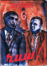
Dutch Issue of RUW! 06 - Spleen
Technische
Angaben
-
[36] S., 31,22,4 cm, Auflage: 50, numeriert, signiert, keine weiteren Angaben vorhanden
geklammerte Einzelblätter in Umschlag, digitale Fotodrucke auf verschiedenen Papieren; Zeichnungen, Gemaltes, Geschriebenes, Collagen, C/Prints, Linoldruck, Kugelschreiber, und andere Techniken auf Fotokarton, handgeschöpftem - und anderem Papier.
ZusatzInfos
-
A magazine which consist of only handmade prints. RUW! is the combination of the word ‘raw’ , as in the American magazine ‘RAW’, founded in the 80’s by Art Spiegelman and Francoise Mouly and the German word ‘rau, pronounced as the Dutch word ‘ruw’. It emphasizes madness as the madness in ‘Tales of ordinary Madness’ by Charles Bukowski.
Text von der Website.
|
Titel
-
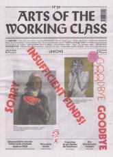
Arts of the Working Class No. 29 - Unions
Technische
Angaben
-
56 S., 35,2x25,8 cm, keine weiteren Angaben vorhanden
Lose ineinander gelegte Blätter, Druck auf Zeitungspapier.
ZusatzInfos
-
„Arts of the Working Class“ ist eine Straßenzeitung für Armut, Reichtum und Kunst. Sie erscheint alle zwei Monate und enthält Beiträge von Künstlern und Denkern aus verschiedenen Feldern und in verschiedenen Sprachen. Sie richtet sich an die Arbeiterklasse, also an alle, und es geht um alles, das allen gehört. Jeder, der sie verkauft, verdient mit. Jeder Künstler, dessen Arbeit beworben wird, gestaltet mit.Hierbei handelt es sich um die Ausgabe November 2023 die in Zusammenarbeit mit dem Kunstmuseum Stuttgart entstanden ist.
This issue was created in collaboration with the Kunstmuseum Stuttgart, in particular with Anne Vieth, who was the museum's curator until July 2023. In the context of a world whose lines of conflict are overwhelming and complex, she conceived an exhibition that looks back on the “categorization mania” of the Weimar Period (1918-1933), in which German society was searching for new coordinates for orientation. Thus, as an aide mémoire, this issue features images of this exhibition, featuring “workers” seen from the perspective of the “New Objectivity” movement, and it poses the question of which images of workers dominate our imagination today.
Englischer Text von der Webseite.
|
Technische
Angaben
-
144 S., 23,8x17,2 cm, ISBN/ISSN 9783868284096
Fadenheftung, Hardcover
ZusatzInfos
-
Dieses Buch, das erste über die weißrussische junge Fotografenszene überhaupt, wurde von Andrei Liankevich initiiert und vom Goethe-Institut Minsk unterstützt. Die Einzelaufnahmen und Werkgruppen wurden aus einer Vielzahl von Einreichungen ausgewählt; sie bewegen sich zwischen klassischem Schwarzweiß-Porträt und grellem Photoshop-Experiment. Der Mensch steht auch hier im Mittelpunkt des künstlerischen Interesses: Er taucht in den unterschiedlichsten Alltagssituationen auf, in der Freizeit beim Sonnenbad am Stadtstrand, bei der Frühstückspause in einer Busstation oder als stolzer Kriegsveteran. Es ist vielmehr eine zeitlos-zeitgenössische als eine repräsentative Schilderung der dortigen Lebenswirklichkeit, mal dokumentarisch, mal in ironischer Brechung. Der zweite Weltkrieg und der Sieg über die deutschenBesatzer bleiben bis heute ein wichtiges "offizielles" Thema für die weißrussische Gesellschaft, was wiederum von der alternativen Kunstszene visuell kommentiert wird. Doch kaum eines dieser Bilder ist bisher veröffentlicht oder ausgestellt worden.
Text von der Website übernehmen.
|