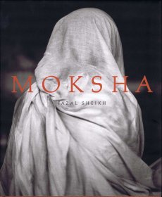
Katalog anlässlich der gleichnamigen Ausstellung im Museion Bozen, 18.09.2015 – 06.01.2016, kuratiert von Andreas Hapkemeyer.
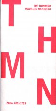
Maurizio Nannuccis Projekt „Top Hundred“ stellt einhundert Werke vor: Multiples, Editionen, Künstlerbücher, Schallplatten, Videos, Zeitschriften, Dokumente und Ephemera von 100 bedeutenden Vertreterinnen und Vertretern der internationalen Kunstszene. Die Arbeiten entstanden in den vergangenen 50 Jahren und stammen aus der Sammlung Zona Archives (Florenz), die der Künstler 1967 gegründet hat. „Top Hundred“ ist wie ein querschnittartiger Parcours angelegt, in dem sich biografisch beeinflusste Rechercheansätze Nannuccis und zeitgleich entwickelte Verfahren anderer Künstler überschneiden. „Top Hundred“ setzt sich mit dem Prinzip der Reproduzierbarkeit von Kunstwerken auseinander, die auf Aura und Einmaligkeit verzichten und auf eine breite und demokratische Verteilung zielen. Die Ausstellung zeigt Werke der Konkreten Dichtung, der Fluxus-Bewegung sowie der Konzeptkunst und umfasst dabei die unterschiedlichsten multimedialen Experimente bis hin zu aktuellen Positionen, die seit der Jahrtausendwende entstanden sind.
Damit wird „Top Hundred“ zu einem umfassenden Kompendium der Kunst der vergangenen 50 Jahre, das die innovative Radikalität und Originalität der vielfältigen Ausdrucksformen aus diesem Zeitraum eindrucksvoll dokumentiert. Für die Präsentation in den Räumen der Studiensammlung des Museion hat Maurizio Nannucci ein außergewöhnliches Ambiente geschaffen, in das raumbezogene Neon-, Sound- und Video-Installationen anderer Künstler integriert sind. „Top Hundred” ist eine Kooperation mit dem Museo Marino Marini in Florenz, das diese Ausstellung Anfang 2016 im eigenen Haus zeigen wird.
Text von der Webseite
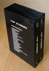
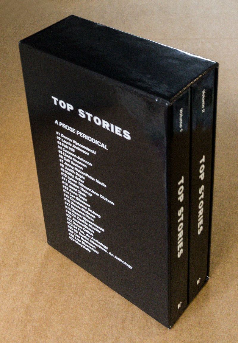
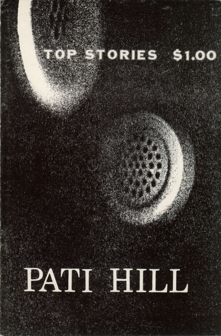
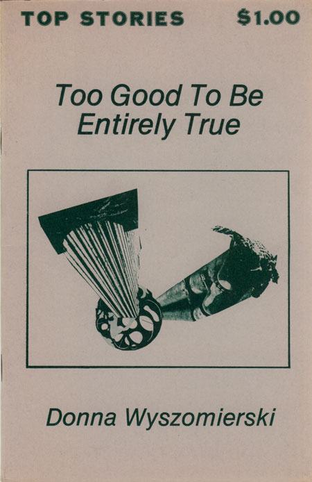
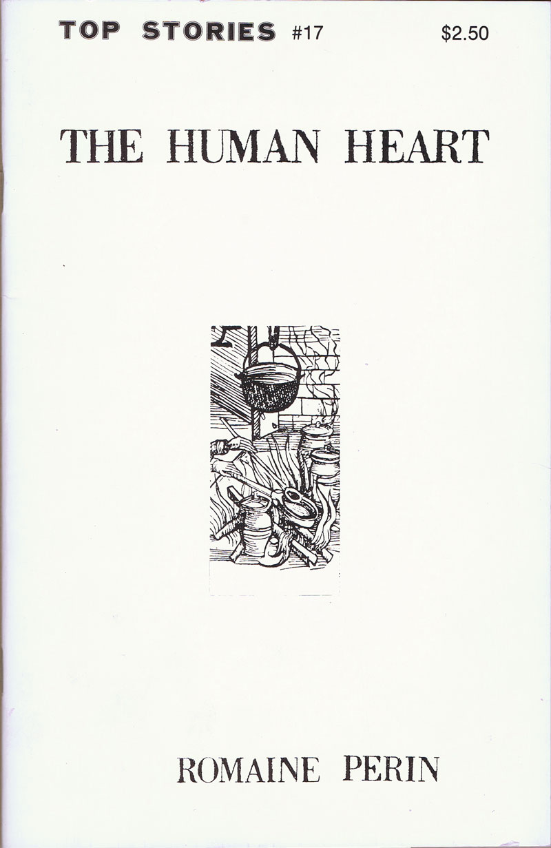
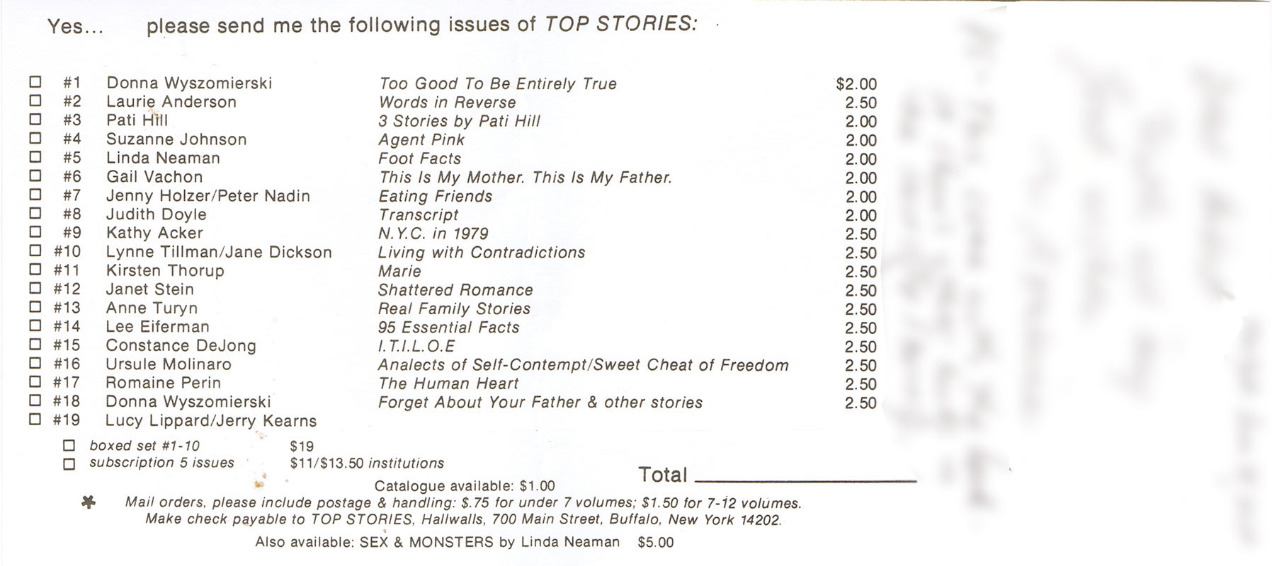
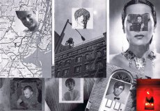
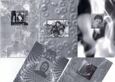
Hierbei handelt es sich um die Anthologie der TopStories, eine Zeitschrift die von 1978-1991 von Anne Turyn herausgegeben wurde. Die Zeitschrift war darauf ausgerichtet experimentelle Belletristik und Kunst von hauptsächlich weiblichen Künstlerinnen zu veröffentlichen. Insgesamt gab es 29 Ausgaben die hier in zwei Bänden gesammelt präsentiert werden.
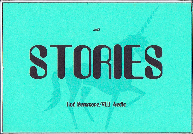
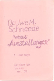
1 S., 29,7x21 cm, keine weiteren Angaben vorhanden Laserausdruck nach Webseite
ZusatzInfos
Zur Ausstellung 20.05.–23.08.2015
Gezeigt werden unter anderem Bücher von Thomas Bayrle und Bernhard Jäger, Max Ernst, Roy Lichtenstein, Adrian Frutiger und Robert Indiana, Werke der Konkreten Poesie von Eugen Gomringer und Gerhard Rühm und Plakate von Günther Kieser und Hans Hillmann
Die Publikation Old Habits Die Hard umfasst einen Großteil der zwischen 2013 und 2020 entstandenen künstlerischen Arbeiten Felix Burgers:
raumgreifende Settings, bühnenhafte Arrangements und Filme. Beigefügt ist eine Sammlung von Texten in Form von Interviews, die seine Arbeitsweise, gedankliche Einzugsgebiete und persönliche Konfliktbereiche zum Gegenstand haben.
The publication Old Habits Die Hard incorporates a majority of the artistic works created by Felix Burger between 2013 and 2020: space-consuming settings, stage-like arrangements and films. Accompanying this is a series of texts in form of interviews focussing on his working methods, conceptual spheres of influence, and personal areas of conflict.
Text von der Verlagsseite
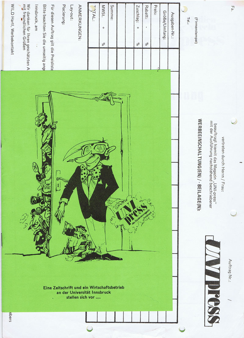
Einladung zur Eröffnung der Ausstellung Top Hundred - Maurizio Nannucci am 17.09.2015 im Museion Bozen. Kuratiert von Andreas Hapkemeyer. Ausstellung vom 18.09.2015–07.01.2016.
Maurizio Nannuccis Projekt Top Hundred stellt einhundert Werke vor: Multiples, Editionen, Künstlerbücher, Schallplatten, Videos, Zeitschriften, Dokumente und Ephemera von 100 bedeutenden Vertreterinnen und Vertretern der internationalen Kunstszene. Die Arbeiten entstanden in den vergangenen 50 Jahren und stammen aus der Sammlung Zona Archives (Florenz), die der Künstler 1967 gegründet hat. „Top Hundred“ ist wie ein querschnittartiger Parcours angelegt, in dem sich biografisch beeinflusste Rechercheansätze Nannuccis und zeitgleich entwickelte Verfahren anderer Künstler überschneiden.
Text von der Webseite
Motive einzelner Wettbewerb-Teilnehmer.
Graphic Stories Cyprus lädt alle kreativen Menschen ein, am internationalen Plakatwettbewerb mit dem Titel "Writing, the origins of Civilisation" teilzunehmen und ihre Arbeit in Form einer eigenen Postkarte drucken zu lassen. Der internationale Wettbewerb ist Teil der 4. Konferenz für Grafikdesign und visuelle Kommunikation in Zypern, die vom 9.-11.03.2018 stattfand.
" Writing, the origin of Civilization " ist das Thema des 2. internationalen Plakatwettbewerbs von Graphic Stories Cyprus. Der Wettbewerb wurde von 700 Designern aus 31 Ländern besucht.
Graphic Stories Cyprus ist eine Non-Profit-Organisation, die seit 2015 die jährliche Konferenz für Grafikdesign und visuelle Kommunikation in Zypern unter demselben Namen veranstaltet. Ihr Ziel ist es, das Bewusstsein für die zyprische visuelle Kunst im In- und Ausland zu fördern und die Vernetzung mit kulturellen Institutionen, Organisationen und zeitgenössischen Kunstgruppen auf internationaler Ebene zu unterstützen. Sie ist eine Gelegenheit zur jährlichen Begegnung und Interaktion zwischen Designern in Zypern und im Ausland sowie ein Maßstab für den Bereich der optischen Kommunikation in Zypern und in der weiteren Region des östlichen Mittelmeerraums. Sie zielt auch darauf ab, die visuelle Kompetenz und die Entwicklung des kritischen Denkens in Bezug auf die zeitgenössische bildende Kunst und die Themen, die sie betreffen, sowohl auf lokaler als auch auf internationaler Ebene zu fördern.
Text von den Postkarten
About the series:
The For Everard zine series chronicles the 1977 fire at New York's Everard Baths, combining archival research with imagined narratives to re-focus attention to obscured histories. The series explores the media coverage of the subsequent investigation of the fire, and the lives of the nine men who perished. The zines bring together photographic images with primary news sources, as well as personal anecdotes collected from eyewitness testimonials.
About the individual zines:
For Everard, Vol. 1, 2013, ed. 100 (nr. 65)
This zine chronicles the May 25, 1977 fire at New York's Everard Baths and the media coverage of the subsequent investigation.
For Everard, Vol. 2 (Bloodbrothers), 2013, ed. 100 (Nr. 81)
In the second volume of his series chronicling the 1977 fire at New York’s Everard Baths, Anthony Malone focuses on Bellevue Hospital’s blood drive for the victims of the great bathhouse tragedy. Malone draws parallels between the 1977 restrictions placed on gay men for donating blood to their “brothers” and current FDA guidelines that indefinitely defer donations from men who have had sex with men since 1977. This black and white photocopied zine (ed 100) juxtaposes archival images, news clippings, and just a touch of fantasy.
For Everard, Vol. 3 (Remembering Jimmy), 2015, ed. 100 (Nr. 94)
Volume 3 of the series, For Everard is dedicated to the memory of Jimmy Stuard, who died in the tragic fire at the Everard Baths in 1977. Stuard was a rising star in the disco music scene. He spun records first at Boston’s 1270 Club, and later at New York’s 12 West, where he inspired an entire generation of musical artists and DJs. In this particular volume, Anthony Malone assembles images and archival texts that serve as a tribute to the great Jimmy Stuard.
For Everard, Vol. 4 (A Lovely Show), 2016, ed. 100 (Nr. 62)
For Everard, Vol. 4 (A Lovely Show) is a tribute to Kenneth Hill, one of the nine men who died in the devastating fire at the Everard Baths in 1977. Kenn played a vital role in the East Village/Lower East side countercultural movement in the late ‘60s and 1970s. He was a hippie, a bar tender at Phebe’s (a watering hole and salon for the experimental theater community in the 1970s), one of the founders of the Old Reliable Theatre Tavern, House Manager at La Mama Experimental Theatre Club, and a photographer. This zine celebrates Kenneth Hill by collaging archival documents with personal artifacts and pictures of Kenn from meaningful moments in his life.
For Everard, Vol. 5 (A Dearly Loved Man), 2017, ed. 100 (Nr. 95)
For Everard, Vol. 5 (A Dearly Loved Man) assembles images and stories from the life of Ira Landau, a gifted and dedicated teacher who died in the tragic fire at the Everard Baths in 1977. Ira left behind a devoted family (his mother, brother, niece, and lover) and is still greatly missed by his loved ones. This zine is a tribute to the life and accomplishments of a remarkable man who served in the Peace Corps and committed himself to educating young minds both abroad (in the Middle East) and at home in the US. It contains family photos and personal images generously contributed by Ira’s niece.
For Everard, Vol. 6 (Yosef’s Song), 2017, ed. 100 (Nr. 94)
Volume 6 of the series For Everard celebrates the life of a remarkable musical prodigy, Yosef Synovec. This zine tells the story of a young man with great aspirations who emigrated to the United States from Czechoslovakia to study classical violin. In 1976, Holly Woodlawn overheard Synovec vocalizing as he was painting the bathroom of his East Village apartment, and determined on the spot that she had discovered an emerging star. As a singer, Synovec used his extreme vocal range to imitate the voice and persona of Peruvian diva Yma Sumac. He performed Sumac’s exotic musical numbers at several New York City cabarets and show venues. Sadly, on May 25, 1977, Yosef perished in the tragic fire at the Everard Baths.
For Everard, Vol. 7 (Tony from the Bronx), 2017, ed. 100 (Nr. 86)
This zine brings together images and stories from the life of Tony Calarco, one of the nine men who died in the fire at the Everard Baths in 1977. Tony was only 26 when he died. He lived with his parents and siblings in a modest house in the Bronx. He had recently graduated from college and was working as a social worker in New York city at the time of his death. Tony had aspirations to become a lawyer and was scheduled to begin law school in September of 1977. This zine celebrates Tony Calarco’s memory through photos of Tony, artifacts from his high school and college years, and recent photographs of his home and final resting place.
For Everard, Vol. 8 (Looking for Amado), 2017, ed. 100 (Nr.84)
Amado Alamo, a young man only 17 years old, lost his life in the fire at the Everard Baths in 1977. In Volume 8 of For Everard, Anthony Malone documents his search for the identity of the youngest victim of the Everard fire. The zine is an abstracted portrait of Alamo that assembles the few extant fragments of his story culled from newspaper articles and documentary sources glued together with the artist’s imagination.
For Everard, Vol. 9 (Last Call), 2017, ed. 100 (Nr.72)
Life was difficult for Hillman Wesley Adams. He was born in Jacksonville FL in 1938. His mother died just a few months after his birth, and by the age of nine, he found himself in an orphanage with his older brother. Fast forward 30 years: Hillman moved to NYC, struggled to make ends meet while working on and off as a bartender, and he met his lover, Ralph, with whom he shared a modest apartment in New Jersey. On May 25, 1977, Hillman died in the fire at the Everard Baths. Vol. 9 of For Everard is an assemblage of newspaper articles and vintage photos chronicling the life and untimely death of Hillman Wesley Adams.
For Everard, Vol. 10 (In Memoriam: Patrick Nott), 2018, ed. 100 (Nr. 64)
Volume 10 of For Everard memorializes the life of Patrick Nott, one of the nine men who died in the fire at the Everard Baths. Nott, a native of Wales with a passion for theater, literature, and music, pursued a successful career in hairdressing. He fell in love with his pen pal (a young woman from Brooklyn) and after their marriage, they moved to New York City, where Nott worked at the Vidal Sassoon Salon. This zine weaves together elements from his story (shared with the artist by Patrick Nott’s wife), with photographs, newspaper clippings, and artifacts. It acts as a humble tribute, an “In Memoriam” for this greatly loved man.
For Everard, Vol. 11 (Thunderbird), 2019, ed. 100 (Nr. 79)
Brian Duffy was an aspiring artist. In 1966 he was accepted to Pratt Institute of Art and although he declined admission to the school, he seized the opportunity to move to NYC and start a new life for himself. In the city, he worked hard at various retail jobs and tried to break into the theater, but everything changed when he met the love of his life, Bradley. The couple moved to a “quieter life” in Boston. They worked in restaurants in the Back Bay area and created a community for themselves amongst their chosen family of friends. Volume 11 of For Everard celebrates the brief life of Brian Duffy, a young man who died in the fire at the Everard Baths in 1977. This zine compiles photographs and stories shared with Malone by Brian’s sister and dear friend.
The pseudonym "Anthony Malone" comes from a novel by Andrew Holleran (Dancer from the Dance). In this novel, Malone is the protagonist and at the end he disappears. Some of his friends believe that he may have committed suicide, others feel that he may have run away from New York, while some say that they saw him at the Everard Baths on the night of the fire. I imagine that Malone survived the fire and he is now making books and zines telling the story of the tragedy.
42 S., 15x15 cm, keine weiteren Angaben vorhanden Drahtheftung
ZusatzInfos
u. a. mit TAM TAM meets Kitchen Stories, in der Fabrica de Pensula, 21.9.2013:
Kitchen Stories ist eine von der Künstlergruppe Mixer initiierte Veranstaltungsreihe, die von der Fabrica de Pensule gefördert wird. Im Zentrum steht das gemeinsame Kochen als Prozess und Kommunikationsmedium. In einer Spezialausgabe treffen die Kitchen Stories auf die Künstler der Gruppe TAM TAM, die mit einer interaktiven audio-visuellen Installation einen außergewöhnlichen Rahmen für die Kitchen Stories kreieren. Das Kochen wird verlegt, jenseits des eigentlich dafür angelegten Ortes. Geräusche, Bilder und Formen, die der Kochprozess erzeugt, werden in abstrakter Form in der Installation reflektiert. Die Zuschauer sind eingeladen, selbst mitzumachen, mit der Installation beim Kochen zu experimentieren, neue Klänge und Bilder zu schaffen und letztlich auch das kulinarische Endprodukt zu genießen.
TAM TAM und Mixer laden Sie auf eine Entdeckungsreise ein. Sehen Sie selbst, wie Nahrung unsere Bilder, Kochen den Klang und Essen die Seele beeinflusst.
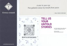
Verschiedene Materialien, die mit den verschiedenen Socialmediaaccounts und Websitenamen bedruckt sind. Bei Untold Stories handelt es sich um eine Gruppe junger Menschen, die zum kreativen Schreiben in der englischen Sprache treffen.
During a two-week residency at the Guesthouse in Cork in August 2011, we created Paper’s first hard-copy edition. We have since published four city-specific hard copy editions to date, focusing on Limerick, Cork, and Dublin. The Dublin edition was launched in June, 2013 at the Joinery, Stoneybatter, Dublin 7.
Text von der Webseite
[52] S., 13,5x9,5 cm, Auflage: 300, ISBN/ISSN 09620672 Drahtheftung, Rückseite mit Metallfolienprägung, in transparenter Kunststoffhülle mit beigelegtem Blatt, Aufkleber
ZusatzInfos
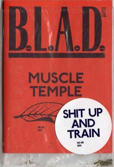
Devoted to body and muscles, this issue of BLAD will explore the fascinating world of bodybuilding. Pictures, articles, ads and other good stuff about a strong and perfect body filled with rock-hard muscles. "Imagine walking through your local beach or neighborhood swimming area… Friends noticing your titanic legs, your manly shoulder, rock hard stomach muscles, and last but not least, your full high-peaked biceps that attract second glances from all." With other words, this issue is for strong and heavy readers!
Text von der Webseite
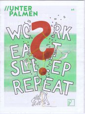
Work. Eat. Sleep. Repeat. Das Mindset heutzutage lautet: Arbeit ist zach, aber sie soll zumindest Spaß machen. Hackln und Chilln ist angesagt - work hard, play hard. Wir wollen versuchen dieses Knäuel wieder zu entwirren: Wie hängen Freizeit und Arbeit zusammen? Wieso arbeiten wir ständig an uns selbst? Was können wir dem entgegen stellen?
Text aus der Zeitung.
Bildmotive: Postapokalyptische geschnitzte und bemalte Krippen in Total- und Detailansichten.
Gestaltung Carsten Wolff, mit einem Text von Thomas Schindler. Fotografen: Anna Atkins, Daoudi Aissa, Carsten Wolff, Harald Fersch.
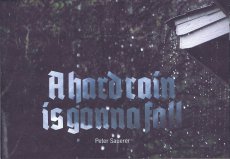
… „Peter Sauerer verändert die Realität, sein Mitteilungsdrang bricht sich in winzigen Dioramen Bahn. Die Neugier am Spiel mit den Darstellungsmöglichkeiten des Apokalyptischen lotet er aus und bleibt dabei aber konventionell. In seiner postapokalyptischen Welt spiegelt sich somit der Zeitgeist, auch der Wissensstand der Zeit(en) und der soziale(n) Verhältnisse, auf welche seine inspirierenden Vorinformationen zurückgehen. Er verarbeitet, was er selektiv in den Medien wahrgenommen hat und was er in sich aufsaugt. Dabei stellt er sein (überhaupt nicht winzig kleines) Licht gerne unter einen Scheffel, lässt sich die Erklärung seiner Kunst nicht einfach entlocken – für ihn gehört zum Verständnis seiner Werke dazu, dass sich Betrachterinnen und Betrachter selbst zurechtfinden. Er legt im übertragenen Sinn die Brotkrumen aus, weist Richtungen und überlässt es dann anderen, daraus eine plausible Erzählung zu entwickeln.“ …
Auszug aus dem Text von Thomas Schindler, Bayerisches Nationalmuseum München
Heft zur Ausstellung "offene Zusammenhänge", bei der Aquarelle des Künstlers Harald Gfader aus seiner Serie "HONIG's offene Zusammenhänge" (2001-2015) gezeigt wurden. Die Ausstellung fand vom 25.02.-26.03.2016 in der Galerie.Z in Hard im Vorarlberg statt.
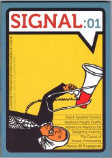
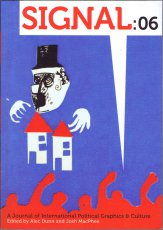
Signal is an ongoing book series dedicated to documenting and sharing compelling graphics, art projects, and cultural movements of international resistance and liberation struggles. Artists and cultural workers have been at the center of upheavals and revolts the world over, from the painters and poets in the Paris Commune to the poster makers and street theatre performers of the recent Occupy movement. Signal will bring these artists and their work to a new audience, digging deep through our common history to unearth their images and stories. Signal 01 includes: The Future of Xicana Printmaking: Alec Dunn and Josh MacPhee interview the Taller Tupac Amaru (Favianna Rodriguez, Melanie Cervantes, and Jesus Barraza), The Adventures of Red Rat: Alec Dunn interviews Johannes van de Weert, Hard Travelin’: A photo essay with IMPEACH, Early 20th-Century Anarchist Imprints, Mexico 68: The Graphic Production of a Movement: Santiago Armengod interviews Felipe Hernandez Moreno, Adventure Playgrounds: A photo essay, Designing Anarchy: Dan Poyner interviews Rufus Segar.
Text von der Website.
96 S., 19x12 cm, ISBN/ISSN 9789086900985 Broschur, von Vitsoe Bookswap München
ZusatzInfos
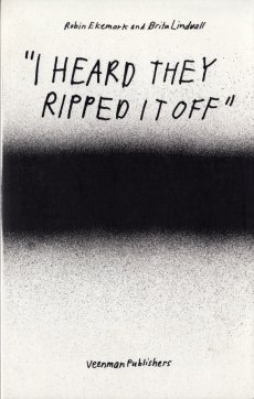
Same story. 43 versions. Each story told from a person close to the source, claiming the absolute truth.
I Heard They Ripped it Off is a volume from the Hard School Books series, investigating what is original vs. copy, surrounding the “what, where and when” of the stories and gossip of the John, Paul, Ringo & George (Beatles) T-shirt that is made by the Experimental Jetset
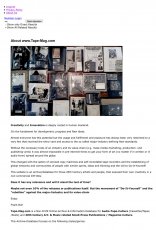
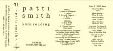
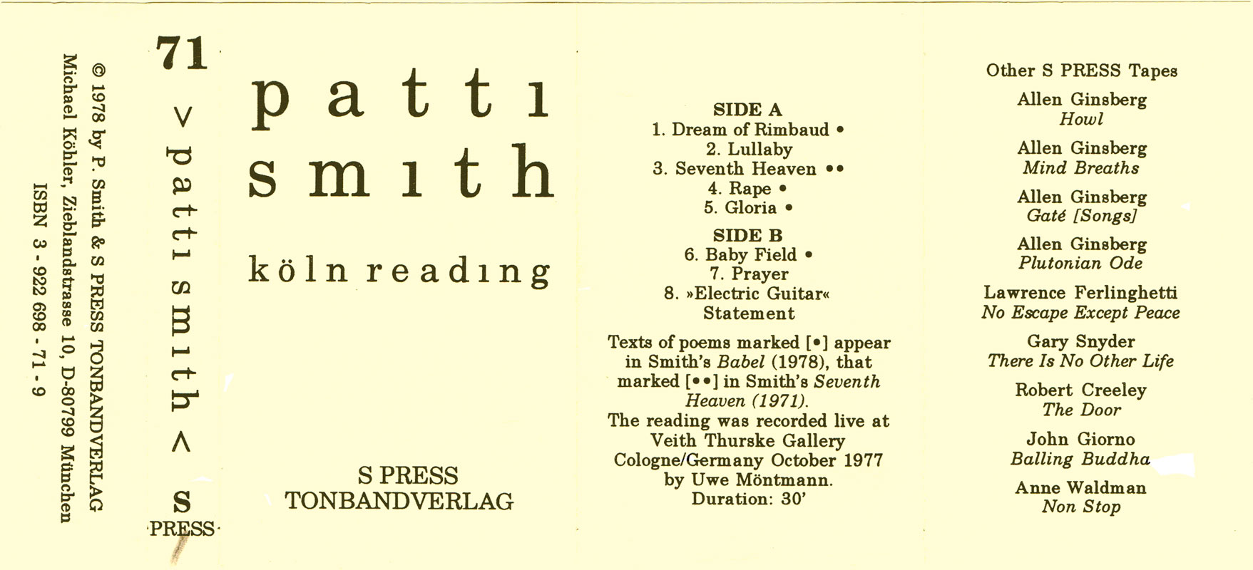
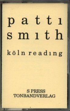
Tape-Mag.com is a Non-Profit Online-Archive & Information-Database for Audio-Tape-Culture (Cassettes/Tapes/Reels) and 20th Century Art- & Music-related Small-Press Publications, Magazine-Culture.
This Archive-Database focuses on the following styles/genres.
- Mid 70's to late 90's Industrial, Experimental, Free Improvisation, Post- Punk, New Wave, Minimal, Synth, Ambient and further musical directions of the DIY-Cassette-Culture.
- early 50's to late 90's Sound Art, Sound Poetry, Text-Sound-Compositions, Poesie Sonore, Verbosonics, Lingual Music, Music Concrete, Audio Art plus related printed Mail Art, Concrete Poetry, Visual Poetry, Lettrisme, Fluxus
Here you are able to browse and research thousands of releases, find further information about the Artists, the Organisations, Press & Label-People behind the scene and/or the published Small Print, Magazines, Information-sheets and Artists-Manifests that all defined a very exciting culture and era. Most of the releases listed here were only released in very limited amount and are hard to find these days but they had without any doubt their important role in the development of contemporary audio & sound-art and music-history. These protagonists of a DIY (Do-It-Yourself)-Culture-Movement in which everybody can be an artist, label, distributor and press-editor or organisation deserves a comprehensive overview in a broader context with all its connections and a framework. With this Database the collected, provided and connected Information can become knowledge. Knowledge that Media in Internet-Age can hardly supply with the current Information Overload.
Text von der Webseite
11,8x18 cm, Auflage: 80, numeriert, keine weiteren Angaben vorhanden Sammelmappe mit 16 Arbeiten, ein Blatt gefaltet, Grafiken in Farbe, Textarbeiten in Schwarz-Weiß
ZusatzInfos
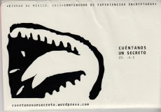
Edition zur gleichnamigen Ausstellung.
Tell me a secret is an sharing secret project between communities. The secrets – written experiences – are graphically depicted by participants during a visual communication workshop. At the end of the workshop participants are invited to anonymously shared their own secrets in order to feed the project flow. As well we collect the secrets within this website. The project considers as secrets both, the written stories and their graphical depiction. Tell me a secret project is an archive as well. The main point of the archive is to preserve the popular storiesof anonymous people.
Text von der Webseite
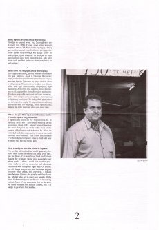
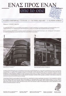
The publication is an attempt to map the local businesses in the area around Victoria Square, and a “meeting point" for the people of the neighborhood where they can narrate their stories. Every issue will host two new stories. Ausgabe vom 21.04.2017
[32] S., 19x13 cm, Auflage: 500, keine weiteren Angaben vorhanden Drahtheftung, Schwarz-Weiss Offsetdruck
ZusatzInfos
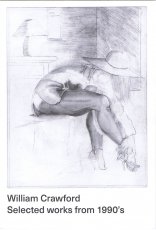
The William Crawford Estate is owned and represented by Ampersand Gallery. William Crawford's drawings were discovered in an abandoned house in Oakland, California. His work brings to mind characteristics of prison drawings, an impression confirmed by the fact that several were made on the backs of prison roster sheets dated 1997. These printouts, however, were cut down the middle, so the exact prison from which they originate is unknown. But given their origin in the Bay Area and the fact that several drawings include San Francisco landmarks, it's possible that Crawford made the work in a California state prison. Other than this information drawn from the archive itself, nothing is known about Crawford's life. Indeed, we only know his name because he signed just a few of the drawings, either as Bill, William or WM Crawford. The archive appears to have consisted of several books, with individual drawings in sequences of 30 or more adding up to tell complex visual stories. Several include written captions or fragments of conversation between male and female characters. These sequences, however, have been broken up over the years and reach us now in a fragmentary and fascinating collection of hundreds of delicate pencil drawings. The work conveys the intense sense of sexual longing of a man with an urge to tell dynamic stories. The drawings, which resemble the eroticism of Eric Stanton, the exaggerated male anatomy of Tom of Finland or the ample breasts of a John Currin, show scantily dressed women, drug use, cuckolding and orgies. The details of his interiors, the hairdos and style of dress suggest that Crawford might have come of age in the late 70s or early 80s. A cast of recurring figures populate the drawings, notably one man with a short afro and a moustache who often figures at the center of events, presumably the artist William Crawford himself. Remarkably, given the number of drawings, there is little to no repetition in the work. Crawford’s inventive eye for sexual positions, facial expressions and gestures of hand and body was vast and masterful. Simple geometric details and architectural subtleties define the unusual settings where the action unfolds. We see rooms shown from unusual angles, features that are hinted at, erased or altogether omitted and articles of clothing that are drawn with obsessive precision. This singular and original drawing style compels us to immerse ourselves in the world William Crawford created, more dream than documentation, more fantasy than perversion. Crawford's drawings have been widely exhibited, notably at Galerie Susanne Zander (Cologne and Berlin), Zieher, Smith and Horton (New York), Freddy (Baltimore) and upcoming solo exhibitions at FARAGO (Los Angeles) and Richardson (New York). His work is also featured in the latest issue of Richardson Magazine and was included in "System and Vision" at David Zwirner, an exhibition organized in collaboration with Delmes & Zander. Reviewing it, The New Yorker wrote, "William Crawford's orgiastic illustrations on the backs of prison rosters haven an erotic intensity that rivals anything by Hans Bellmer or Pierre Klossowski."
Text von der Webseite
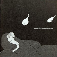
´yesterday, today, tomorrow´ is a collection of visual short stories by the japanese artist Yumiko Hegenbart-Matsui.
Every picture and its title tell different stories about the life of the wobbly headed people
256 S., 23.5x17 cm, ISBN/ISSN 9781999789251 Broschur, Umschlag und Rücken mit Folienblock gedruckt auf Fedrigoni Stucco Acquerello Gesso 240gsm mit fadengehefteter Bindung. Körper gedruckt auf Cyclus Offset 135gsm.
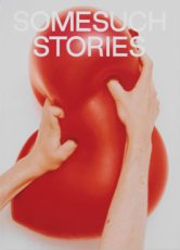
Somesuch Stories ist eine jährlich erscheinende Zeitschrift, die originelle Einblicke in zeitgenössische Erfahrungen mit Kultur, Gesellschaft, Sex und Natur bietet. Das Magazin fördert aufregende internationale Künstler und Autoren.
Anhand von 19 Beiträgen einer elektrisierenden Gruppe von Autoren und Künstlern erforscht diese Ausgabe, wie Spannungen Emotionen auslösen und Handlungen erzwingen, während sie die Menschen zu unvorhersehbaren Ergebnissen treiben - einschließlich des Tragischen, Komischen und Schrecklichen, des Unheilvollen und Explosiven.
Text von der Webseite übersetzt mit DeepL.
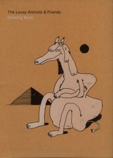
[80] S., 29,7x22 cm, ISBN/ISSN 9783905999136 Rollo Nr. 22, 6. Auflage. Metallspiralbindung, Risographie
ZusatzInfos
Stefan Marx’ coloring book was the first publication ever to be released by Rollo Press in early 2008. Since then, due to popular demand, it has been extended and reprinted using the risograph for five times, adding up to a total print run of 1000 copies. In early 2012, we released this offset version, which features a whole bunch of new animals as well as it marks a step forward in terms of the object, employing a silkscreend hard cover and semi-concealed wire-o binding.
Text von der Webseite
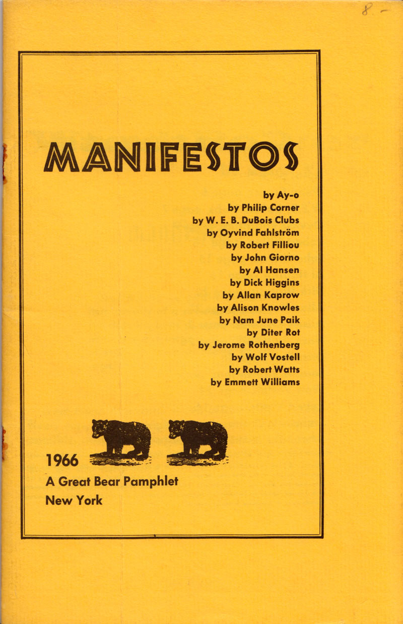
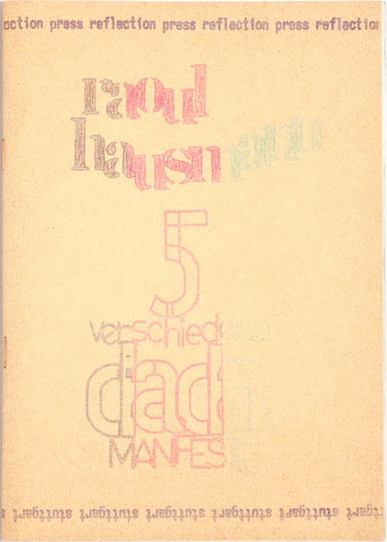
Dick Higgins, Ein Something Else Manifest
Der 1964 von dem Künstler, Verleger und Theoretiker Dick Higgins gegründete Verlag Something Else Press war einer der ersten amerikanischen Verlage, die sich der Veröffentlichung von Künstlerbüchern widmeten. Der Verlag entstand in einer Zeit intensiver Fluxus-Aktivitäten in New York, als Higgins bei John Cage an der New School for Social Research studierte und eng mit dem Fluxus-Aushängeschild George Maciunas zusammenarbeitete.
In Higgins' Press fanden die Leser einen neuen Raum für das, was ihr Gründer als "intermediale" Werke bezeichnete - Werke, die zwischen verschiedenen Medien angesiedelt waren oder diese übersprangen. Konkrete, visuelle und vorgefundene Poesie, Mail Art, Theaterstücke, Gedichte und Opern, bewusstseinsverändernde Verse, die wie ein Gebetbuch gebunden sind, Poesie-Prosa, die auch als "Sciart" bezeichnet wird, und Romane, die "wie ein Kupferstich aussehen". Diese Werke waren ebenso medien-, format- und fächerübergreifend wie ihre Schöpfer (z. B. der Künstler, Schriftsteller, Philosoph und Wissenschaftler Bern Porter). Es waren, in den Worten von Higgins, "Dinge, die einfach nicht in Ordnung waren, die aber, wie mir schien, ihr Publikum brauchten, die in unserer Welt natürlich erschienen".
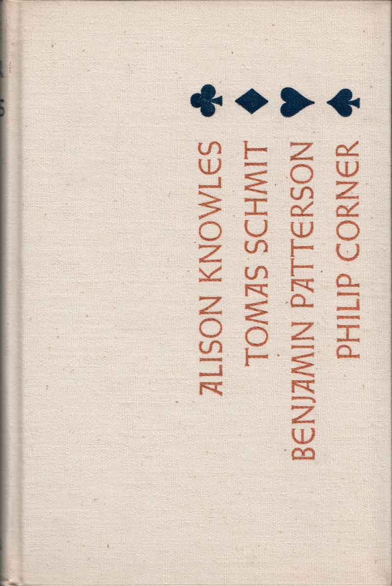
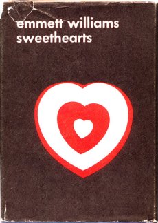
Zu den publizierten Künstlern gehören unter anderem John Giorno, Dick Higgins, Alison Knowles, Jackson Mac Low, Bern Porter, Daniel Spoerri, Gertrude Stein, Emmett Williams.
Die Something Else Press war ein von 1964 bis 1974 ursprünglich in Chelsea (Manhattan), New York beheimateter Avantgarde-Verlag für Künstlerbücher, insbesondere des Fluxus. Verlagsgründer war der Künstler Dick Higgins (1938–1998).
Higgins gründete, nachdem es in dieser Zeit mit dem Fluxus-Gründer George Maciunas wegen Verzögerungen einer Buchpublikation zu einem Bruch gekommen war, den Verlag 1964 und veröffentlichte als erste Publikation einen Band mit eigenen Werken (Jefferson's Birthday und Postface).[1] Der Verlag veröffentlichte viele wichtige Texte und Werke von George Brecht (Grundlagentext zum Zufall in der Kunst von 1957), Robert Filliou, Daniel Spoerri (Topographie des Zufalls, in Übersetzung), Alison Knowles, Emmett Williams sowie Dutzende von Vorreitern und Vertretern der Avantgarde wie Richard Huelsenbeck (Dada Almanach), Gertrude Stein (mit amerikanischen Erstveröffentlichungen), John Cage oder Bern Porter.
Die Something Else Press war einer der ersten Herausgeber in den Vereinigten Staaten von Konkreter Poesie und anderen Werken von Fluxus-Künstlern in den 1960er Jahren, wobei die zusammen mit der Edition Hansjörg Mayer, Stuttgart, 1967 von Emmett Williams veröffentlichte Anthology of Concrete Poetry als eine der ersten Übersichten für diese neue Kunstform auch in Deutschland nachhaltiges Interesse fand.
Das Verlagsprogramm zeigte die enge Verbindung zwischen der europäischen und amerikanischen Fluxus-Bewegung in den frühen Jahren. Higgins prägte Mitte der 1960er Jahre den Begriff „Poetry Intermedia“, der dann im Weiteren als Intermedialität Beachtung fand. Die Kombination von hoher Qualität bei vermarktbaren Formaten für eine größere Verbreitung schuf ein Gegengewicht zu den noch, z. B. von Maciunas und anderen, in Handarbeit hergestellten Künstlerbüchern und Buchobjekten als Original, Unikat oder in Kleinstauflagen. Die Strategie war, Bücher mit progressivem Inhalt jedoch mit konventionellem Aussehen zu veröffentlichen, so dass diese auch in normalen Buchhandlungen platziert werden konnten.
In den späten 1960er Jahren arbeiteten für die Something Else Press Künstler wie Emmett Williams, Chefredakteur für die Jahre 1966 bis 1970, Alison Knowles, der Dichter Larry Freifeld, die irisch-amerikanische Schriftstellerin Mary Flanagan und der Maler Ronnie Landfield.
Der Fluxus-Künstler Ken Friedman fungierte als General Manager für Higgins in New York und Kalifornien in den Jahren 1970 und 1971. Während Higgins Haupteigentümer und Verleger blieb, dienten andere als Herausgeber, einschließlich Emmett Williams und Jan Herman. Herman übernahm die Aufgabe im Jahr 1973 und hatte sie bis zur Aufgabe des Verlages ein Jahr später inne. Ursprünglicher Verlagssitz war Chelsea (Impressum: New York, später auch Middelton), der in den 1970er Jahren in das nördlichere Glover (Vermont) (Impressum: West Glover, später Barton) verlegt wurde.
In dem zehnjährigen Bestehen des Verlages veröffentlichte dieser etwas über 60 Werke und 20 Broschüren der Reihe „Great Bear Pamphlet“, Karten, Poster, Newsletter und Ähnliches, die heute noch in Kunstbuch- oder Fluxus-Ausstellungen gezeigt werden. Die ursprünglich als Künstlerbücher vorwiegend von Privatsammlern beachteten Werke fanden durch Schenkungen Eingang in öffentliche Sammlungen, so dass heute eine kunst-, literatur- und musikwissenschaftliche Erschließung möglich ist.
Text aus Wikipedia
27 Teile. keine weiteren Angaben vorhanden Diverse Andrucke, Plakate und unbeschnittene Papiere, Makulaturen, handbeschriebenes Packpapier
ZusatzInfos
Gefunden auf der documenta 15 Mitte August 2022, Druckerzeugnisse zum Mitnehmen auf Paletten vor der Druckerei.
lumbung Press ist ein Projekt der lumbung member, lumbung-Künstler*innen und des Künstlerischen Teams der documenta fifteen. Im Kern besteht es aus einer kollektiv betriebenen Offsetdruckerei in der documenta Halle, ihren Druckerzeugnissen und den begleitenden Veranstaltungen.Die Idee ist es, einen direkten Fluss von Information durch die unvermittelte Weitergabe von Bildern und Erzählungen zu erzeugen. Die Bearbeitung und Übersetzung außerhalb der Logik der jeweiligen künstlerischen Absicht soll dabei möglichst vermieden werden. lumbung Press startete im Juni 2022 und entwickelt sich im Laufe der documenta fifteen zu einem kollaborativen Raum. ...
Text von der Webseite und soweit die Theorie
Die Ausstellung Druck Druck Druck bringt die Druckwerkstatt in die Galerie und schafft Raum für unabhängige Print-Gemeinschaften aus Berlin und darüber hinaus, 13.04.-14.08.2019. Die interdisziplinäre, multi-formatige Ausstellung erforscht wie Druckmethoden verwendet werden können, um radikale Ziele in der Kunst, der Bildung und der Gemeinschaft zu erreichen, kuratiert von Nina Prader und John Z. Komurki.
Neben u.a. dem Mimeographen, ist der Risograph ein Fokus der Ausstellung und versammelt künstlerische Positionen aus ganz Berlin, die den Risographen verwenden. Die größte Ausstellung zu Kunstwerken, die den Risographen feiern seit dem Risofest Berlin 2017. Eine zunehmend beliebte Methode für das unabhängige, künstlerische Drucken und Verlegen.
Text von der Webseite
AFTER MODERN HISTORY is a report on world events that re-edits the news of the day by linking together images according to a totally idiosyncratic perspective of pattern recognitions and typologies. AFTER MODERN HISTORY lifts photos from daily newspapers and re-organizes disparate, often atomized subjects into newly imagined affinities. For most people caught on the hard end of luck, the newspaper can be a lonely place. But in this second draft of history, bad news is no longer so isolated. There is no dateline
AFTER MODERN HISTORY is a report on world events that re-edits the news of the day by linking together images according to a totally idiosyncratic perspective of pattern recognitions and typologies. AFTER MODERN HISTORY lifts photos from daily newspapers and re-organizes disparate, often atomized subjects into newly imagined affinities. For most people caught on the hard end of luck, the newspaper can be a lonely place. But in this second draft of history, bad news is no longer so isolated. There is no dateline
Every item on the List is a transcript of a part of Kasper Andreasen‘s ongoing work Proofs. Since 2004, he collects sheets of paper: receipts, newspaper articles, packaging, tickets and other written traces which he is confronted with on a daily basis. Twice a year, he chronologically assembles these papers into hard cover books. These sheets compress the time of his daily life and are an attempt to capture lost time.
Text von Website
64 S., 28x21 cm, ISBN/ISSN 9783981229479 Drahtheftung
ZusatzInfos
... Diese geometrischen Abstraktionen sind Überreste der Propaganda der Mitglieder der Westboro Baptist Church aus Kansas/den Vereinigten Staaten, die durch ihre aggressiven, insbesondere homophoben Parolen Bekanntheit erlangte. Nach der digitalen Retusche der in massiven Grotesken gesetzten Sprüche bleiben diese abstrakten, zuweilen an die Hard Edge bzw. Colourfield Painting und die Farbbäusche eines Rothkos erinnernden Farbkompositionen übrig, die in ihrer prägnanten Einfachheit die sprachliche Hetze unterlaufen und sich augenzwinkernd auf die Seite des erklärten Feindes schlagen.
Text von der Webseite
29,1x23,3 cm, signiert, keine weiteren Angaben vorhanden Blätter in Karton mit 2 Latexhandschuhen mit Anhängern aus Karton, aufgeklebter Titel, Niete, Stempel, Bindfadenverschluss
[36] S., 24x17 cm, ISBN/ISSN 9783942547369 Drahtheftung
ZusatzInfos
Whats up in that commune ? (Claudio Pogo) Christian Gfellers Polaroid photography series Tiger chronicles the artists raucous life, from the mid 90s to the early 2000s, taking place in between Strasbourg and Berlin. It is a #no filter punk account of Gfellers life, friendship, sex and hard partying, shot at unrehearsed intimate moments, revealing them in all their imperfection, excess and vulnerability.
Text von der Webseite
16x11,5 cm, 5 Teile. keine weiteren Angaben vorhanden Konvolut mit 5 mehrfach gefalteten Schwarz-Weiß-Fotokopien und Risographie, in Pergaminhülle
ZusatzInfos
Enthalten sind die Titel "Build an abstract monument mit Patrick Molnac", "Sehen wir uns später?", "Copyright - Copyleft - Copycenter - Copycenter - Copy" und "work very hard and you will be able to draw a diamond"
William Eggleston’s pioneering video work, Stranded In Canton, has been restored and is finally available, almost thirty-five years after it was made. The book contains forty frame enlargements from the digital remaster, an appreciation by Gus Van Sant, and a DVD of the seventy-seven-minute film itself, along with more than thirty minutes of bonus footage and an interview with Mr. Eggleston conducted at the 2005 Toronto Film Festival.
Shot in 1974 with a Sony Porta-Pak, the crazily careering Stranded in Canton documents a cast ofhard-drinking Southerners with the intimacy, ease and instability of a seasoned participant.
Text von der Webseite
82 S., 29,7x20,7 cm, Auflage: 150, keine weiteren Angaben vorhanden Drahtheftung, Softcover, mit Request-Form auf buntem Papier, letzte Seite gestempelt
This publication is the outcome of a review assignment which was part of the theory programm Critique & Actuality in the graphic design department of the Gerrit Rietveld Academie, 2007. The eleven-day program was compiled by Kasper Andreasen and was based on studying and understanding different methodologies of reviewing and analyzing printed matter. Among the guest lecturers were Louis Lüthi, Petra Van der Jeught and Felix Weigand.
[230] S., 22x30,5 cm, Auflage: 50 ca., ISBN/ISSN 9783982047973 Hardcover, am inneren Buchrücken eine original Fotografie in Schutzfolie eingeklebt, aus der Serie Hard Light I-XV
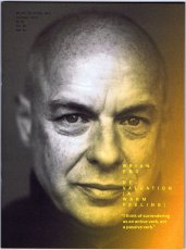
Chances are that you will be far more familiar with Brian Eno and his work than you might realise. Whether you know him as a founding member of the gloriously influential 1970s art-rock outfit Roxy Music, or as the inventor of ambient music, in one breathless career Eno has actually released no less than 25 solo albums and contributed to countless projects and collaborations, but also left his fingerprints on dozens of seminal albums as a producer – think U2, Talking Heads or Coldplay, to name but a few – composed several film scores not to mention the start-up theme for Microsoft’s Windows 95. All of which is to say that it is hard to not be in earshot of his musical influence in one way or another. With mono.kultur, Brian Eno talked about the impact of technology on culture, the similarities between producing music and parenting, and why they called Elvis ‘The Pelvis’. Given Brian Eno’s interest in how art can affect moods and emotions, our new issue turned into somewhat of an experiment in chromatics, with the pages gradually traveling the entire colour spectrum from yellow to blue and back again, which not only affects the optical perception of the yellow text, but also how one responds to the content of the interview. Suffice to say: this must certainly rank as the most colourful mono.kultur to date.
Text von der Website.
[40] S., 29,7x21 cm, keine weiteren Angaben vorhanden Farblaserdruck, gefaltete Einzelblätter, mit Gummiband zusammengehalten. PDF-Download von der Webseite
“We want you to GO INSIDE — your house, and your self. Everything is about interiors now: the interior of your home, your mind, your archive, your hard drive. Mine it all for insight and purpose.
Once that’s done, show off what you find – just because you’re alone doesn’t mean you can’t share from within. There is no such thing as “too much information” now; COVID-19 took out “TMI.” In fact, there is no more “enough” — enough data, enough circulation, enough fodder. Binge on it. Burn out on it. Document it. Post it. Build a website for it. Get turned on by it. Get freaked out by it. Open up your screens, talk about your dreams, slide into those DMs. Get dressed up to go absolutely nowhere. Never go out, but leave nothing “behind the scenes” – there is no “behind,” and no “in front of” either. There is only “now,” and it is Big and Flat. Closeness happens at a distance here, but dialogue has never been this intimate. Your private hygiene is a matter of public health, your personal cloister backdrops community debate. Dualities — east and west, north and south, us and them, out and in — melt into each other and coat the old world like lava, like an act of god. In the New Interior isolation is a commons, the self that inhabits it is a collective. Historical moments stack vertically and occur simultaneously, around the globe. Welcome to the novel sanctum sanctorum, the single-occupant House of We.
Text von der Webseite
16x11,5 cm, 5 Teile. keine weiteren Angaben vorhanden Eine Postkarte, beklebt mit zwei Briefmarken, in Bilderrahmen, Passepartout beklebt mit zwei Briefmarken, jeweils eine entwertete und unentwertete Briefmarke
ZusatzInfos
Briefmarken mit Motiv LOVE (1962), welches ab 1973 vom United States Postal Service für eine Briefmarken verwendet wurde.
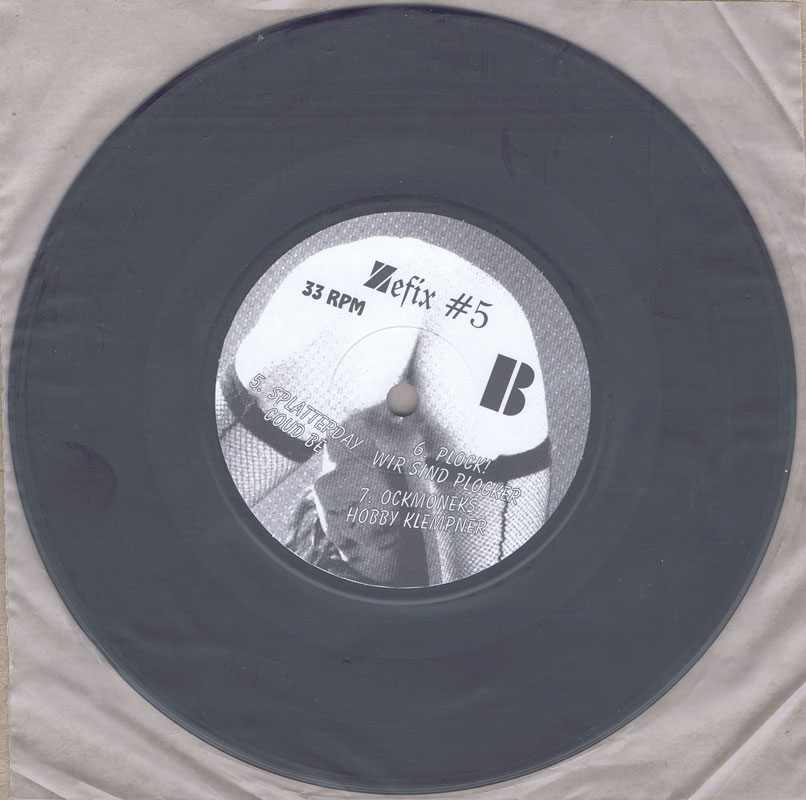
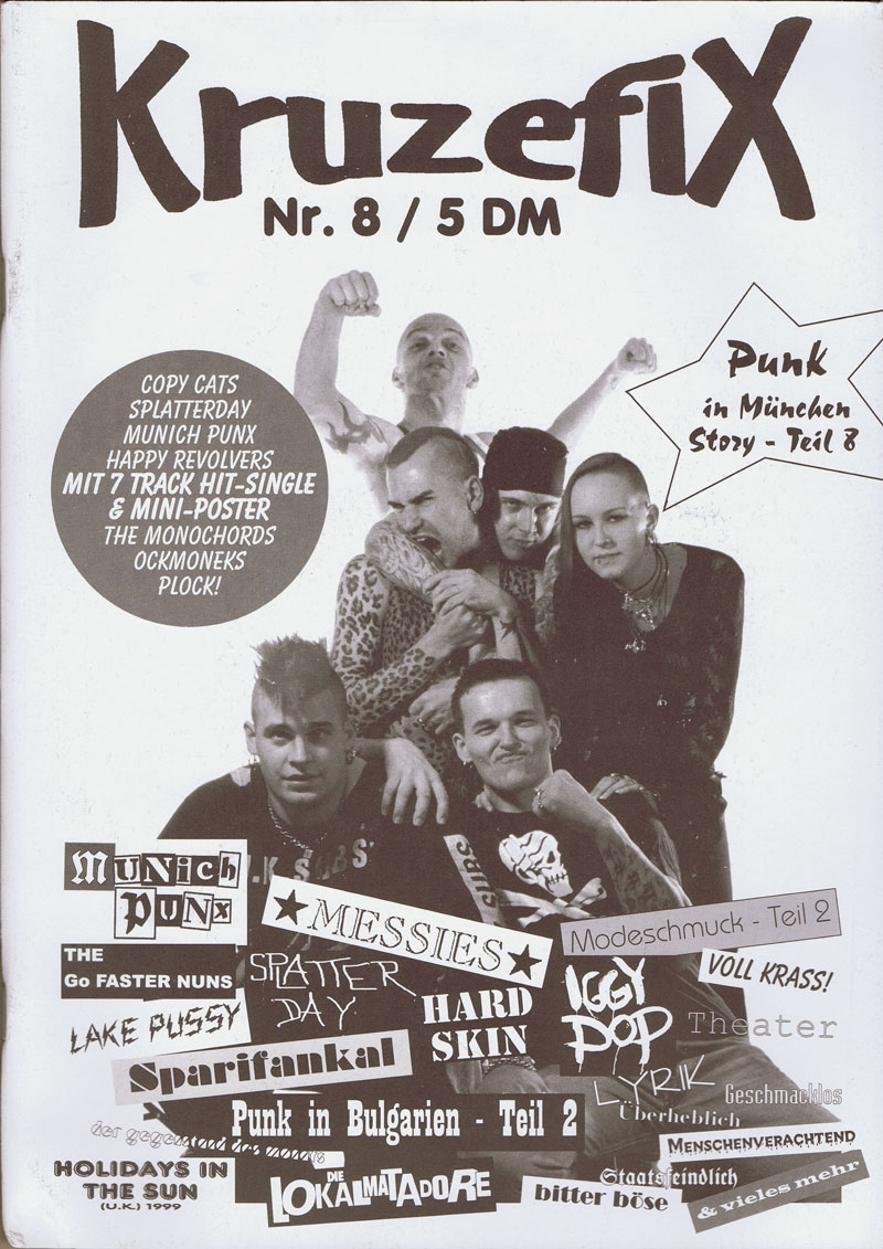
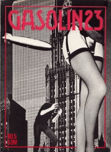
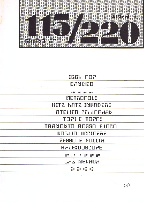
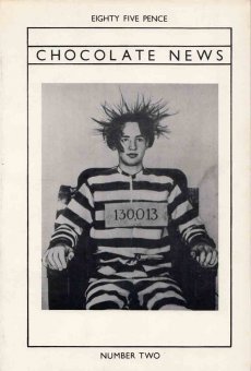
Zine mit "6-Track-Hit-Single & Miniposter" + Punk in München Story Teil 8
Das KRUZEFIX-Fanzine ist kein gewerbliches Unternehmen=keine Veröffentlichung im Sinne des Pressegesetzes! Es ist ein Rundbrief an Freunde, Bekannte und Sympatisanten. Verkaufspreis und Anzeigen decken - wenn überhaupt -nur die Unkosten wie Druck, Porto usw. Zensur gibt es bei uns nicht! Wir drucken was uns gefällt, was man uns schickt, oder sonst irgend einen Schmarrn, ohne Kommentar, möglichst ungekürzt und ungeschönt. Wem's nicht passt, kann uns am Arsch lecken.
Text aus dem Heft
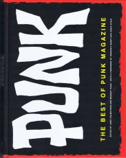
... The very best of Punk—the legendary magazine that defined an era—finds new life in this stunning anthology, featuring original articles along with behind-the-scenes commentary and the backstory on each issue as told by editor-in-chief John Holmstrom. Punk was the Bible of the urban counterculture movement. It not only gave punkmusic its name, but influenced the East Village art scene and steered the punkaesthetic and attitude. The Best of Punk Magazine includes high-quality reprints ofhard-to-find original issues, as well as rare and unseen photos, essays, interviews, and even handwritten contributions from the likes of Andy Warhol, Lou Reed, Debbie Harry, the Ramones, the Sex Pistols, Lester Bangs, Legs McNeil, Lenny Kaye, and many more. For collectors, lifelong punks, and those just discovering what punk is all about, this is the chance see the history of the movement come back to life. ...
Text von der Webseite
[32] S., 21x14,8 cm, signiert, keine weiteren Angaben vorhanden 1 x gefalteter stabiler Din A 4 Bogen, seitlich zugeklebt, bedruckt. Darin Letrasetbögen (Din A 4 und kleinere Schnipsel).
1 Karton mit dem Letter A. 3 Din A 4 Bögen gefaltet und ineinander gelegt mit Zeichnungen und Textschnipseln sowie mit Faserschreiberdetails - Original. Insgesamt 7 Teile zuzüglich eingeklebten Papierstücken.
12 S., 20,3x13,4 cm, keine weiteren Angaben vorhanden Drahtheftung, Schwarz-Weiß-Laserdrucke, Umschlag aus farbigem Papier
ZusatzInfos
Das Konzept:
1. Anonymous Press (Α,–Π,) is a self-sufficient publishing platform.
2. Every publication by Α,–Π, is a byproduct of an individual and a database, i.e. Google Image Search.
3. Human author defines the topic, the content and the form is generated from the most relevant images found online.
4. Each publication is added to a public library.
5. Every item in the library can be printed on-demand and is available to everyone for a small fee covering shipping and production costs.
6. Publications are sorted in a chronological order.
7. Α–Π does not own, nor is responsible for the content generated by its users.
Text von der Webseite
240 S., 34x22,5 cm, ISBN/ISSN 9781419706292 Broschur mit Klappumschlag
ZusatzInfos
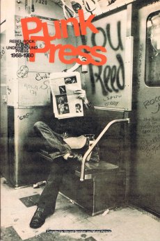
Punk was born on the East Coast in the late 1960s, later crossing the Atlantic and exploding in London and Paris. This dynamic countermovement churned out heaps of professional magazines and photocopied, hand-stapled fanzines, all expressing ideas on music, art, and current events. By creating its own press, the punk movement secured its place in the history of 20th-century culture. Featuring collages, cutouts, and handcrafted typography, Punk Press compiles the stunning graphics created by these publications, spanning from the East Village to East London to the Left Bank. With unforgettable images of punk’s greatest bands—the Ramones, the Sex Pistols, the Clash, the Dead Kennedys, Iggy Pop, and more—this is a captivating look at some of music’s most fascinating personalities and greatest talents.
Text von der Webseite
AAP Archiv Künstlerpublikationen / Archive Artist Publications - Haus der Kunst, Archiv Galerie 2018-2019, Archives in Residence - Vitrine 2 Künstlerpublikationen mit Münchenbezug
[2] S., 29,7x42 cm, Auflage: 300, 2 Stück. keine weiteren Angaben vorhanden Techn. Angaben, Infoblatt zur Wandpräsentation und zur 2. Vitrinenausstellung mit Künstlerpublikationen mit Münchenbezug
Listen der Titel zur Vitrine 2, Münchner Künstlerpublikationen, Ausstellung in der Archiv Galerie im Haus der Kunst, ab 18.12.2018, 76 Titel aus den Jahren 1968-2018, kuratiert von Sabine Brantl.
Bücher aus den Verlagen agoodbook, Anderland Verlagsgesellschaft, BBK München und Oberbayern, bizarrverlag, Carl Hanser Verlag, Edition Galerie Seevorstadt, Edition Nusser & Baumgart, Edition Taube, edition UND, Francoise Heitsch Galerie, Galerie der Künstler, Gina Kehayoff Verlag, Goethe Institut, Hammann & von Mier, Hammann von Mier Verlag, Hanser Verlag, Hirmer Verlag, icon Verlag Hubert Kretschmer, Jürgen Willing Verlag, Kasino, Kulturreferat der Landeshauptstadt München, Kulturzentrum am Gasteig, Künstlerverbund im Haus der Kunst München, Kunstraum München, Kunstverein München, Lenbachhaus München, Lothringer13, Ludwig Verlag, mlein press, Museum Villa Stuck, Musikverlag Stephan Wunderlich, National Centre for the Performing Arts, Oberste Baubehörde, Ottenhausen Verlag, Parabel Verlag, Peter Seyferth Verlag, Piramal Gallery, Prestel Verlag, Raben Verlag, Rogner & Bernhard, Schirmer/Mosel, Selbstverlag, Städtische Galerie im Lenbachhaus, Sternberg Press, Verlag Hubert Kretschmer, Verlag Kretschmer & Großmann, Verlag Silke Schreiber, Walter Zürcher Verlag
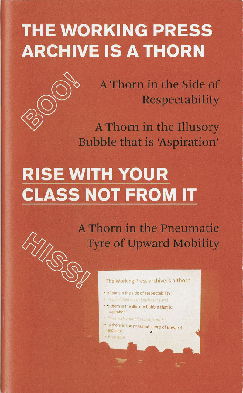
The fruit of a collaboration with artist/activist/creator of the Working Press archive Stefan Szczelkun and keeper archivist Rebekah Taylor.
Rise with your class not from it represents a lasting trace of and a vehicle for the Working Press project whose archive is now housed in UCA library special collections in Farnham. It highlights some important works by working-class artists while providing a valuable resource for anybody interested in working with archive material.
Working Press is a collective publishing imprint, which had the subtitle books by and about Working Class Artists, 1986-1996. Working Press includes the first computer generated comic (Harwood), the first book by Micheline Mason (disability and inclusion artist), and the first book about Greenham Common Yellowgate (Beth Junor).
Text von der Webseite
In the Fall of 2018, the Small Walker Press invited poet Adam Dickinson and artist Lorène Bourgeois to walk through a former landfill (1976-2001), the Glenridge Quarry Naturalization Site. Located on the Niagara Escarpment, overlooking the City of St. Catharines, Ontario, it functions today as a public recreation area.
Im Herbst 2018 lud die Small Walker Press den Dichter Adam Dickinson und die Künstlerin Lorène Bourgeois zu einem Spaziergang durch eine ehemalige Mülldeponie (1976-2001), die Glenridge Quarry Naturalization Site, ein. Sie befindet sich am Niagara Escarpment mit Blick auf die Stadt St. Catharines, Ontario, und dient heute als öffentliches Erholungsgebiet.
ISBN/ISSN 17526442 a paper based on asking major figures in graphic design the question: what are the top ten books that you believe designers should read? Blätter lose ineinander gelegt. In Transparentfolie
1 S., 29,7x21 cm, numeriert, signiert, keine weiteren Angaben vorhanden signierte Kopie mit Widmung aus einem nicht erschienen Unikat-Künstlerbuch, gefaltet in Briefumschlag mit Verlagsstempel
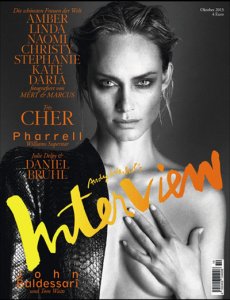
Interview: John Baldessari & Tom Waits. Andy Warhol Ausstellungen in München in der Pinakothek der Moderne (Zeichnungen der 1950er Jahre) und im Museum Brandhorst (Reading Andy Warhol). Cover: Amber
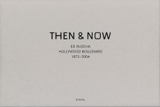
One of the most well-known of Ruscha's books from his early period is Every Building on The Sunset Strip, showing a famous stretch of real estate along Sunset Boulevard in Los Angeles, published in 1966. In July, 1973 he followed the same procedure while documenting Hollywood Boulevard.
Loading a continuous strip of 33 feet of Ilford FP-4 black & white 35mm film into his motor-drive Nikon F2 and then mounting it on a tripod in the bed of a pickup truck, he drove back and forth across the 12 miles of the street shooting, frame-by-frame, both the north and south sides of its entire length. The negatives were developed, contact sheets were made, and the materials were placed in storage.
Thirty years later, in 2003, a digital record of Hollywood Boulevard was created and it served as a reference guide for the traditional film/still documentary of 2004. For this shoot, the same type of camera equipment was used to re-photograph the street on 35mm color-negative film.
The resulting material of both shoots — 4500 black & white and 13,000 color images — have been scanned and digitally composed into four panoramics of the complete 12 miles. In THEN & NOW, the original 1973 North side view is shown along the topof the page and juxtaposed with its 2004 version underneath. Along the bottom of the page, you find the original 1973 South side view shown upside down, also juxtaposed with its 2004 version. The panoramics face each other and they are aligned.
Text von der Webseite
64 S., 28x21 cm, ISBN/ISSN 9783981229480 Drahtheftung
ZusatzInfos
LITHOSTAR belichtet, SPEEDMASTER druckt und STITCHMASTER heftet – die Druckindustrie überrascht uns seit vielen Jahren mit wunderlich kreativen Wortschöpfungen für ihre Produkte. PICNIC #5 präsentiert eine Auswahl an altehrwürdigen bis top-modernen Gerätschaften, die auf dem Druckparkett anzutreffen sind. Fotografiert, illustriert und zerlegt bis in ihre einzelnen Farbkanäle.
Text von der Webseite
356 S., 32,2x26 cm, 2 Stück. ISBN/ISSN 9783944874258 Hardcover, Leinen bedruckt mit HP Indigo 10000, mit Lesebändchen. Die Bilder auf dem Umschlag werden per Zufall aus 230 Bildern kombiniert
Englischer Originaltitel "The Art of Typewriting". Jedes Buch ist ein Unikat mit individuellem Cover.
Das Sackner Archive of Concrete and Visual Poetry gilt als das größte Archiv seiner Art weltweit und umfasst Werke unterschiedlichster Kunstrichtungen, Stile und Genres. In diesem Band präsentieren die passionierten Sammler Marvin und Ruth Sackner knapp 600 Beispiele von herausragenden Vertretern einer besonderen Kunst: der Typewriter Art. Von den Anfängen dekorativer Schreibmaschinenkunst über Lautgedichte des Dadaismus und konkrete Gedichte der 1960er-Jahre bis hin zu zeitgenössischen Arbeiten, welche die Einzigartigkeit des getippten Blatts im digitalen Zeitalter unterstreichen – allen Werken wohnt eine völlig individuelle, überraschende Kreativität inne. Die internationale Sammlung Konkreter und Visueller Poesie fasziniert in ihrer Vielfalt und hohen Qualität. Ein reich bebilderter, bibliophil gestalteter Prachtband, der dem »Werkzeug« Schreibmaschine ungeahnten Glanz verleiht.
Text von der Website.
Mixed-Nummer, Ausstellungskatalog
Die Nummer wurde in Verbindung mit einer Ausstellung von Danske Grafikeres Hus mit der Teilnahme von Jesper Fabricius, Åse Eg Jørgensen, Jesper Rasmussen, Claus Egemose, Marianne Jørgensen und Toni Larsen veröffentlicht und fungiert als eine Form des Ausstellungskatalogs, zu dem diese Künstler beigetragen haben. Serien von ganzseitigen Bildern und Originaldrucke sind im Magazin. Gleichzeitig enthält das Magazin einige weitere Features: eine Kurzgeschichte von Pablo Henrik Llambias und einen Comic von Christian Schmidt Rasmussen, sowie eine Top 100-Vorhersage darüber, an welche zeitgenössischen dänischen bildenden Künstler man sich erinnert. 25, 50 und 100 Jahre (Vanitas Dänemark).
Text von der Website, übersetzt
42x29,9 cm, Auflage: 50, numeriert, keine weiteren Angaben vorhanden Transparente Plastikhülle mit beidseitig bedrucktem Einzelblatt (Risographie), nummeriert, und zwei signierten Einladungskärtchen.
Posteredition. „The work Rondell Rondel Rondeel puts the architectonic structure of Mehringplatz into dialogue with the historic meaning of the plaza. From top view the plan evokes ideas of mechanical complexes, abstracted gear wheels, occult symbolism or extraterrestrial flying objects. In a fictional interview the author and architect of the plaza discusses his motives, concerns and visions.“
Text von der Webseite.
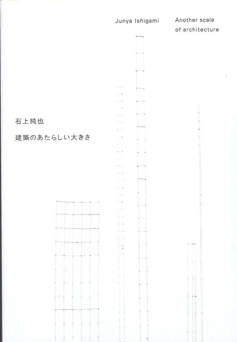
Anlässlich der gleichnamigen Ausstellung im Toyota Municipal Museum of Art, 18.09.-26.12.2010.
In 2009, Junya Ishigami’s workshop design for the Kanagawa Institute of Technology won Japan’s top architecture award: the Architectural Institute of Japan Prize. This book offers more proof of Ishigami’s precocious talent. Plans, designs, photographs, models and writings from various projects illustrate Ishigami’s stated aim to “embody in architecture that which has never been embodied before.” An essay by historian Taro Igarashi assesses Ishigami’s importance and success, including his Golden Lion award at the 12th International Architecture Biennale.
Text von der Webseite.
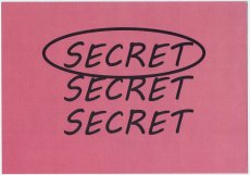
Einladungskarte zur Ausstellung THE MISSING ROOM, 04.10.-14.10.2018, kuratiert von Pierre Granoux, LAGE EGAL [STUDIOS ID — Eingang B, 2.OG] Genslerstraße 13a, 13055 Berlin-Hohenschönhausen. Auf der Karte ist dreimal "SECRET" untereinander zu lesen, der oberste Schriftzug ist zur Hervorhebung eingekreist. Wortspiel: Top-Secret.
"Welches Verhältnis besteht zwischen KünstlerInnen, Kunstwerk und dem Raum, in dem es entsteht? Was passiert, wenn das Atelier zum Ausstellungsraum wird? "Der Ort der Schöpfung – das Hirn des Künstlers – ist ein geheimer Ort, dessen äußeres Emblem ist das Atelier" (Brian O'Doherty).
Um genau diesen "geheimen Ort" geht es in diesem Ausstellungsprojekt. Verkörpert wird er durch einen ca. 250 qm großen fensterlosen Raum, welcher sich im Zentrum des zweiten Stockwerkes des Atelierhauses Studios ID in Alt-Hohenschönhausen befindet. Das ehemalige Gebäude (ID = Intelligence Department) wurde 1985 innerhalb des Sperrgebiets durch das Ministerium für Staatssicherheit erbaut und diente der Entwicklung, Produktion und Instandhaltung von verschiedenen Spionagegeräten. Der Raum ist "isoliert" im zweifachen Sinne: Zwar befindet er sich im Zentrum und ist umringt von zahlreichen Ateliers, doch ohne Fenster und nur mit zwei einfachen, bis jetzt immer versperrten Türen ist er von außen kaum wahrnehmbar. Von innen sind die Wände und Decke vollständig mit Kupfer ausgekleidet und somit von der Außenwelt faktisch abgeschirmt. Der Raum war somit sowohl abhörsicher als auch abstrahlsicher und wurde voraussichtlich für geheime Besprechungen und zum Testen von Spionage-Geräten oder Erstellung von Computerplatinen genutzt. Für die Ausstellung THE MISSING ROOM wird dieser Raum erstmals der Öffentlichkeit zugänglich gemacht."
Text von der Webseite
Schwarz-Weiß-Drucke, Nr. 027 aus der Reihe 100for10.
„Hate it or love it – the underdog’s on top.“ This basically says everything about Eva. Born and raised in the bavarian desert she made her way up north to study graphics and end up in Berlin. Being everything and nothing. Graphics, drawing, painting and writing was always part of her social media lifestyle.
FABIAN MAIER-BODE is a graphic designer currently working in Berlin. The starting point and main engine of his practice is a significant interest in type and content. That’s why he develops straight-forward and methodically design solutions that aim to be conceptually strong, contextually innovative and personally challenging.
where to begin with an architect as over the top as Ricardo Bofill, notorious since the 1970s for his vast city-like housing estates that look like surreal experiments in crossbreeding desert caves with Star Wars. an architect who has designed over 1000 projects in the space of five decades, from perfume bottles to city plans, and pretty much everything in between. who has worked in a style – or a hundred styles – that is as unique as it is impossible to describe. who founded a leftist collective that would eventually end up building airport terminals. whose life reads somewhat like a fairytale itself, taking us from fascist Spain under Franco’s rule to the celebrity frenzy of our modern times, with the Bofill clan holding a somewhat unique position among Spanish tabloids? To add any more is to inevitably leave out too much. With mono.kultur, Ricardo Bofill talked about fifty years of architecture, the vagaries of ambition and how Modernism killed the city. Visually, the issue offers a disorienting journey of architectural splendour with plenty of previously unpublished images from the archives of Ricardo Bofill (as well as the odd film still of naked bodies). Using partial high gloss varnish throughout, it is a pleasing juxtaposition of the natural and the artificial, the intellectual and the sexual, the disciplined and the decadent.
Text von der Website.
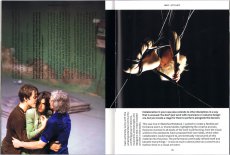
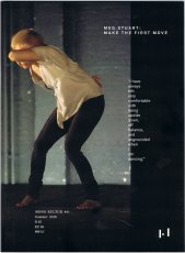
Meg Stuart’s work is not about the elegance and beauty of dance, or at least not in the conventional sense. It is about exploring the outer edges of movement, where bodies age, fail, and surrender, where individual spaces disintegrate and bleed into each other, where physical memories are exposed like open wounds. Meg Stuart’s work is located at the vanishing point where dance meets visual arts. Within just two decades, Stuart’s dance company Damaged Goods, which she founded in 1994, have produced a lengthy and diverse list of projects, ranging from countless full-length feature works to multi-disciplinary dance installations, improvisations, and films that spread far beyond the theatre stages of the world, into museum spaces, film festivals or the wide open street. With mono.kultur, Meg Stuart talked about her first physical memories, the healing power of dancing and the thrill of disorientation. Following Meg Stuart’s interest in abundance and complexity, the design discards all notions oftop or bottom, left or right, with text and images set in different and ever-changing directions. A magazine as a physical object that wants to be handled and turned. Reading as a dance.
Text von der Website.
Ausgabe #5 mit den Themen: Wieso Deutschland gerne mal ne Line zieht, Weshalb grün das neue schwarz ist, warum nicht alle Pornos geil sind, und wieso auch Hamster gerne mal nach unten treten.
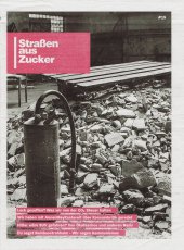
Die „Straßen aus Zucker“ ist eine kostenlose antinationale Jugendzeitung der Berliner Gruppe TOP B3rlin und Einzelpersonen. Sie erscheint etwa dreivierteljährlich in einer aktuellen Auflage von 180.000 Stück und wird im gesamten deutschsprachigen Raum gelesen. Themenschwerpunkte der letzten Ausgaben waren u.a. Alltag und politisches Handeln. Kommunismus & Realsozialismus. eine gepfefferte Kritik an Staat, Nation & Kapital. Religionskritik. Liebe, Sex und Freund_innenschaft. Rassismus und die Proteste der Geflüchteten. Reaktionäre Bewegungen und befreite Gesellschaft, Utopien und wie wir leben wollen.
Text von der Website (Stand März 2019).
Die „Straßen aus Zucker“ ist eine kostenlose antinationale Jugendzeitung der Berliner Gruppe TOP B3rlin und Einzelpersonen.
Ausgabe #15 mit den Themen: Lack gesoffen? Was wir von der CO2 Steuer halten, Wir habe mit AnnanMayKantereit über Konsumkritik geredet, Hitler wäre SUV gefahren? Von Ökofaschos und anderen Nazis, Du sagst Bambusstrohhalm - wir sagen Kommunismus
29,7x21 cm, signiert, 28 Teile. keine weiteren Angaben vorhanden Sieben Fotografie-Collagen, neun Postkarten, mehrere Blätter, geklammert, fünf Flyer, mehrfach gefaltet, fünf lose Blätter, mehrfach gefaltet, ein Plakat, mehrfach gefaltet, ein Briefumschlag, beklebt und gestempelt.
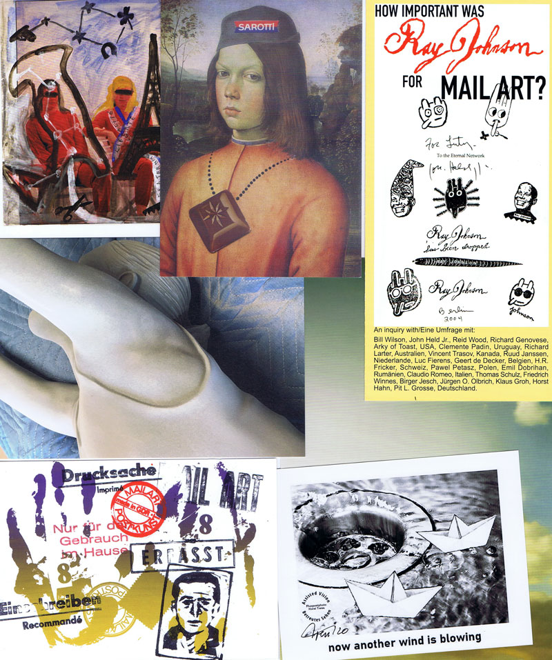
Mail Art Postkarten u.a. aus dem Verlag Lutz Wohlrab, mit Motiven von Helmut Zielke und Robert Rehfeldt, ein Flyer "How Important Was Ray Johnson For Mail Art?" von Lutz Wohlrab. Mail Art Fotocollagen und Informations-Text von Horst Tress. Postkarten-Einladung zu "Meisterwerke zu Gast: Gerhard Richter - Himmel" ab 10.11.2020 im Museum Folkwang Essen. Postkarten zu den Veranstaltungen Alexandra Bircken "Top Down, Bottom Up" und Trisha Baga "Hope" November 2020 im Fridericianum, Kassel. Einladung zum Medienrundgang "Hauptsache Malerei: Werke aus der Hilti Art Foundation" November 2020 im Kunstmuseum Liechtenstein. Flyer des Kunstmuseum Krefeld zu den Ausstellungen Marcel Odenbach - "plötzlich konnte eins wie das andere sein, suddenly, one could be just like the other" und Ignacio Uriarte - "Den Zufall ordnen, Structuring chance". Flyer zur Ausstellung "A Darker Shade Of Black" im Kunstmuseum Bochum 25.10.2020-10.01.2021 mit Werken von Frank Gerritz, Apostolos Palavrakis, Bruno Querci und Kasimir Malewitsch.
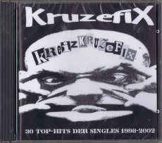
20 S., 14,2x12,4 cm, keine weiteren Angaben vorhanden CD in Hartplastikhülle mit 20-seitigem Beiheft mit Kruzefix-Historie, Konzertberichten von den Festivals und vielen, meist unveröffentlichten Fotos
Das Kruzefix ist was zum Lesen. Ein Fanzine, oder nur ein ‘Zine ohne Fan, ein Heft eben. Das Kruzefix ist aber auch was zum Anhören, denn dem Zine liegt immer auch eine Vinyl-Single bei, auf die viele klasse Songs draufgepackt sind - einmal waren es sogar acht Stücke auf einer Single! Bei diesen Stücken handelt es sich zum Großteil um unveröffentlichte Songs, die teilweise auch bis heute nirgendwo anders erschienen sind. Viele Bands konnten auf den Kruzefix-Singles erstmals eins ihrer Stücke verewiglichen, manche haben sogar überhaupt keine anderen Veröffentlichungen vorzuweisen. Da das Kruzefix immer konsequent anti-kommerziell und unabhängig war und ist, ist auch die Auswahl der teilnehmenden Bands immer rein subjektiv gewesen - hier kann sich keiner “einkaufen”, es gibt keine “Teilnahmegebühr” oder “Unkostenbeteiligung”. Drauf kommt, was uns gefällt und was dazupaßt zur je-weiligen Ausgabe des Heftes. Anfangs gehörte es zum Konzept des Kruzefix, insbesonders die Münchner Punkrockszene zu unterstützen, daher sind auf den ersten Singles ausschließlich Münchner Bands zu hören. Im Laufe der Jahre und spätestens seit der Idee, die “Punk Over Munich”-Samplerreihe mit aktuellen Münchner Punkbands zu starten, erweiterte sich der Rahmen des Ganzen. Auf den jeweils zum Erscheinen des neuen Heftes stattfindenden “Kruzefix-Festivals” spielen nunmehr neben Münchner Bands auch viele gute auswärtige, teilweise sogar ausländische Gruppen. Alle unterstützen unsere Idee und unser Konzept, unser Heft und unsere vielen anderen Projekte. Viele Bands schreiben ihre Lieder eigens für die Veröffentlichung auf der Kruzefix-Single, passend zum Motto der jeweiligen Ausgabe! Nun haben wir eine kleine Auswahl der auf den Single-Beilagen erschienenen Songs getroffen, um einen CD-Sampler zusammenzustellen. Weil es immer wieder Leute gibt, die jammern, sie hätten keinen Plattenspieler mehr zuhause. Weil es schade wäre, diese wirklich tollen Stücke in Vergessenheit geraten zu lassen. Weil Musik auf CD einfach eine breitere Öffentlichkeit erreicht - ganz gleich, ob uns das als Vinyl-Liebhaber nun paßt oder nicht... Weil wir allen teilnehmenden Bands auf diese Art und Weise mal Dankeschön sagen wollten für ihre Unterstützung.
Aus dem Vorwort des Booklets zur CD
Teufelsberg (mountain devil), is an artificial hill located southwest of Berlin, overlooking the city. Amusement park very popular with young Berliners, this hill was built after the Second World War with the remnants of the city after the Allied bombing. An estimated 30 million cubic meters of rubble piled mass there, the equivalent of 400,000 buildings. The hill rises on the site of the University of Nazi war which had been designed by the architect of the Third Reich, Albert Speer, and half done. As after the war, it was difficult to totally destroy the building riddled with underground bunkers, the German authorities decided to bury him and make him disappear under an artificial hill. The hill was then covered with trees, and used during the winter ski run in the 60s and 70s. During the Cold War, was built at the top center of U.S. espionage radar to listen to communications of the Soviet bloc in East Berlin.
Text von der Webseite
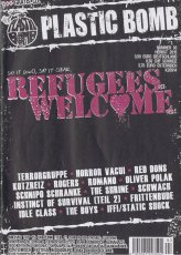
Im Interview: Terrorgruppe (Ullah), Horror Vacui (Ronja+Rob), Red Dons (Dennis Degenerate), Kotzreiz (Ronja), Rogers (Häktor), Romano (Philipp), Schnipo Schranke (Lars), Oliver Polak (Philipp), the Shrine (SaRah+Rob), Schwach (Stemmen), Instinct of Survival Teil2 (Rob), Frittenbude (Basti), Idle Class (Häktor), the Boys (Basti), Iffi/Static Shock (Helge)
Außerdem im Heft: Michas Top 15: UK Punk (Teil2), Punk in der Provinz: Juz Peine (Lars), Über den Tellerrand: Türkischer Psych Funk (Lars), Punkrock Almanach (Maks), Geschichten aus der Gruft: Dr.Axel Stoll (Basti), Pork Pie zur SkaSkaSkandal-Reihe (Basti), Platzhirsch Festival in Duisburg (Daniel), Denice Bourbon Kolumne (neu!!!), Kurzabrisse zu AntilopenGang, Torsun, The Other
Text von der Webseite
Schwarz-Weiß-Drucke, Nr. 115 aus der Reihe 100for10
Im Jahr 2015 begann Raban Ruddigkeit mit einem wöchentlichen grafischen Kommentar für die Berliner Zeitung DER TAGESSPIEGEL. Bis heute wurden rund 250 Arbeiten veröffentlicht, von denen 50 für diese Schwarz-Weiß-Zusammenstellung ausgewählt wurden. Hinzu kommen einige freie Grafikdesigns, die für soziale Medien und persönliche Produkte erstellt wurden.
Raban ist einer der meist ausgezeichneten Kreativen in Deutschland (Der Tagesspiegel) und einer der Top 50 in Europa (Designfriends Luxembourg). Im Jahr 2012 wurde Ruddigkeit's Atelier vom ADC mit dem Rookie Agency Of The Year Award für Deutschland ausgezeichnet. 2016 wurden seine wöchentlichen grafischen Kommentare in DER TAGESSPIEGEL von der Lead Academy als Illustration des Jahres ausgezeichnet.
Text von der Website, übersetzt mithilfe von DeepL.
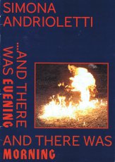
"So it was evening, then it was morning: and it was the first day." How does the beginning of everything look like? That eternal energy that generated the first beginning, the early morning of all time, for Simona has to do with an explosion: the fire, linked to the Latin verb foveo and to the Greek words φῶς (phos), light. Imploded energy, the Genesis of all moments. It is with one of the simplest destruction tools, the Molotov bomb, that the artist opens her personal exhibition, where an explosion accompanies us on a journey that with great delicacy investigates the boundaries of human exploration, in its higher sense. That man who wants to know, measure, ennoble. How much space does the highest point of the Earth occupy? "I asked Silvio Mondinelli, the sixth mountaineer in the world to have climbed all fourteen of the eight-thousand of the Himalayan chain, (without the help of oxygen) to recover through memory the space of the summit of Everest. He traced its perimeter in 1: 1 scale on a piece of paper" says Simona. This perimeter was used as a template to create a marble base, where Silvio Mondinelli’s signs and writings make that memory immortal in the most faithful way possible. In that memory, Francesco Šljiva Venturi gives life to a primordial sound that once again seeks a point of contact with the origin, through the use of his voice and a single instrument: a shamanic drum, purpose-built by a craftsman for the performance.
He will climb "on the topof Mount Everest" to sing a variation of Ives' Unanswered Question, in the lowest possible pitch. It is the elaboration of an impossibility: to go as high as possible while going as low as possible.
Text von der Website
Published within the framework of Untrue stories, an exibition that took place at Media Art Farm in November 2004. The exhibition was a part of the Swedish-Georgian collaborative project Absolute Mythologies, EKEA
8 S., 33x24,5 cm, Auflage: 1.000, numeriert, ISBN/ISSN 9788896501009 Blätter lose ineinander gelegt, gefaltet in transparenter bedruckter Kunststoffhülle
ZusatzInfos
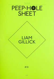
Peep-Hole was an independent contemporary art center operating in Milan from 2009 to 2016. During seven years, Peep-Hole has organized many exhibitions involving some of the most interesting international contemporary artists. It published 28 editions of the quarterly journal of artists writings Peep-Hole Sheet with texts and developed projects in partnership with numerous institutions.
Text von der Website.
28 S., 18x11,5 cm, Auflage: 50, numeriert, keine weiteren Angaben vorhanden Drahtheftung, Risographie auf gelben Karton
ZusatzInfos
Drawings and text in german and english including an illustrated short story about apes in leather suits.
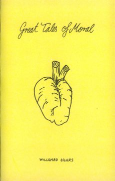
Willehad EIlers (1981, Peine) lives and works in Amsterdam. He is tirelessly working in all kinds of media including film and sculpture always looking for obscure situations inside incomplete stories. Great Tales of Moral was released accompanying to the exhibition with the same title at
self service open art space stuttgart
15x10,3 cm, Auflage: 100, signiert, keine weiteren Angaben vorhanden Farblaserkopie, Drahtheftung, mit Aufklebern
ZusatzInfos
Absurdes, skurriles und verstörende Wahrheiten aus der Lego-Welt des New Yorker Künstlers Peekasso. Das neue Heft versammelt über 40 ausgewählte Arbeiten aus seinem Lego-Archiv. Vom Künstler handgemacht. ----- Grotesque, quirky and disturbingly true stories out of the Lego-world the New York based artist peekaboo created. This new sine collects more than 40 selected works from the artists archive. Handmade by the artist.
Sarah Bodman made her first artist’s book tribute to Kurt Johannessen after Tanya Peixoto introduced her to his books at bookartbookshop.
She produced ‘An Exercise for Kurt Johannessen’ in 2010, in tribute to his book ‘Exercises’. The titles of the 100 short stories she wrote and buried for her exercise, have since been taken up by BookArtObject an international book arts group, founded in Australia by Sara Bowen, with 84 artists currently making a book using one of Sarah’s short story titles.
As it is now the 10th anniversary of bookartbookshop in February 2012, and the celebrations are based on theme of: x or what is to be done? Sarah asked Kurt Johannessen if she could select a further 10 (x) exercises from his artist’s book to carry out.
The result is ‘X Exercises for Kurt Johannessen’ an image only artist’s book, published as a free download, DIY self-assembly book on 21.02.2012. The exercises can be identified through reading the texts in Kurt Johannessen’s ‘Exercises’. Sarah has made her book as a free PDF download for you to print out and assemble yourself, you will need 4 sheets of A4 paper and a stapler
Inhalt: Marryat & Scott Lifts, How KaDeWe Became a Model for Contented Normality, Stephen Thompson: A Photographer at the British Museum, Martin Parr on La Costa Concreta, An Outsider, Looking In: The Life and Work of Mark Neville, Love and Madness: Ill-Assorted Details in the Life and Death of Henri Gaudier-Brzeska, Fay Asi: Funerals of the Fali, Stephen Gill & Mark Chesterman’s 9-Day Dig
der:die:das: Is a mono thematic magazine based in Zurich. It draws its inspiration from objects of everyday life. Our relationship with the mundane is put to question and deconstructed through the investigation of objects, ideas and stories. The familiar is staged in an unfamiliar way while the alien in the usual is discovered.
Text von der Webseite
44 S., 13,5x13,5 cm, Auflage: 100, keine weiteren Angaben vorhanden Drahtheftung, Umschlag handkoloriert und mit transparenter Klebefolie überzogen
ZusatzInfos
tragedies and others absurdities
My lats book of poetry and short stories. Twenty tragic situations that make you laugh, or simply, absurdities. Made in collaboration with Andres Felipe Garzon and edited by perrosinvergüenza in Bogota.
Text von der Webseite
60x42 cm, 2 Stück. keine weiteren Angaben vorhanden Plakat zum Magazin, zweimal gefaltet
ZusatzInfos
gefunden in der Ausstellung Paper Weight im Haus der Kunst.
GIRLS LIKE US is an independent journal turning the spotlight on an international expanding community of women from all genders within arts, culture and activism. Through personal stories, essays and vanguard visuals GIRLS LIKE US unfolds feminist legacies in arts and writing. Mixing politics with pleasure, the magazine is mapping new routes towards a feminist, post-gender future.
Text von der Webseite
[44] S., 25,3x17,8 cm, keine weiteren Angaben vorhanden Drahtheftung, in losem Pappumschlag, zwei verschiedene Papiere, in transparenter Kunststoffhülle mit Aufklebern
Begleitheft zur Ausstellung "Gasworks Yaoi" vom 26.11.2010 - 23.01.2011 im Gasworks in London.
"Gasworks Yaoi" is the first solo exhibition by Spanish artist Francesc Ruiz in London. The show is the culmination of Ruiz's research in the local area, conducted during his residency at Gasworks. Inspired by the longstanding gay establishments in Vauxhall, the artist has created a semi-fictional narrative that overemphasises the clichés around sexuality and lifestyle in the area.
For "Gasworks Yaoi", Ruiz will transform the front of the gallery into a bookshop specialising in yaoi comic books. Originating in Japan, this genre (translated as 'boys love') depicts male homoerotic narratives. However, unlike male-oriented gay erotica, yaoi comic books are both produced and consumed by women.
The yaoi comics, featured in Ruiz's bookshop at Gasworks are allegedly produced by female amateur illustrators who portray the encounters of a group of men whose nightlives revolve around Vauxhall's sprawling gay club and bar scene. By adopting the yaoi comic format and resorting to female authorship, Ruiz distances himself from the stories and characters he depicts, allowing for the imagination to run wild, indulging in stereotypes and idealised situations. Through the comics' humour and distortion of reality Ruiz gives himself license to explore a specific subculture and the way it sits within the wider fabric of the neighbourhood.
Turned into a specialised comic bookshop for women, Gasworks' space becomes an environment where sexuality, local context and its social dynamics are fictionalised and packaged into a product for consumption.
Text von der Webseite
112 S., 24x16,5 cm, keine weiteren Angaben vorhanden Broschur
ZusatzInfos
We Are Dublin is a magazine dedicated to the city. We combine the lo-fi and the high-end - expect long form journalism, poetry, humour and short stories, as well as striking photography. This is immersive publishing at its finest - a long-form postcard from one of the most interesting cities in the world. Published every three months, the magazine is available to buy online and in selected retailers in Dublin and around the world.
Text von der Webseite
5,5x9,5 cm, Auflage: 100, numeriert, keine weiteren Angaben vorhanden 2 GB USB-Stick in Kreditkartenformat, Inhaltsverzeichnis auf Postkarte beigelegt, in Pappschachtel mit aufgeklebter Betitelung in Luftpolstertasche
ZusatzInfos
Enhalten sind Audio Stories, Audio Dramas, Audio Art, Documents und Cover Art
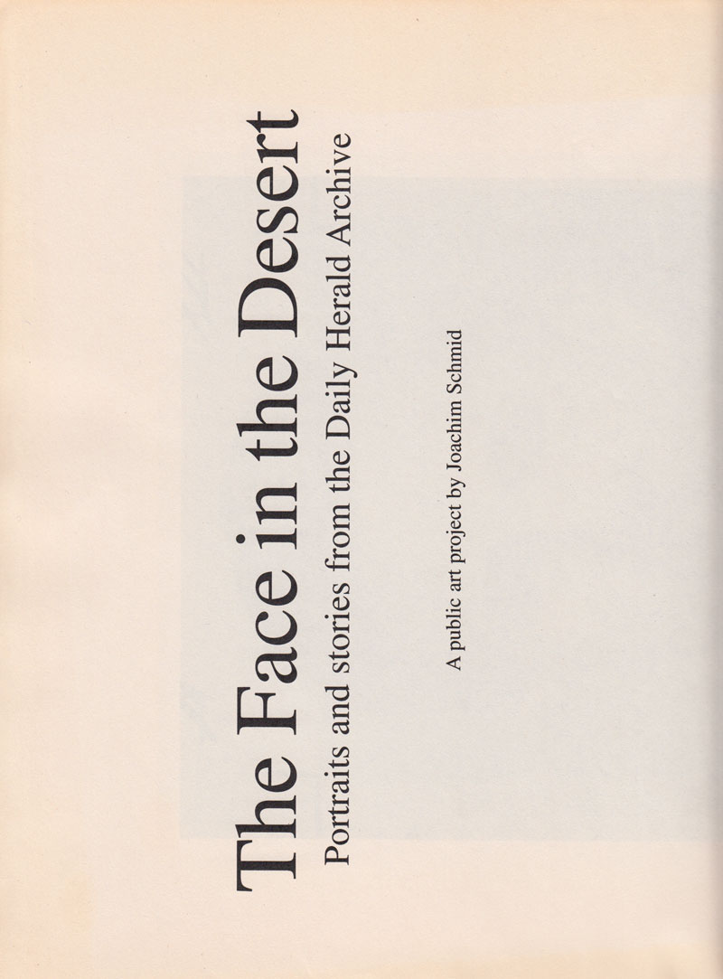
The Face in the Desert (1999) was a public art project commissioned by and realized in collaboration with the National Museum of Photography, Film and Television, Bradford. The project consisted of both an installation in Bradford city center and a newspaper. The images used for this project were found in the museum’s vast Daily Herald newspaper archive.
Text Website
8x11,5x2,5 cm, Auflage: 4, numeriert, keine weiteren Angaben vorhanden USB-Stick 4GB ICIDU (1GB Daten, 77 Dateien MP3 und PDF, 11 Ordner) in Pappschachtel, Karton, Samt
16 S., 29,7x21 cm, keine weiteren Angaben vorhanden Drahtheftung, ein Sticker eingelegt. Cover mit Prägedruck. Risographie. In braunem Papierumschlag mit Aufkleber
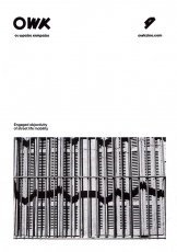
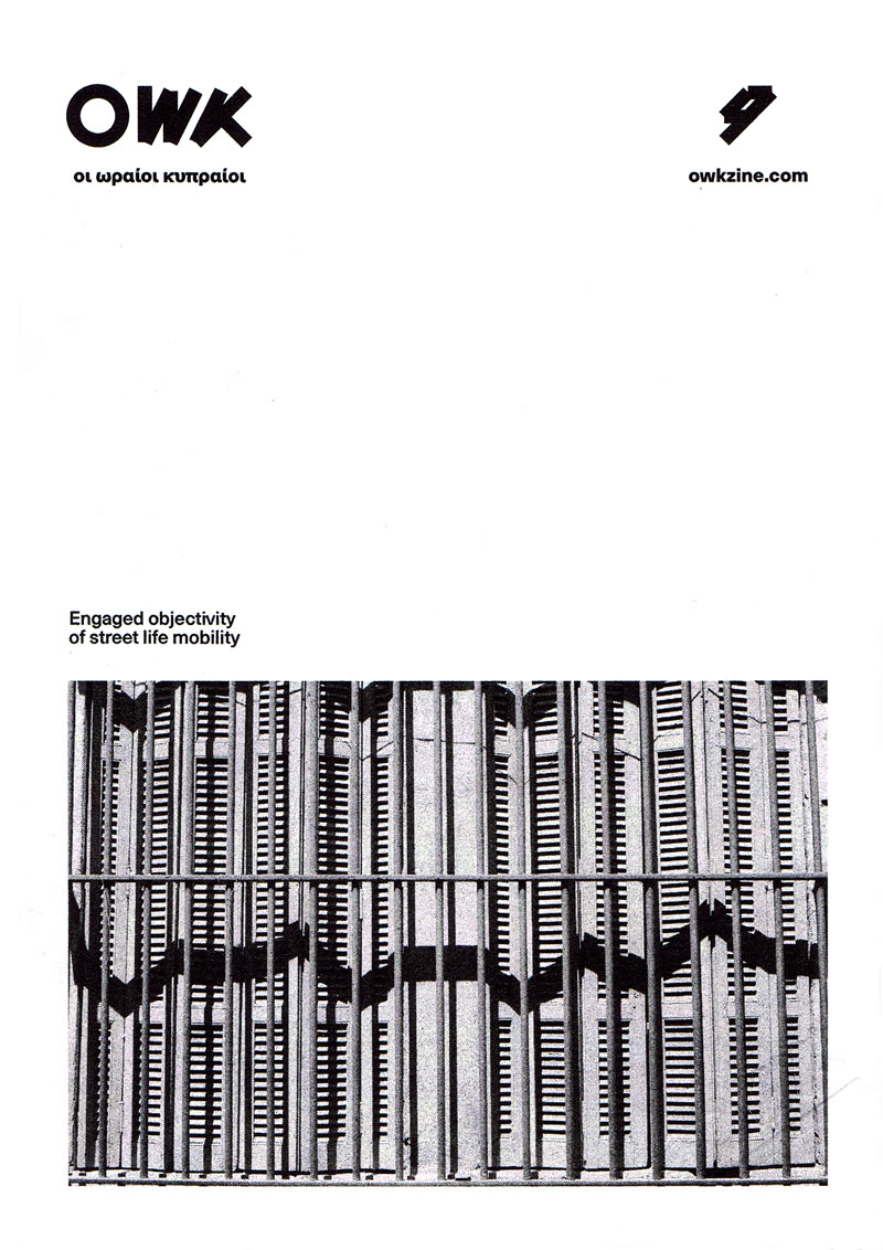
OWK is an independent visual library for words and images that create linear or abstract stories providing a structure for publishing and archiving projects. We focus on graphic design, illustration, photography, art and creative writing.
OWK is a Riso print project, meaning that color will fail to present photographs in its purest form. Registration too will fail and colors will be imperfect. It is what it is. An experimental electronic single drum screenprint with its own unique aesthetic and feel.
512 S., 30x23 cm, keine weiteren Angaben vorhanden Broschur
ZusatzInfos
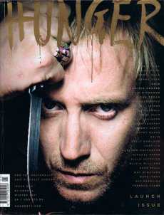
In dieser Nummer: Welsh actor Rhys Ifans and intriguing young songwriter Sky Ferreira took to the covers for , the launch issue of The Hunger. Other highlights of the issue include Terence Stamp on why being shunned by the film industry as a young actor was a blessing in disguise, The Winstone family invite us to their family home for an old-fashioned knees up, Anna Friel grills her friend, folk star Fionn Regan, on what inspires him, and Erin O’Connor divulges why she is finally ready to express her often ignored femininity. For our fashion stories, we shot Kelis, Cheryl Cole, Holliday Grainger, Portia Freeman, Heidi Klum, Milla Jovovich, Giggs and DELS.
Text von der Webseite
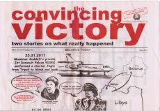
The Office for Anti-Propaganda was founded by Marina Naprushkina in 2007.
Started as an archive on political propaganda with the focus on Belarus the „The Office for Anti-Propaganda“ drifted to a political platform. In cooperation with activists and cultural makers Office lounges and supports political campaigns, social projects, organizes protest actions, and publishes underground newspapers.
The emphasis lies on projects which work outside the white cube and has social and political relevance. The 16-page newspaper-size novel illustrates the events which happened in Belarus during 2010 Presidential Elections. This is a story about the elections and, in particular, of the day and night of December 19, when the citizens’ peaceful demonstration against falsified elections was brutally suppressed by the police. The novel presents two views on the developments in parallel. The first one shows how the events are interpreted by the state regime and currently widely publicized by state-run newspapers and television. The other version was assembled from information presented by independent media, which for the most part can exist only in the Internet, i.e. blogs, oppositional websites, users’ comments, testimonies of victims and political activists.
Text von der Website
Mit Untzerstützung der Konrad Adenauer Stiftung und der Zeit-Stiftung Ebelin und Gerd Bucerius
Twelve years after the first AIDS issue, an update on the evolution of the problem and its new geography, with a focus on both personal stories and general issues. On the cover the portrait of Nyameka J. Matiayana, one of over three million people who died of AIDS-related causes in 2005. Text von der Website
Fazal Sheikh made his first trip to the holy Indian city of Vrindavan in 2003. Each year thousands of women make their way there to join the community of widows who spend their days in the temples, worshipping their god Krishna, and preparing for death. Over the next three years, Fazal Sheikh became accepted by the widows, who agreed to sit for their portraits and talked to him about their lives. Their stories revealed how powerless some of the women had been under the strictures of traditional Hindu law. They were victims of enforced marriage, physical violence, sexual abuse and neglect. Some had been evicted from the family home once their children were married. Others had left of their own accord. As Fazal Sheikh discovered, what the women find in Vrindavan is not just religious solace, but in the sisterhood of other widows they find companionship and support. In his portraits their faces are suffused with calm – in some cases they already seem to have reached a half-life, somewhere between this world and the next – and their religious faith, in many ways the source of their past troubles, finally brings them peace. This project was published as Moksha
Text von Website
46 S., 17,5x17,5 cm, Auflage: 200, numeriert, 2 Stück. keine weiteren Angaben vorhanden Drahtheftung, mit Pergamentpapier, 2farbige Risographie und Farblaserkopie, in transparenter Kunststoff-Schutzhülle,
We all have songs that left a mark, that changed the way we thought about music, about life, that helped us make new friends, that set something in motion. We wanted to collect these songs, and especially the stories behind them, from people that we know and like. This zine contains written pieces (in Englisch and German), as well as images, done by 13 wonderful people.
Text aus dem Heft
Bast Fooks was one of my new years resolutions for 2016. I haven’t given up smoking yet, but I did end up spending my new years eve in, printing and sewing the first Bast Fook issue. There and then I had decided that it would be a project in 12 parts and that I would produce a book for each month of 2016. Each Bast Fook is a repository of ideas (in the form of notes, thoughts, readings and misreadings, assumptions, aphorisms, contemplations, stories, lists, observations and lost projects). Bast Fooks have evolved into a platform through which, I can organise - in a pretty disorganised way-ideas as they happen and material produced in different ways, under different circumstances, at different places and times and sometimes by totally different versions of myself. Bast Fook is an anagram of Fast Book and in a way each issue is offering a slow consumption of a fastness that often reads a lot like a facebook newsfeed, decentered, fragmented, multivoiced.
Text von der Website
Zur Ausstellung in der Fotobuchgalerie Goodtransfergallery, Clemensstraße 61, 17./23./24.03.19-22 Uhr, 18./19.03.16-19 Uhr. Zimmer eines leerstehenden Wohnblocks in Thüringen
Zur Ausstellung "Graphic Design: Woodtli und Blackyard", Schule für Gestaltung Bern, 23.02.-31-03.2017. "Mad Max and the Tiles of my Father - Childhood Stories from Israel", Haus der Festspiele Berlin, 07.-17.09.2011. "Soiree graphique No 8", Komet Bern, 04.09.2015.
Zur Ausstellung Objekt-Magazine aus dem Archive Artists Publications im kunsTTempel Kassel, 04.05.–10.06.2018.
Mit der Ausstellung Objekt-Magazine präsentiert die Galerie Kunsttempel erstmals 39 herausragende Titel mit über 100 Ausgaben von Objekt-Zeitschriften, die von 1965–2016 publiziert wurden. Die Ausstellung gibt mit dieser Bandbreite an Titeln aus dreizehn unterschiedlichen Ländern (Australien, Belgien, Deutschland, Frankreich, Italien, Japan, Niederlande, Österreich, Polen, Schweiz, Spanien, USA, Zypern) einen repräsentativen Überblick über diese Sonderform künstlerischen Verlegens. Einige der ausgestellten Magazine sind raumgreifend und regelrechte Skulpturen, andere zeigen sich in ungewöhnlichen Verpackungen wie Dosen, Mützen, Kleidungsstücken oder Flaschen. Es werden auch Magazine gezeigt, die noch dem herkömmlichen Zeitschriftenformat ähneln, jedoch sind auch diese mit Materialien durchsetzt und zeigen oftmals auf dem Cover applizierte Gegenstände. Die ausgestellten Objekte lassen sich den Kunstrichtungen Mail Art, Neo-Dada, Post-Fluxus und neueren Stilrichtungen zuordnen.
Gezeigt werden Ausgaben von
Aspen, 1965-1971, AXE, 1975-1976, Reaktion, 1975-1983, Lightworks, seit 1975 oder 1976, TAU/MA, 1976-1981, Plages, 1978-2011, Arte Postale!, 1979-2009, Brauchbar/Unbrauchbar, 1980/1981, Museum Rost, 1980-1983, Art/Life, Artlife, 1981-2006, Artfusion, 1979-1982, Toi et moi pour toujours, 1982 bis ca. 1985, CAPS.A., 1982-1985, CARE, ab 1982, Canoe, ab 1983, Tango, ab 1983, Tra, frühe 1980er Jahre, Normal, 1984-1988, smile, ab 1984, Tiegel & Tumult, 1986-1992, PiPs, 1986-2009, DOOS, 1988 bis ca. 1992, Miniature obscure, 1991-2007, Skola, 1991 bis ca. 1993, No News, 1993-1998, La Más Bella, 1993-2014, Cave Canis, 1995-1999, Boxhorn, 1998 bis heute, Achse Kassel-Bern, 1999-2007, Bella Triste, 2003 bis heute, Esopus, 2003 bis heute, Papermind, ab 2005, KART, 2006 bis heute, Landjäger, 2007 bis heute, Wipe, schon vor 2009 bis heute, Tigre énorme, ab 2010, Matchbook Stories, 2012 bis heute, RUW, 2013 bis heute.
Zur Ausstellung erscheint ein Katalog in einer Normal- und einer limitierten Vorzugsausgabe im icon Verlag.
Zur Ausstellung Objekt-Magazine aus dem Archive Artists Publications im kunsTTempel Kassel, 04.05.–10.06.2018.
Enthaltene Magazine:
Aspen, 1965-1971, AXE, 1975-1976, Reaktion, 1975-1983, Lightworks, seit 1975 oder 1976, TAU/MA, 1976-1981, Plages, 1978-2011, Arte Postale!, 1979-2009, Brauchbar/Unbrauchbar, 1980/1981, Museum Rost, 1980-1983, Art/Life, Artlife, 1981-2006, Artfusion, 1979-1982, Toi et moi pour toujours, 1982 bis ca. 1985, CAPS.A., 1982-1985, CARE, ab 1982, Canoe, ab 1983, Tango, ab 1983, Tra, frühe 1980er Jahre, Normal, 1984-1988, smile, ab 1984, Tiegel & Tumult, 1986-1992, PiPs, 1986-2009, DOOS, 1988 bis ca. 1992, Miniature obscure, 1991-2007, Skola, 1991 bis ca. 1993, No News, 1993-1998, La Más Bella, 1993-2014, Cave Canis, 1995-1999, Boxhorn, 1998 bis heute, Achse Kassel-Bern, 1999-2007, Bella Triste, 2003 bis heute, Esopus, 2003 bis heute, Papermind, ab 2005, KART, 2006 bis heute, Landjäger, 2007 bis heute, Wipe, schon vor 2009 bis heute, Tigre énorme, ab 2010, Matchbook Stories, 2012 bis heute, RUW, 2013 bis heute.
Ein Überblick über 50 Jahre Objekt-Zeitschriften, mit 38 Titeln und über 170 Ausgaben und Hunderten von Einzelelementen aus dem Bestand des Archive Artist Publications (Sammlung Hubert Kretschmer) in München.
„Die Objektzeitschriften erweitern den Rahmen der zweidimensionalen, gedruckten Künstlerzeitschriften ins Skulpturale und Materielle. Jede Ausgabe an sich ist ein Objekt, eine Skulptur oder ein objekthaftes Multiple.“
Rolf Dittmar und Jürgen O. Olbrich
Kenneth Goldsmith wants you to rethink the internet. Many people feel guilty after spending hours watching cat videos or clicking link after link after link. But Goldsmith sees that “wasted” time differently. Unlike old media, the internet demands active engagement—and it’s actually making us more social, more creative, even more productive. When Goldsmith, a renowned conceptual artist and poet, introduced a class at the University of Pennsylvania called “Wasting Time on the Internet”, he nearly broke the internet. The New Yorker, the Atlantic, the Washington Post, Slate, Vice, Time, CNN, the Telegraph, and many more, ran articles expressing their shock, dismay, and, ultimately, their curiosity. Goldsmith’s ideas struck a nerve, because they are brilliantly subversive—and endlessly shareable. In Wasting Time on the Internet, Goldsmith expands upon his provocative insights, contending that our digital lives are remaking human experience. When we’re “wasting time,” we’re actually creating a culture of collaboration. We’re reading and writing more—and quite differently. And we’re turning concepts of authority and authenticity upside-down. The internet puts us in a state between deep focus and subconscious flow, a state that Goldsmith argues is ideal for creativity. Where that creativity takes us will be one of the storiesof the twenty-first century. Wide-ranging, counterintuitive, engrossing, unpredictable—like the internet itself—Wasting Time on the Internet is the manifesto you didn’t know you needed.
Text von der Webseite
Schwarz-Weiß-Drucke
Based in a quiet undisclosed studio a short train ride outside of downtown Berlin, artist Peter Aurisch creates some of the most original tattoos in the city — and in a place with an estimated 2,000 tattoo artists, that’s saying something. To keep his ideas fresh and original, he may only begin planning a new piece when the client first arrives. He tends to work freehand without sketches or source imagery, and instead draws inspiration from stories and details provided by his customers. Aurisch’s studio is called Johnny Nevada, he takes only a single appointment daily.
20,5x13,5 cm, keine weiteren Angaben vorhanden 4 Bände in Schuber. Schuber geprägt in Gold und Schwarz, Rückseite mit Umkehr der Farben. einzelne Cover mit Reliefprägung, geometrische Formen, Farbschnitt schwarz. Einzelne Bände in Schweizer Broschur (Umschlag nur auf Rückseite angeklebt, Rücken mit Gewebestreifen eingefasst). Bd. 1 130 S., letzte Seite mit Kalender als Fold-Out. Bd. 2 160 S., Bd. 3 96 S., Bd. 4 Blindband, (Notizbuch), 72 S.
The Typographic Society Munich is the largest organisation in Europe for typographers and people who are interested in typography and design. Since being founded in 1874 the designers’ club establishes a foundation for sophisticated and interdisciplinary thinking and dialogues among content and form, text and photo, tradition and innovation, design and technology. The tgm represents quality and education for the branch of communication and offers a huge accompanying training program. As Chairwoman of the club I curated several lectures in the last years, inviting design and typography celebrities.Throughout the years designers like Stefan Sagmeister, Mirko Borsche, Eike König, Mario Lombardo, Sascha Lobe, Fons Hickmann, Amir Kassaei or Kurt Weidemann to name a view, followed these invitations and appreciated the warm welcome of our community.
To show the wide range of offerings we traditionally create a yearbook. More over I tried to give the content based complexity of our proposal a clear and neat arrangement. Therefore the new release is a compilation of four different books, which should invite the reader to inform themselves, to browse, to experience and to participate. The first one exposes all the topics, facts and dates for the further education programs. Part two presents all the people and their stories who are involved in the club, who are on stage and behind the scenes. The third book is a journey into the past and also the future of tgm’s conferences, excursions and other specials. And finally there is room for the reader’s own ideas, experiences and criticism as a foundation for a future dialogue with tgm.
Every offer under the roof of tgm is a result of solidarity. It is a result of people and companies who are united by the common interest in typographic quality. This project has only been possible with the support of Kösel Druck GmbH & Co Kg, Geese Paper, mycolorserver and the collaboration with Boah Kim.
Text von der Webseite
Nr. 9, November 2018. Gedruckte Korrektur neben Jahreszahl 2019 in Pink.
OWK is an independent visual library for words and images that create linear or abstract stories providing a structure for publishing and archiving projects. We focus on graphic design, illustration, photography, art and creative writing.
OWK is a Riso print project, meaning that color will fail to present photographs in its purest form. Registration too will fail and colors will be imperfect. It is what it is. An experimental electronic single drum screenprint with its own unique aesthetic and feel.
Text von der Webseite
Beiträge, Eat Pray Love, Lost Bodies - Corps Perdus, Rainbow Refugees Stories - Porträts von Flucht und Freiheit, München geht grün, Ich war noch niemals in New York
“We Are Cypriots” is a chronicle that takes us behind the scenes sharing personal histories that official histories often ignore.
Between 2015 and 2018, during the reunification talks and after they failed, the author Lisa Fuhr visited Cypriots from both communities and photographed them in their surroundings. These intimate photographs and accompanying in-depth conversations shed light on life in Cyprus today.
Travellers, Cypriots living abroad, foreigners who have chosen to settle there, and last but not least, the people of Cyprus itself just might discover in these pages something they did not expect.
This book, furthermore, is intended as a contribution to the current European-wide discussion on national identity, separatism, nationalism or unification, and reconciliation.
In his comprehensive preface, the Berlin journalist, Klaus Hillenbrand, traces the historical and contemporary, as well as the social and political developments that have so profoundly shaped this island and Cypriots today.
Photo Exhibition and Book Launch at Goethe-Institut Nicosia, Cyprus, in the buffer zone next to Ledra Palace. Opening Wednesday 15 May 2019. Duration of the exhibition until 11 June 2019
With UNCHAIN CHANGE we seek to develop awareness of presences and practices beyond the hegemonic, and this is how our body turns against the contours of its shadow that distresses the world with its opacities. The issue at hand contains academic texts, activist manifestos, Creole stories, fables of millennials, internet manuals, and once again welcomes the cacophony of styles, convictions and vibrations on which our movement is grounded. We aim, above all, to heal the abyss between art and society.
Text von der Webseite.
Werbekarten zum Buch “We Are Cypriots”, a chronicle that takes us behind the scenes sharing personal histories that official histories often ignore.
Between 2015 and 2018, during the reunification talks and after they failed, the author Lisa Fuhr visited Cypriots from both communities and photographed them in their surroundings. These intimate photographs and accompanying in-depth conversations shed light on life in Cyprus today.
Travellers, Cypriots living abroad, foreigners who have chosen to settle there, and last but not least, the people of Cyprus itself just might discover in these pages something they did not expect.
[18] S., 50x35 cm, keine weiteren Angaben vorhanden Künstlerzeitung vom 25.06.1979, mehrfach gefaltet 25,5x17,5 cm, 2 gefaltete Bögen, sowie 5 Einzelseiten, gedruckt in schwarz und rot auf Zeitungspapier, jede Seite der 2 Bögen ist in kleine Einzelseiten unterteilt und je einem Künstler gewidmet, vier der Einzelseiten zeigen - großformatig - je eine Arbeit.
Francesco Saverio Dòdaro - Poet, visueller Poet, Autor - 1930 in Bari geboren, rief nach seiner Zeit in Bologna und Paris und seinem Umzug nach Lecce 1976 das Genetic Art Movement ins Leben.
Er konzipierte und führte Regie bei der Serie: "Ghen arte" (Lecce, 1978), "Aesthetic violations" (Lecce, 1981), "Scritture" (Parabita, 1989), "Spagine. Infinite writings "(Caprarica di Lecce, 1989)," Compact Type. New narrative "(Caprarica di Lecce, 1990)," Diapoesitive. Scriptures for screens "(Caprarica di Lecce, 1990)," Mail Fiction "(Caprarica di Lecce, 1991)," Wall Word "(Lecce, 1992) - translated into Japanese and exhibited at the Hokkaido Museum of Literature in Sapporo -, "International Mail Stories" (Lecce, 1993), "Internet Poetry" (Lecce, 1995), "Walkman Fiction. Novels to listen "(Lecce, 1996)," E 800 European Literature ", in 5 languages (Lecce, 2000)," Narrative folds "(Lecce, 2001)," Poetic folds "(Lecce, 2001)," Folds of memory "(Lecce, 2001)," Naked leaves "(Doria di Cassano Jonio, 2003)," Literary posters "(Lecce, 2005),"Naked novels" (Lecce, 2006-07), "Literary papers" (Lecce, 2009), "792 Mail Theater" (Lecce, 2009), "New Page. Narrative in store ", (Lecce, 2009)," New Page. Theater in store "(Lecce, 2010)," New Page. Poetry in store »(Lecce, 2011).
Eine weitere Redaktion befand sich in Genua: Ghen Res Extensa Ligu.
2016 feierte das Genetic Art Movement sein 40-jähriges Bestehen.
44 S., 25x20,2 cm, keine weiteren Angaben vorhanden Drahtheftung, die Seite 38/39 ist doppelt, liegt als loses Blatt ein weiteres Mal darin, aber etwas kleinformatiger als das Heft, gestempelt und betitelt mit "smallest poem", von Piermario Ciani.
Heft mit Comics, Albenbesprechungen, Konzertanzeigen, Grafiken, Zeichnungen, Illustrationen von italienischen Künstlern. Die Stories im Heft heißen: Iggy Pop, Damned, Metropoli, Kitz Katz, Atelier, Topi e Topoi, Tramonto Rosso Fuoco, Voglio Uccidere, Sesso e Follia, Kaleidoscope, Gaz Nevada.
.... Das Interesse an imaginären Entitäten, die Fähigkeit, die Geschichte neu zu schreiben, der Versuch, die Mechanismen der Medieninformation zu entlarven, sind die von Ciani in dieser Zeit entwickelten Praktiken, die wir in den kommenden Jahren im Luther-Blissett-Projekt und im der Mail Art wiederfinden.
29,7x21 cm, 4 Teile. keine weiteren Angaben vorhanden Gefaltetes Blatt, eingelegt ein Bogen Mail Order Form, eine Postkarte von Barbara Helmer mit handschriftlichem Gruß vom PrintRoom, eine gefaltete Risoprint Edition
Erschienen zu INEXISTENT BOOKS II at PrintRoom Rotterdam 17.11.2020-31.01.2021.
Inexistent Books wants to celebrate the invisible in times of hypervisibility, embrace paradox and explore the anti-heroic utopian potential of the anti-medium. We have asked artists for nonexistent books—a’ps that did not exist before, have been idle, deal with non-existence or simply refuse to exist.
The ephemeral bookstore organised by Jan Steinbach first appeared in collaboration with I Never Read at Schaulager in September 2020.
Text von der Webseite
Edition Holes [Special Edition], 2020 von Sveinn Fannar Johannsson, 13/50
Reprint nach einer Publikation des Visual Studies Workshop in Rochester, 1979, erschienen zur posthumen Ausstellung im Kunstverein München Something other than either, von März bis August 2020.
The book is composed of images and texts by Hill through which she intended to contextualize and explain her working methodology to Jill Kornblee, her New York gallerist. Untrained as an artist, Pati Hill began to use the photocopier as an artistic tool in the early 1970s, leaving behind an extensive oeuvre that oscillates between image and text. Besides this comprehensive body of xerographic work, she published four novels, a memoir, several short stories, wrote poetry, and made drawings. Instead of an exhibition catalog that would offer an interpretation of her work, this publication provides space for Hill’s own writing that interrogates and accompanies her visual work.
Text von der Webseite
Zine der ecuadorianischen Künstlerin Abigail Cárdenas (alias EECO), bestehend aus Zeichnungen und Kommentaren zu alltäglichen Dingen. Das Zine ist Teil der Reihe "Little Stories", in der die Künstlerin 100 Tage alltägliche Geschichten erzählt. Das Zine ist so gefaltet, dass jede Seite des Papierbogens eine Geschichte ist, die eine trägt den Titel "La tormenta" (dt. Das Gewitter), die andere "Observando gente cotidiana en el parque" (dt. Beobachtungen alltäglicher Menschen im Park).
28,2x43,8 cm, keine weiteren Angaben vorhanden Mehrfach gefaltetes Poster, doppelseitig bedruckt
ZusatzInfos
Die Arbeit ist Teil des "Equilibrium Projects": Equilibrium is a collaborative initiative to develop creative contexts for women in towns and cities to explore practices that stay immersed in everyday. The project gave a platform for artists from Europe and Asia to come together, interact and work with the women members of self-help groups from Partapur and nearby villages. The artists and women members worked together as equals through sharing their experiences, skills, stories, and recipes through several creative projects. Now these creative projects are going to be displayed in an interactive exhibition at Walpodenakademie Mainz from May 08, 2015.Equilibrium is a project of Walpodenakademie (Mainz), Sandarbh (Partapur/ New Delhi), and Beneshwer Lok Vikas Sansthan (Partapur), curated by Shilpa Upadhyay and h.i.s.(Tanja Roolfs and Stefan Brand).
Text von Website
Die drei Fläschchen gehören zum Projekt APoetheke. Jedes Fläschchen hat ein Thema und beinhaltet zwei passende Gedichte die auf Papier gedruckt, eingerollt und in die Fläschchen gepackt wurden. So beinhaltet Loneliness die Gedichte 'A haiku' und 'Long Distance', Heartbreak 'eviction notice' und 'god' und New Love 'bloom' und 'Who's holding the matches?'
60 S., 21,5x15 cm, 2 Stück. keine weiteren Angaben vorhanden Drahtheftung, verschiedene Papiere, mit eingehefteten Informationen zur reflection press und gefaltete Presseberichten
aus verschiedenen Papieren von Günter Saree (Briefe, Konzepte, Zeitungsartikel über Aktionen und Nachrufe, Skizzen und Notizen) von Albrecht D. bearbeitet
31x23,6x1,5 cm, keine weiteren Angaben vorhanden Kassette mit zwei gefalteten Einzelblättern, beidseitig bedruckt, eins davon Werbemappe mit Werbeheftchen für Gordon's und Newsletter der Something Else Press, drei Poster, drei Hefte mit Drahtheftung und eine Schallplatte.
Ausgabe gestaltet von Quentin Fiore. Ausgabe besteht aus 9 Teilen: 1. Box, 2. "The Medium Is the Massage" Poster-sized mosaic of pages from The Medium Is the Massage by McLuhan and Quentin Fiore, 3. "The TV Generation" Poster of a color photo taken at the Tribal Stomp at San Francisco's Avalon Ballroom, 4. "Diary: How to Improve the World (You Will Only Make Matters Worse)" Random observations by John Cage, 5. "The Electronics of Music" Essay on electronic music by Faubion Bowers and Daniel Kunin, 6. Phonograph recording. A Recorded Sampler of Electronic Music. Side A: In Memoriam of Edgar Varèse, by Mario Davidovsky. Side B: Horn, by Gordon Mumma, 7. "The Braille Trail" Bob Lewis and Alfred Etter describe a nature trail for the blind, 8. "Psycles" Excerpts from The Bikeriders, Danny Lyon' book about the Chicago Outlaws motorcycle club. Prefaced by a meditation on motorcycling by Bob Chamberlain, 9. Mappe mit Werbung mit einem Werbeheft für Gordon's und Newsletter der Something Else Press (Something Else Newsletter Volume 1, Number 6: May, 1967), weitere Werbehefte der Originalausgabe fehlen.
Wahrscheinlich steht das "PG" im Titel für Percy Grainger, der zu Beginn - als einziges Foto - das Buch mit dem Bilduntertitel "Percy Grainger shoe-cleaning in Melbourne - 1926/7" eröffnet. (Grainger lebte von 1882 bis 1961 und war Pianist.)
Auf der letzten Seite befindet sich die mit Bleistift geschriebene Widmung: To Trollo & Irene all the best Simon Frankfurter Bookfair 1981. (Gemeint sind Wolfhard und Irene Ottenhausen)
Simon Cutts ist Schriftsteller, Künstler, Designer und Verleger. Er ist Autor vieler Gedichtbände (darunter Quelques Pianos und Seepages von Jargon Society) und von unzähligen Künstlerbüchern und ephemerer Druckwerke. Mitte der siebziger Jahre gründete er Coracle Press in London. Eine Sammlung seiner Vorträge und Schriften über das Verlegen von Kleinpressen und Künstlerbüchern ist in Some Forms of Availability zusammengefasst, das 2007 von Granary Books und RGAP veröffentlicht wurde.
Broschüre zur Vorstellung des Medienvereins UNI-Press und des Studentenmagazins UNI-press mit Redaktionskonzept, Produktion, Finanzierung und Projekte.
Einladungskarte Ausstellung in der Galerie ep.contemporary, Berlin, 26.08.–19.09.2021.
"Klatsch, Tratsch und manipulativer Journalismus: Zum Ergötzen der LeserInnen quetscht sie ihre Opfer aus wie Zitronen – das sind Assoziationen, die Yellow Press als Titel einer Ausstellung weckt.
Begreift man die Farbe Gelb aus der psychologischen oder soziokulturellen Perspektive, sind ihr verschiedene, teils sogar konträre Bedeutungen zugeschrieben. Sie steht für Licht, Freude und Wohlbefinden, Geduld und Weisheit – aber auch für das Gegenteil: Neid, Geiz und Missgunst. Gelb ist die Farbe sowohl der Geächteten als auch der Geachteten: Gelb war der Stern zur Ausgrenzung der Juden; gelb waren die Gewänder, mit denen sich chinesische Kaiser schmückten.
„Das Auge wird erfreut, das Herz ausgedehnt, das Gemüt erheitert; eine unmittelbare Wärme scheint uns anzuwehen“, schreibt Johann Wolfgang von Goethe in seiner Farbenlehre. In der Bildenden Kunst symbolisiert sie die Ewigkeit: Gelb ist die Farbe mit der größten Strahlkraft.
Text: Ophelia Beckmann
Gleichzeitig präsentieren wir in unseren Räumen:
EP.CONTEMPORARY EDITION # 0.1
Mit Arbeiten von Ophelia Beckmann, Angela Bröhan, Albert Coers, Matthias Hagemann, georgia Krawiec, Uschi Krempel, Celia Mehnert, Martina Reichelt, Jens Schünemann, Sabine Wild."
Text von der Webseite
Portuguese Small Press Yearbook ist gestaltet von verschiedenen Künstler*innen, wobei es größtenteils aus Text besteht. Es wurde bis 2019 einmal im Jahr veröffentlicht und ist eine Zusammenfassung der in diesem Jahr erschienen Publikationen jener Künstler*innen. Hierbei handelt es sich um die dritte Ausgabe.
Am 02. & 03.11.24 richtet das Haus der Kunst die fünfte Ausgabe von Super BOOKS aus. Die jährlich veranstaltete, unabhängige Messe der Künstler*innenbuchszene bringt fast 70 Künstler*innen, Gestalter*innen und alternative Verleger*innen sowie Institutionen und Hochschulen zusammen, um ihre jeweils neuesten Produktionen zu präsentieren.
Der Schwerpunkt von Super BOOKS liegt auf Publikationen, die die Grenzen des Mediums Buch hinterfragen, neu denken und deren Themen, Formate und Techniken sich ständig erweitern. Mit ihrer Ethik der Zugänglichkeit, die in der Preisgestaltung und der Direktheit von Vertriebswegen zum Ausdruck kommt, bilden alternative Publizist*innen ein Gegengewicht zur herkömmlichen Verlagsbranche und ihren gängigen Spielregeln.
Super BOOKS wurde 2019 im Rahmen der Ausstellung „Archives in Residence: AAP Archiv Künstlerpublikationen“ im Haus der Kunst initiiert und hat sich seither zu einem wichtigen Forum für die unabhängige Kunstverlagslandschaft entwickelt. Das große Publikumsinteresse der vergangenen Jahre zeigt, wie sehr die Veranstaltung auch die breite Öffentlichkeit anspricht und zur lebendigen Auseinandersetzung mit Künstler*innenpublikationen inspiriert. Projektleitung: Sabine Brantl (Haus der Kunst)
Text von der Webseite
21x14,6 cm, 2 Stück. keine weiteren Angaben vorhanden Drahtheftung, mit eingelegtem Einzelblatt und angehefteten handschriftlichen Notizen zu Günter Saree
ZusatzInfos
Mit Grafiken und Plakaten von Günter Saree (im beigelegten Programmheft)
50 Blätter S., 10,2x14,5 cm, keine weiteren Angaben vorhanden Drahtheftung, Klebestreifen. Schwarz-Weiß Fotokopien, teilweise auf farbigen Karton
ZusatzInfos
dieses buch ist die visuelle ergänzung zu der langspielplatte albrecht d. und joseph beuys - performance at the ICA (institute of contemporary arts) london - 1. november 1974.
Semi-Constructs of the Secrétaire du Registre erschien erstmals in serieller Form in Ausgaben der Zeitschrift INTERSTATE zwischen 1974 und 1979.
Die Future Press ist einzigartig in ihrer exklusiven Hingabe an radikal alternative Materialien für Bücher und radikal alternative Formen von Büchern. (Aus der Zeitung; S. 2, Original auf Engl.)
29,7x21 cm, keine weiteren Angaben vorhanden Titel auf Cover mit Farbe geschrieben, Stempel, Schwarz-Weiß-Fotokopien, Umdruck, ein Blatt eingelegt, 12 Blätter, geklammert
29,7x21 cm, Auflage: 2.000, keine weiteren Angaben vorhanden Drahtheftung, Schwarz-Weiß-Fotokopien, Titelblatt mit weißem Blatt zugedeckt
ZusatzInfos
Photocopied material on the trial of The Judson. Three artists - Faith Ringgold, Jean Toche, and Jon Hendricks - arrested at the People's Flag Show in New York City in November 1970 for flag desecration. Includes clippings, letters, photos, and narratives. [Kataloginformation des Museum of Modern Art, New York]
15,5x11,7 cm, keine weiteren Angaben vorhanden Drahtheftung, Verlagsverzeichnis, handschriftliche Korrekturen, eingelegtes gefaltetes Ergänzungsblatt Spring 1982
27,3x21,6 cm, keine weiteren Angaben vorhanden Drahtheftung, Verzeichnis mehrerer zusammengeschlossener Verlage (Station Hill Press, Treacle Press, Printed Editions)
12 Blätter S., 10x6,8 cm, keine weiteren Angaben vorhanden 3. Auflage, Drahtheftung, Vorsatzpapier mit Zackenschere beschnitten, farbiger Umdruck und Fotokopien
115 S., 17x12 cm, keine weiteren Angaben vorhanden 115 Einzelblätter von 90 Künstlern lose eingelegt, im Pappkarton mit Leinenüberzug, mit Klappöffnung
Im Anschluss an ein Gespräch mit seinem guten Freund Robert Filliou kartierte Daniel Spoerri eines Tages die Gegenstände, die wahllos auf dem Tisch seines Zimmers lagen, und fügte ihnen eine streng wissenschaftliche Beschreibung hinzu. Diese Gegenstände riefen Assoziationen, Erinnerungen und Anekdoten hervor, und zwar nicht nur bei dem ursprünglichen Autor, sondern auch bei seinen Freunden: eine betörende Kreation war geboren. Viele der Hauptakteure von FLUXUS haben einen Auftritt. Es ist ein Roman der Abschweifungen in der Art von Tristram Shandy oder Robbe-Grillet; es ist ein Spiel, ein Gedicht, eine Enzyklopädie, ein Wunderkabinett: ein Fest der Freundschaft und der Kreativität.
Aus Atlas Arkhive - Dokumente der Avantgarde: Fluxus, Atlas Press, London England. Aus dem Französischen übersetzt und mit weiteren Anekdoten versehen von dem Dichter Emmett Williams.
Es gibt zwei Ausgaben. Die erste von 1973 (Selbstverlag (samizdat)) und die andere von 1974, herausgegeben von Albrecht D. Es sind die gleichen Postkarten. In der ersten Ausgabe sind die Karten Schwarz-Weiß und in der Ausgabe von 1974 haben sie einen violetten Farbton.
Herzliche Grüße Emmanuelle Rapin und Raphaël Levy
The Bloomberg website says of the project:
For Comma 38, artist and publisher Arnaud Desjardin will exhibit new, old, rare, and popular books while running an active printing press in Bloomberg Space. His COMMA commission, part of an ongoing project titled The Book on Books on Artists' Books, is intended to create an active and participatory review of current and historical practice. This exhibition is about both the display of books on artists' books and the production of a book about the books displayed. He intends to print a first edition, a book of books, a critical anthology and source book, alongside which a large range of books on artists' books will be displayed in a series of vitrines.
Artists' books have normally been sold and distributed through small networks of bookshops and galleries that often produce lists of available titles in printed form. The advent of the Internet has meant that information online has changed the nature of this documentary evidence. Desjardin's unique and extraordinary combination of display and production makes an exhibition that actively engages in both the making and disseminating in real time. The books themselves become both vehicles for information and documents that testify for artistic activity in its own right
368 S., 24,8x19,5 cm, ISBN/ISSN 9783865606624 Katalog zur Ausstellung im Haus der Kunst 2009, mit Installationsansichten von Wilfried Petzi und Objektfotografien von Jann Averwerser, Schutzumschlag aus gefaltetem Plakat
Vorwort von Chris Dercon. Essay von Julienne Lorz.
"Ich bin interessiert an der Verbreitung von physischen Vehikeln in Form von Editionen, weil ich an der Verbreitung von Ideen interessiert bin." Joseph Beuys, München gilt als heimliche Hauptstadt von Editionen und Multiples. "Made in Munich. Editionen von 1968 bis 2008" bietet einen anderen Blick auf die Geschichte des Münchner Kunsthandels. Im Vordergrund stehen die Produzenten von Multiples und Editionen, die über einen Zeitraum von 40 Jahren in und um München entstanden sind. Darunter sind Editeure wie die Galerie Heiner Friedrich, Galerie Fred Jahn, Galerie Bernd Klüser, Sabine Knust und ihr Maximilian Verlag, Galerie van de Loo und Edition Schellmann, sowie Aktionsraum A1, ECM Records, edition x, Kunstraum München, P.A.P. Kunstagentur Karlheinz & Renate Hein, s press tonband verlag und zehn neun. Neben Druckgraphiken finden sich Editionen und Multiples verschiedenster Art nebeneinander: von fotografischen Mappenwerken, Plattencover Skulpturen, Videos und Tonkassetten, 16 mm-Filme, bis hin zu eigens an den Raum angepassten Kunstwerken.
"I am interested in the circulation of physical vehicles in the form of editions, because i am interested in the circulation of ideas." Joseph Beuys, Since the beginning of the 1970s, Munich along with New York and London, was leading with regards to editions and multiples. This catalogue shows works from 1968 to today, which were initiated and produced by a.o. dedicated munich galleries and "editeurs". "Made in Munich" shows outstanding works by international as well as german artists a.o. by Georg Baselitz, Joseph Beuys, Marcel Broodthaers, Dan Flavin, Lucio Fontana, Richard Hamilton, Carsten Höller, Jeff Koons, Hermann Nitsch, Blinky Palermo, Gerhard Richter, Dieter Roth and Andy Warhol.
Text von der Webseite
Reinhard Grüner is a collector from Monaco. His passion is art books, which he collects – and sometimes exhibits – since the 1960s.
His website, www.buchkunst.info is a real “online museum”, where international artist books are catalogued and photographed. Amongst the artists there are Marc Chagall, Anselm Kiefer, Henri Matisse, Pablo Picasso and Andy Warhol. Books, but also works of art made of images and text, created by the artist often in collaboration with a writer and a publisher. For the high artistic quality – original graphics, unique designs, paintings and collages – these works are different from the usual picture books. Their manifestations are multiple: books with graphic effects, objects-book, artist’s books, sometimes printed in offset or illustrated by works of artists.
At the centre of Grüner’s attention there are Eastern German and Eastern European books (mainly Russia, Hungary, Lithuania). many of these works were created in response to specific social, political and cultural issues, with unimaginable insights into the culture of modernity.
Reinhard first came in contact with the art in book form with the English Edition, printed privately, of “A Dissertation Upon Roast Pig”, printed in 1975 by Shoestring Press on paper of the legendary Chiswick Press: from here begins a life of a book maniac among thousands of books. As Grüner states in an essay, the acquisition of artist books is more than a simple purchase: the artist, the life as a collector and thoughts are tied together, they influence each other, and a network of contacts with other collectors begins. With nearly all the books in his collection Grüner forms a symbiotic relationship: each of them describes, explains, and gets to the heart of some chapters of his life.
Download the pdf file with the essay on the collection of Reinhard Grüner (in English)
Edited by Chapin Library of Williams College, Williamstown, texts by Robert L. Volz, Wayne G. Hammond.
The books from the Kaldewey Press are important documents of contemporary bookmaking that have been featured in exhibitions all over the world. Since the 1985 founding of his handpress, which Gunnar A. Kaldewey set up in Poestenkill, in upstate New York, over sixty unique artist books have been produced in cooperation with artists such as Jonathan Lasker, Mischa Kuball, or Richard Tuttle. Among the authors are famous names such as Samuel Beckett, Paul Celan, Marguerite Duras, and James Joyce. Published in small limited editions, the books are produced according to the highest level of craftsmanship. Kaldewey does the typesetting and prints the books, sometimes making the paper himself, too. The bookbinding is done by renowned workshops such as Christian Zwang's in Hamburg, or Jean de Gonet's in Paris.
This bibliophilic book is a catalogue raisonné of the books published to date by the press
This issue of Bulletins of the Serving Library doubles as a catalog of sorts to "Ecstatic Alphabets/Heaps of Language," a group exhibition curated by Laura Hoptman at the Museum of Modern Art, New York, from May 6 to August 27, 2012. It is a *pseudo*-catalog in the sense that, other than a section of images at the back, it bears no direct relation to the works in the exhibition. Instead, the bulletins extend in different directions from the same title, and could be collectively summarized as preoccupied with the more social aspects of Typography.
Text von der Webseite
352 S., 21x15 cm, ISBN/ISSN 9782915859416 Broschur mit Banderole, eingelegt ein Informationsblatt
ZusatzInfos
Originalausgabe erschienen bei Artists Press, Bern, 1980.
This book is the third and final version of the first artist’s book published in 1960 by herman de vries, who is currently the author of more than one hundred publications.
The story of this book dates back to 1960. Closely associated with the Zero Group, but also drawn to the buddhist concept of emptiness, herman de vries had just produced a series of white monochromes when he self-published a twenty-page booklet in Arnhem. It had no title, its cover was blank and its pages were unprinted. It contained nothing but a short final poem celebrating, in four languages, the superabundance of white: “wit is overdaad”. In 1962, this manifesto appeared in another version, now entitled wit: two hundred blank pages, four white collages by the artist and an introduction, itself completely blank, by the poet J. C. van Schagen, published in arnhem in only five copies by M. J. Israel. It was followed in 1967 by a second “revised” edition, wit weiss: two hundred and fifty blank pages, pocket-sized, in five hundred copies, published by Hansjörg Mayer in Stuttgart. The only printed elements were the artist’s name, the title and the publisher’s name on the cover, the word “introduction” and the name of its author on the very first page and a colophon on the final page. In 1980 the Artists Press in Berne published the “third revised edition”, in a larger format and with more pages. The original title wit was translated into english and japanese and into sanskrit with a word that means “white” in the sense of bright, pure, immaculate. The title itself does not appear on the book, which remains completely blank. It is printed with the paratext on a broad strip of paper in the form of a detachable publicity strip. The inside flap contains a brief statement initially dating back to the 1962 edition, stating that this book incorporates all aspects of reality. Of the five thousand copies advertised, only a hundred were published. It is this last edition, the most radical, which is republished here, the only addition being the french translation of the statement.
On 1 april 2012, herman de vries wrote of his book, insisting on the importance of the final comma:
white is white
0 = 0
no name
no idea
not even emptiness,
2 S., 29,7x21 cm, keine weiteren Angaben vorhanden Flyer, gefaltet
ZusatzInfos
Flyer zur Veranstaltung Drucken Heften Laden der neuen Gesellschaft für Bildende Kunst in Berlin, vom 08.-18.01.2015
Teilnehmer adocs, Hamburg. Architektur in Gebrauch, Berlin. Archive Books, Berlin. Michael J. Baers, Berlin. Books People Places, Berlin. Botopress, Berlin. Edition Bernward Reul, Berlin. ernstundmund, Leipzig. Errant Bodies, Berlin/Los Angeles. form und sinn, Berlin. Fulcrum, London. image-shift, Berlin. Wolfgang Kil, Berlin. Metabook, Amsterdam/Berlin. metroZones, Berlin. nGbK, Berlin. Revolver Publishing, Berlin. Scriptings/Achim Lengerer, Berlin. Spector Books, Leipzig. Temporary Services/Half Letter Press, Chicago/Kopenhagen. The Green Box, Berlin. von hundert, Berlin. ztscrpt, Wien/Berlin
[52] S., 21,6x17,9 cm, Auflage: 500, keine weiteren Angaben vorhanden Drahtheftung, Risographie, mehrfarbig
ZusatzInfos
The first official publication put out by Pegacorn Press, Future Tense, features 11 different artists from the U.S. and Germany. The extremely broad topic of "2012" and/or "the future," was suggested as a theme that everyone was encouraged to interpret however they pleased. The result is a cornucopia of hilarity and subliminal social commentary!
Artists include: Edie Fake, Jo Dery, Anna Haifisch, Mike Taylor, Sy Wagon, Roby Newton, Josh Bayer, Al Burian, James Turek, Kasey Henneman + Caroline Paquita.
Text von der Webseite
166 S., 20,5x13,5 cm, ISBN/ISSN 9783956790652 Broschur, auch Gerhard Bibby, Natasha Soobramanien (Hrsg)
ZusatzInfos
per Hand zugeschnittener Zettel zur Lesung inliegend,
in Kooperation mit If I Can’t Dance, I Don’t Want to Be Part Of Your Revolution, Kunsthaus Bregenz ARENA, CCA Glasgow, The Showroom London und dem Institute of Modern Art Brisbane
"Der in Australien geborene und in Berlin lebende Gerry Bibby (geboren 1977) vermeidet in seiner künstlerischen Produktion bewusst jegliche Kategorisierung und erschließt dadurch noch unerforschtes Terrain. Bibbys aktuelles Projekt ist ein fortlaufendes Auftragswerk für die in Amsterdam ansässige Organisation If I Can’t Dance, I Don’t Want To Be Part of Your Revolution. Sie war für ihn Anlass, sein persönliches Verhältnis zum Schreiben, das schon immer ein wesentlicher Aspekt in seiner Praxis war, weiter zu vertiefen. Während eines mehrmonatigen Aufenthalts in Bregenz nutzte Bibby die KUB Arena als eine Art Lese- und Schreibsaal – die daraus entstandene Publikation ist bei Sternberg Press Ende 2014 erschienen."
Text von der Website
Pressung nach einer Musikkassette der reflection press nR. 25 von Albrecht D. von 1972, Slowcase Vol. 33 von 2012.
Bezieht sich auf einen Artikel im Feuilleton aus der ZEIT Nr. 40 vom 6. Oktober 1972, Kölner Kunstmarkt (03.-08.10.1972), Fragen an einen Galeristen von Petra Kipphoff an den Galeristen Hans Neuendorf
Published in an edition of 50 hand-bound copies — of which only 20 are for sale. Taking inspiration from 8 different prominent visual poets, Spinosa has created a series of feminist and revisionist interventions made available by doctoring the glosa form to fit concrete typewriter poetics.
Text von der Webseite.
Timesheets, Tasks (Aufgaben), Emails, Dokumente, Berichte über Aktivitäten, die ein Praktikant bei Troll Thread Press, New York, sonst College-Student einer Poetry class verschickt und bearbeitet. Adressatin u.a Holly Melgard.
304 S., 28x22,8 cm, ISBN/ISSN 1895176271 Broschur, Softcover, umschlagen mit Klebefolie, mit Bibliotheks-Strichcode am Buchrücken und auf der Rückseite, Schnitt mehrmals gestempelt
Eternal Network is the first university press publication to explore the historical roots, aesthetics and new directions of contemporary art in essays by prominent, international mail art networkers from five continents. This forty-chapter illustrated book examines the free exchanges and collaborations of an international community[...].
Text aus dem Buch.
Highlights of the fourth volume of Signal include: Imaging Palestine: Rochelle Davis and Emma Murphy take a look at Palestinian Affairs, one of the PLO’s major publications, Fighting Fire with Water: Lincoln Cushing discusses the Bay Area Peace Navy’s large-scale visual interventions. The Walls Speak Even If the Media Is Silent: Tennessee Watson documents a project made in response to the violence in Juárez, Revolutionary Continuum: Jared Davidson cracks open New Zealand’s Kotare Trust Poster Archive, Kommune 1: Michael McCanne teases out the early years of West Germany’s militant counterculture, Illustrating the 3rd World: Josh MacPhee interviews Max Karl Winkler, book cover designer for Three Continents Press, Dynamic Collectivity: Ryan Hayes traces the history of Toronto’s Punchclock Printing Collective
Text von der Website.
Highlights of the fifth volume of Signal include: The Club de Grabado de Montevideo: Georgia Phillips-Amos unearths printmaking under dictatorship, Three Print Collectives: Alec Dunn interviews Friends of Ibn Firnas, A3BC, and the Pangrok Sulap collective, Survival by Sharing—Printing over Profit: Josh MacPhee interviews Paul Werner about the history of New York City's Come!Unity Press, The Pyramid's Reign: Analyzing an enduring symbol of capitalism with Eric Triantafillou, Empty Forms—Occupied Homes: Marc Herbst looks at the intersection between movement design and the struggle for housing in Barcelona, Discs of the Gun: A trip through music and militancy in postwar Italy by Josh MacPhee
Text von der Website.
Highlights of the sixth volume of Signal include: Basement Workshop: The Genesis of New York’s Asian American Resistance Culture, Jamaa Al-Yad: An Interview with Daniel Drennan ElAwar, La Escuela de Cultura Popular Revolucionaria Mártires del 68: Thirty Years of Collective Agitation in Mexico City, The Appalachian Movement Press, Adhesing Uprisings, and much more.
Text von der Website.
10,8x6,9 cm, keine weiteren Angaben vorhanden Musikkassette, mit gefaltetem Text mit Titelliste, mono, zweispurig, Geschwindigkeit 9,5 cm/sec., Spieldauer 59:43 Minuten
1. Auflage 1958, Johns Hopkins Press;
"The purpose of this book is to bring together some of the many significant essays on art that have appeared within the last five or six decades, in widely scattered publications, and make them available to readers of English, especially readers who have no great library at their disposal. This is not an anthology intended to give students a survey of trends and schools in aesthetics; it does not offer representative statements of current views. It is a source book to serve independent study on the part of scholars and fairly advanced students in philosophy of art, and those excellent teachers of the arts -- of painting and sculpture, music, dance, literature, or whatever else -- who do their own thinking about basic principles." (Introduction)
Programm des Le Centre des livres d'artistes vom 16.10.2020-22.01.2021 mit dem Titel L'objet art unter der Leitung von Laurent Buffet.
Außerdem Nennung neuer Eingänge der Sammlung aus der the eschenau summer press & temporary press publications.
Das au verso, post-scriptum, diesmal von Louis Zerathe, rare, moins rare, pas rare.
A Field Guide to American (Generic) Cultural Forms, mit Kapiteln, Unterkapiteln und Indizes zu Fotografie, Kino, Architektur, Lounge-Musik, Donald Trump, Chloe Sevigny, Alain Ducasse, Restaurants, Nachrufen, Metadaten-Containern, Zagat's Guide, Malerei, Bibliothek, Systemen (Theorie) und Landschaft. Dies ist die erste Ausgabe (achte Überarbeitung) des Buches. Diese Ausgabe erschien 2007 auf lulu. Sie wurde anschließend von Wesleyan University Press als überarbeitete und gründlich aktualisierte Ausgabe herausgegeben, mit zusätzlichem Material, Fotos, Vorder- und Rückseiten und Katalogisierungs-/Lizenzierungsinformationen.
Text von der LULU-Webseite übersetzt mit Deepl
Angabe im Buch: 2004 bei FAUX PRESS
Von der Vorhersage von Kriminalität bis hin zur sexuellen Orientierung - gefälschte und zutiefst fehlerhafte KI ist weit verbreitet. Inmitten dieser fieberhaften Hype-Atmosphäre hinterfragt dieses Buch den Aufstieg und Fall von KI-Hype, Pseudowissenschaft und snake oil.Es bringt verschiedene Perspektiven und Stimmen aus unterschiedlichen Disziplinen und Ländern zusammen und stellt Verbindungen zwischen den Ungerechtigkeiten her, die durch unangemessene KI verursacht werden.
Jedes Kapitel packt faule und schädliche Annahmen aus, die von Entwicklern bei der Konzeption von KI-Tools und -Systemen gemacht werden, und untersucht die existenziellen Grundlagen der Technologie selbst, um zu fragen: Warum gibt es so viele nutzlose und sogar gefährlich fehlerhafte KI-Systeme?
Klappentext, mit DeepL übersetzt
Die Problematik von Künstlicher Intelligenz (KI) wird in 16 Kapiteln von unterschiedlichen Blickwinkeln beleuchtet:
Kapitel 1: This book is an intervention
Kapitel 2: AI Snake Oil, Pseudoscience and Hype
Kapitel 3: Cheap AI
Kapitel 4: The bodies underneath the rubble
Kapitel 5: Who am I as data?
Kapitel 6: The case for interpretive techniques in machine learning
Kapitel 7: Do we need AI or do we need Black feminisms? A poetic guide
Kapitel 8: How (not) to blog about an intelligent toothbrush
Kapitel 9: Learn to take on the ceiling
Kapitel 10: Uses (and abuses) of hype
Kapitel 11: Talking heads
Kapitel 12: What is a face?
Kapitel 13: Why automated content moderation won’t save us
Kapitel 14: Consolidating power in the name of progress: techno-solutionism and farmer protests in India
Kapitel 15: When fintech meets 60 million unbanked citizens
Kapitel 16: Algorithmic registers and their limitations as a governance practice
The power of resistance: from plutonium rods to silicon chips
Zweites Heft einer 6-teiligen Reihe des Fanzines "Cor" mit verschiedenen Illustrationen internationaler KünstlerInnen. Türkis und Schwarzer Risodruck. Der Verlag Lentejas Press aus Barcelona wurde 2014 gegründet und 2017, nach drei Jahren, aufgelöst und war auf Risographiedruck spezialisiert.
[24] S., 21x14,2 cm, Auflage: 120, numeriert, 3 Teile. keine weiteren Angaben vorhanden Lose ineinander gelegte Kartonbögen, zusammengehalten mit Gummiband. Das Centerfold ist ein zweifach gefaltetes Poster, was man herausnhemen kann. Postkarte beigelegt. Verpackt in bestempeltem Papierumschlag. Risographie
Das Fanzine ist entstanden, als der Verlag Bolboreta Press in einer Ecke der neuen Räumlichkeiten eine kleine, alte private Büchersammlung gefunden hat. Als Hommage an private, persönliche (Bücher)sammlungen entstand das Fanzine. Diese Sammlung bzw. die Hommage an den Sammler lag dem Verlag besonders am Herzen, da sie zu Zeiten des Franquismus in Spanien enstand und alle Bücher bzw. deren Inhalte die anti-franquistische, anti-faschistische Haltung ihres Sammlers repräsentieren. Daher entstand das Fanzine auch als Hommage an diejenigen Personen, die ein liberales Bewusstsein hatten, welches in Zeiten der Diktatur wichtig war.
Der dritte Teil einer Sammlung von Beobachtungen, Nachrichten, Anekdoten, Zitaten, in denen John Cage über die Welt reflektiert.
Die Great Bear Pamphlet Reihe wurde 1965-67 von Dick Higgins in der Something Else Press veröffentlicht. Die insgesamt 20 dünnen Broschüren repräsentieren einige der zukunftsweisenden Themen der Avantgarde- und Kulturszene der Zeit. Jede Broschüre, außer der Manifest-Ausgabe, enthält einen einzigen Autor, darunter u.a. John Cage, Allan Kaprow, Dieter Roth, Claes Oldenburg, George Brecht, Jerome Rothenberg und Jackson Mac Low. Die Künstlerhefte zeigen u.a. konkreten Gedichten und Theaterstücken bis hin zu Happenings/Events und Collagen.
E. Pauline Johnson, Tekahionwake (1861-1913) ist eine Schriftstellerin, Dichterin und Künstlerin, die bei den Six Nations of the Grand River und Brantford in Oberkanada/Ontario aufwuchs. Landon Mackenzie ist ein kanadischer Künstler, der in den unbestrittenen traditionellen Gebieten der Coast Salish lebt.
Übersetzt mit DeepL
Alejandro Cartagena’s photographs of recently built Mexican suburbs, ask us to look at this phenomenon of the suburban environs and how it has fueled variously the need for solutions to overcrowded cities, or the desire to form and incorporate community living where replication and anonymity are the rule rather than the exception.
Alejandro Cartagenas Fotografien von kürzlich errichteten mexikanischen Vorstädten fordern uns auf, dieses Phänomen der Vorstadt zu betrachten und zu sehen, wie es das Bedürfnis nach Lösungen für überfüllte Städte oder den Wunsch nach einem gemeinschaftlichen Leben, in dem Reproduktion und Anonymität eher die Regel als die Ausnahme sind, beflügelt hat.
Übersetzt mit DeepL
Das Heft basiert auf einer Initiative der irischen Künstlerin Kate O'Shea, die sie während der Pandemie ins Leben rief. Sie gründete das Kollektiv "The Just City Collective", ursprünglich als Lesekreis, der sich einmal wöchentlich online versammelte, um Themen rund um Wandel im urbanen Raum zu diskutieren. Durch die Beiträge diverser Menschen, u.a. Künstler*innen & Aktivist*innen wurde daraus ein Projekt, was verschiedene Zusammentreffen und Aktivitäten mit verschiedenen Einrichtungen und Organisationen möglich machte. Im Sinne dieser Kooperation entstand nun das Heft "Kate O'Shea & The Just City Residency - Reflections on an embedded Practice at the Intersection of Art and Activism", ebenso in Zusammenarbeit mit der Künstlerin und dem Verlag Half Letter Press und den Organisationen Common Ground und Create.
Das Heft besteht ins Englische übersetzte Essay "How to Prepare Yourself for the Collapse of the Industrial Publishing System" des argentinischen Künstlers Eric Schierloh. Der Text wurde zusammen mit Paul Holzman übersetzt.
This publication is the result of a warm exchange between Public Collectors and Eric Schierloh of the press Barba de Abejas, (Beard of Bees).
In 2020 Eric wrote this essay that he translated into English with an American friend, Paul Paul Holzman, who also lives in Buenos Aires. In December 2021, Eric reached out to me to share his enthusiasm for my text “Towards a Self Sustaining Publishing Model.” Eric proposed making a Spanish translation and publishing my writing as a cheap edition in Argentina. He felt my text had similarities to his own words; the two works share a similar spirit of encouraging publishing experimentation outside of typically limiting market constraints.
Though Eric’s text had already been published in English in World Literature Today magazine and translated into French by the cardboard press La Liebre Dorada, we agreed that it could still be worthwhile to make a US edition that stood alone. So, in a celebration of artist publishing exchanges, Public Collectors is happy to share Eric Schierloh’s inspiring writing. It provides many potential creative paths forward for people with access to any form of printing, and any materials that could be used to make a book.
Text von der Webseite
Heft des Künstlers Brian Cotnoir, der auch der Gründer des Verlages Khepri Press ist. Er beschreibt sein Heft selbst wie folgt:
On the Mystic, Magick, Talismanic, Alchemical Practice of Zine Making is a description of alchemical practice through the making of zines. Alchemy is the art and science of bringing something to its final perfection or completion. And, being perfected, can in turn perfect. It is about making change in the world for the betterment of the world and the soul. You know, like Marx said, “the philosophers have only interpreted the world, in various ways; the point, however, is to change it.”
Text aus dem Heft.
Buch, das eine Sammlung an Manifesten - der letzten Jahrzehnte bis in die Gegenwart - von Künstler*innen, Autor*innen, Redakteur*innen, Verleger*innen, Designer*innen, etc., die das Publizieren als künstlerische Praxis erkunden, darstellt.
Das von dem Kurator Pierre Bal-Blanc organisierte experimentelle Architekturprogramm "Project Phalanstère" bestand aus einer Reihe von ortsspezifischen Kunstwerken in den Pariser Vororten. Diese Projekte, die von 2003 bis 2014 stattfanden, entwickelten einen kreativen, zeitlich ausgedehnten Raum. Im Gegensatz zur Dauer des Arbeitsplans, in dem eine Aufgabe auf die andere folgt, behauptete hier die Gleichzeitigkeit der Lebenskräfte ihren Rhythmus. Einige Werke sprengten den konventionellen Zeit- und Raumrahmen einer Ausstellung: Lionel Estèves "myope et amnésique" (2005) zum Beispiel ist so konzipiert, dass es größer ist, als ein einzelner Betrachter sehen kann; durch die Verschiebung bestehender Objekte reflektierten sowohl Cyprien Gaillard als auch Lois Weinberger über Dauerhaftigkeit und das Denkmal; Christodolous Panayiotou und Jens Hanning nahmen subtile Veränderungen an der bestehenden Architektur vor und spielten mit der materiellen Präsenz und der Erfahrung von Licht usw.
Dieses Buch schlägt eine neue Syntax vor. Es fordert nicht nur eine Erneuerung der im Bereich der zeitgenössischen Kunstprogrammierung verwendeten Terminologie. Seine Syntax hat sich aus der komplexen Materialität von Kunstwerken in einem spezifischen Kontext - einem Kunstzentrum in einem Pariser Vorort - entwickelt, und nicht aus Worten und Diskursen, die aus einer abstrakten Perspektive heraus formuliert wurden. Die politischen Ziele des "Project Phalanstère" zeigen sich in den ungrammatischen Formeln, die die Werke artikulieren, und in dem aktiven Widerstand, den sie gegen eine normative Autorität leisten, die sich nicht an die Regeln hält.
Text von der Website, übersetzt mit Hilfe von DeepL.
Copy Machine Manifestos: Artists Who Make Zines ist die erste Ausstellung, die sich mit der reichen Geschichte der in Nordamerika produzierten Künstler-Zines aus fünf Jahrzehnten beschäftigt. Seit den 1970er Jahren haben Zines - die Abkürzung für "Fanzines", Magazine oder selbst veröffentlichte Broschüren mit Texten und Bildern, die in der Regel mit einem Kopiergerät hergestellt werden - vielen Künstlern, die außerhalb der Mainstream-Kultur agieren, eine Stimme und Sichtbarkeit verliehen. Künstler haben sich die wichtige Rolle des Mediums für die Kommunikation und den Aufbau von Gemeinschaften zunutze gemacht und es dazu verwendet, materielle und konzeptionelle Ansätze für die Kunstproduktion in allen Medien zu verändern. Diese den Kanon erweiternde Ausstellung dokumentiert die Beziehung von Zines zu verschiedenen Subkulturen und Avantgarde-Praktiken, von Punk und Straßenkultur bis hin zu konzeptueller, queerer und feministischer Kunst. Sie untersucht auch die Überschneidungen von Zines mit anderen Medien wie Collage, Kunsthandwerk, Film, Zeichnung, Malerei, Performance, Fotografie, Skulptur und Video. Mit über eintausend Zines und Kunstwerken von über hundert Künstlern zeigt Copy Machine Manifestos die Bedeutung von Zines für die künstlerische Produktion und deren Rezeption in ganz Nordamerika.
Die Ausstellung wird von der ersten umfassenden Publikation begleitet, die sich mit Zines von Künstlern befasst und gemeinsam mit Phaidon Press herausgegeben wird. Sie enthält über 800 Abbildungen von Zines und Arbeiten in anderen Medien sowie Texte der Kuratoren und speziell in Auftrag gegebene Essays von Gwen Allen, Julia Bryan-Wilson, Tavia Nyong'o, Alexis Salas und Mimi Thi Nguyen sowie einen ausführlichen Abschnitt mit Biografien.
Text von der Website, übersetzt mit DeepL
Liminal Ossetia ist eine Suche nach Spuren der russischen Cyberkriegsführung von 2008, die bis heute auf Google Maps zu finden sind.
Der Cyberangriff während der russischen Invasion in Georgien im Jahr 2008 war der erste in der Geschichte aufgezeichnete Fall von Cyberangriffen, die mit einem physischen Krieg einhergingen, eine für die damalige Zeit unbestreitbare Spitzentechnologie.
Schon Wochen vor den eigentlichen Kämpfen griffen die Zombie-Computer an und legten gleichzeitig das Internet in Georgien lahm.
Der Katalog enthält Google-Bewertungen, Karten, Screenshots und Kommentare von Zombie-Bots.
Text aus dem Zine, übersetzt mithilfe von DeepL.
Schwarz-Weiß-Drucke, Nr. 124 aus der Reihe 100for10
Vadim Vasilev alias Vadicore ist ein Künstler, der 1989 in der schönen Stadt Ventspils geboren wurde und derzeit in Velikiy Novgorod lebt. Er wuchs inmitten von Industrielandschaften und weißen Sandstränden auf, die an das kalte und endlose Wasser der Ostsee grenzen. Die postsowjetische Ära war ein merkwürdiger Ort mit ihrer düsteren Ästhetik und einem Soundtrack, der sich aus Metal, Trip-Hop und elektronischer Musik zusammensetzte. Vadicore begann zunächst aus Langeweile zu zeichnen, entwickelte aber später seine eigene Bildsprache, die vor allem von Frauen inspiriert ist.
Text von der Website, übersetzt mithilfe von DeepL.
Heft Nr. 39 1970, Kunst und Computer, Kybernetik - Informationsästhetik - Computer Art (Anzeige Aktionsraum 1, Günter Saree).
Heft Nr. 40, Kunst und Politik (Anzeige Galerie Schein München, Berengar Laurer. 2 Anzeigen von Wolf Vostell).
Heft Nr. 46, Verkehrskultur Kunst und Sport (Anzeigen Von Winfried Gaul, Vostell. Klaus Staeck und Gerhard Steidl, Befragung der documenta oder: die Kunst soll schön bleiben).
Heft Nr. 47, Die Kunst auf dem Prüfstand: documenta 5.
Heft Nr. 48, Der Rubel rollt, 5 Jahre Kunstmärkte (International Artist's Cooperation, zur Gründung des I.A.C. im Februar 1972 in Oldenburg von Klaus Groh. Kunstszene München, Gruppe Z, Vlado Kristl im Herbstsalon, Konrad Balder Schäuffelen im Münchner Justizpalast).
Heft Nr. 49, Zeit, Ein Aspekt in der aktuellen Kunst (Leserbriefe von Albrecht D., Wolf Vostell, Thomas Niggl, Klaus Groh. Anzeige vom I.A.C., Klaus Staeck: Die Litfaßsäule als Galerie).
Heft N. 50, Joseph Beuys (Leserbriefe von Klaus Staeck, H. A. Schult. Von Bernhard Sandfort und Dieter Hacker, Die Welt als Produzentengalerie).
Heft Nr. 51, Kunst-Fazit 72/73 (Leserbrief von Peter Below).
Heft Nr. 52, Kunst und Fernsehen (Leserbrief von Klaus Staeck. AQ Kunstzeitschrift. Saree, letzte Arbeiten, Dokumentation bei reflection press Stuttgart von Albrecht D.. Jochen Gerz, Die Kunst ein Mißverständnis?)
Beispiele für die höchst originellen und einfallsreichen Konzept-Performances und Non-Performances der ersten spanischen Avantgarde-Gruppe Zaj Group von internationaler Bedeutung seit dem Spanischen Bürgerkrieg.
Text von der Webseite, Übersetzung mit DeepL
Die Great Bear Pamphlet Reihe wurde 1965-67 von Dick Higgins in der Something Else Press veröffentlicht. Die insgesamt 20 dünnen Broschüren repräsentieren einige der zukunftsweisenden Themen der Avantgarde- und Kulturszene der Zeit. Jede Broschüre, außer der Manifest-Ausgabe, enthält einen einzigen Autor, darunter u.a. John Cage, Allan Kaprow, Dieter Roth, Claes Oldenburg, George Brecht, Jerome Rothenberg und Jackson Mac Low. Die Künstlerhefte zeigen u.a. konkreten Gedichten und Theaterstücken bis hin zu Happenings/Events und Collagen.
Die Great Bear Pamphlet Series wurde von 1965 bis 1967 von Dick Higgins in seinem Verlag Something Else Press herausgegeben. Die insgesamt 20 dünnen Broschüren repräsentieren einige der zukunftsweisenden Themen der damaligen Avantgarde- und Kulturszene. Mit Ausnahme der Manifest-Edition ist jedes Heft einem Autor gewidmet, darunter John Cage, Allan Kaprow, Dieter Roth, Claes Oldenburg, George Brecht, Jerome Rothenberg und Jackson Mac Low. Die Künstlerhefte reichen von konkreten Gedichten und Theaterstücken bis hin zu Happenings/Events und Collagen. In dieser Ausgabe sind Auszüge aus Dieter Roths Arbeit "die baue flut" zu sehen.
Die Great Bear Pamphlet Series wurde von 1965 bis 1967 von Dick Higgins in seinem Verlag Something Else Press herausgegeben. Die insgesamt 20 dünnen Broschüren repräsentieren einige der zukunftsweisenden Themen der damaligen Avantgarde- und Kulturszene. Mit Ausnahme dieser Manifest-Edition ist jedes Heft einem Autor gewidmet, darunter John Cage, Allan Kaprow, Dieter Roth, Claes Oldenburg, George Brecht, Jerome Rothenberg und Jackson Mac Low. Die Künstlerhefte reichen von konkreten Gedichten und Theaterstücken bis hin zu Happenings/Events und Collagen.
The earliest (1960-62) section of Higgins' largest work, designed to be read only aloud.
Die Great Bear Pamphlet Reihe wurde 1965-67 von Dick Higgins in der Something Else Press veröffentlicht.
[80] S., 33x21,5 cm, keine weiteren Angaben vorhanden Klebebindung, Cover mit aufgeklebtem Farbxerox, eingelegtes WerbeBlatt zu einem Dada TV Guide von 1982 mit rückseitigem handschriftlichem Gruß, einige eingeklebte farbige Abbildungen, eingeklebter Umschlag mit doppelseitiger Schallfolie, kleines Heft eingelegt, verschiedene Papiere,
An artist's book of text and photomontage exploring a visual poetic dedicated to the founder of Gaberbocchus Press, Stefan Themerson. According to the Victoria and Albert Museum, "From the start, Gaberbocchus was 'a vehicle for introducing new ideas', and specialised in intellectual avant-garde texts. These ranged from poetry and philosophical novels to unclassifiable combinations of text and pictures" (Nicholas Pounder, New Series Catalogue no. 6, July 2015)
A nuclear facility in Iran before and after an explosion, a village in Pakistan before and after a drone attack, a Cambodian river valley before and after a flood. The before-and-after image has become the tool of choice for analysing events.
Satellite photography allows us to scrutinise the impact of war or climate change, from the safe distance of orbit. But one thing is rarely captured: the event itself. All we can read is its effect on a space, and that’s where the architectural expert is required, to fill the gap with a narrative. In this groundbreaking essay, Eyal and Ines Weizman explore the history of the before-and-after image, from its origins in 19th-century Paris to today’s satellite surveillance. State militaries monitor us and humanitarian organisations monitor them. But who can see in higher resolution? Who controls the size of the pixels? Interpreting these images is never straightforward.
Text von der Webseite
• Schwarz-Weiß Kopie Text von Albrecht D. "das verborgene zu suchen, ist das sehen, daß im nichts der leere sich mehr verbirgt, als erahnt werden kann. 09.10.77", handschriftliche Notiz "aus Programm Pro Musicanova Radio Bremen 1979"
• Schwarz-Weiß Kopie, Gedanken zum Ausstellungsbeitrag "Zen gegen Gewalt" mit handschriftlicher Notiz "Kat. Eremit - Forscher - Sozialarbeiter- Kunstverwalter - 1980"
• Schwarz-Weiß Kopie Montage aus dem Feuilleton der Stuttgarter Zeitung, 27.02.1984
• Postkarte Fotomotiv "Die wunderbare Welt des Bambus - Musikskulptur/1984"
• Schwarz-Weiß Kopie Artikel aus der FAZ "Spiel mit dem Fluß - Die wunderbare Welt des Bambus: Der Fluxus-Agent Albrecht/d.", 01.11.1985
• Schwarz-Weiß Kopie Zeitungsartikel über die Ausstellung "Zen gegen Gewalt" in St. Wendel, rückseitig handschriftliche Nachricht an Kattenstroth, Stempel, 13.06.1986, signiert
• Künstlerpostkarte Kinky Beaux Arts, Aufkleber, handschriftliche Neujahrsgrüße, Poststempel 1990
• Postkarte collagiertes Motiv "CAR-E Fool oder Einsicht kommt meistens zu spät.../1990"
• Brief adressiert an Kattenstroth; Postkarte Fotomotiv "Die wunderbare Welt des Bambus - Musikskulptur/1984"; Postkarte collagiertes Motiv "CAR-E Fool oder Einsicht kommt meistens zu spät.../1990"; Schwarz-Weiß Kopie Zeitungsartikel der Saarbrücker Zeitung vom 12.02.1991 über Ausstellung in der Galerie Oeil im Forbacher Lycée Jean Moulin, rückseitig handschriftliche Nachricht; Poststempel 1991
• Brief adressiert an Kattenstroth; Postkarte mit collagiertem Motiv, rückseitig handschriftliche Nachricht, Stempel; Einladungskarte zur Eröffnung der Ausstellung von Albrecht/d. Kinky Beaux Arts" in der Galerie Minotaura; Poststempel 1993
• Schwarz-Weiß Kopie Aufforderung zur Subskription der der Zeitung "Kinky Beaux Arts", "Reflection Press"
Mit Letraset gesetzt. Das Heft ist eine Antwort auf die tägliche, wöchentliche, monatliche Gewalt in den Medien. Als fotokopierte Collage realisiert, enthält es unter anderem auch sexuelle Aspekte.
Texte du catalogue - Biennale de Paris
19x14 cm, Auflage: Unikat, signiert, keine weiteren Angaben vorhanden 2 mit Kunststoffschnüren verbundene Pappen, Collagen, Klammer, Farbe, beigelegter Brief mit Stempeln, Widmung, Stempeldrucke, in gelben Briefumschlag mit Stempeldrucken
9,5x21,5 cm, Auflage: 200, numeriert, 2 Stück. keine weiteren Angaben vorhanden Spiralbindung, verschiedene Papiere, 2 Plastikschäufelchen mit aufgeklebtem Sandpapier und Paketanhänger bzw. mit Wasser und Plstikfischchen im transpareten Stiel
9,5x21,5 cm, Auflage: 200, numeriert, 2 Stück. keine weiteren Angaben vorhanden Spiralbindung, verschiedene Papiere und Kunststofffolien, Plastikschäufelchen mit aufgeklebtem Sandpapier und Paketanhänger
ZusatzInfos
Zu einer Ausstellung Painting and Sculpture, late June until late August 1983
This book is part of the series of self-published ISBN Bookworks. It is a gradual and extensive accumulation and sequencing of homogeneous photographic imagery. These books consist entirely of halftone photographs (no text), printed full-pagebleed on newsprint
19x26,5x1,5 cm, ISBN/ISSN 0969074514 Eingelegtes Kärtchen
ZusatzInfos
Epigraph: Eyes half-closed. Nothing as strong as solace. Do the themes still connect? A Venus day is longer than a Venus year, the National Geographic Society says. A selection was assembled from more than 2000 photographs taken over an eight month period the year before last. Erect walking became necessary when female pre-hominids lost their estrus cycle. The street runs below the window which is above the cinema. Everything in place. Nothing is ever forgotten, only displaced. The planet spins on its axis once every 243 Earth days and orbits the Sun every 224.7 Earth days. Pyramids have always been. What you once thought still holds. The man who invented the first lighthouse perished in his own primitive model. "It was a totally whimsical point. It's inarguable of course. The evidence is all around. The facts are there."
Text von der Webseite
Die Fotografien ergeben zusammen die Arbeit 128 Fotos von einem Bild [WVZ: 441] aus dem Jahr 1978. Dieses Werk basiert wiederum auf dem Ölbild Abstaktes Bild (früherer Titel: Halifax) [WVZ: 432-5], ebenfalls aus dem Jahr 1978.
Text von der Webseite
Messezeitung 09.-12.05.1991, mit Beiträgen über die Autorenvereinigung K. C. aus Leningrad, The Small Press Group of Britain, Fünf Thesen zur Typografie, V.O. Stomps Preis, Pressendrucke aus der DDR
70 S., 29,5x21 cm, numeriert, 2 Stück. keine weiteren Angaben vorhanden Klebestreifenbindung, Cover bestehend aus fotokopierter Transparentfolie, Schwarz-Weiß-Fotokopien, zwei Seiten farbig, eingetackertes hinten und vorne bestempeltes kleinerformatiges Heft
ZusatzInfos
Produziert & herausgegeben von Kryptic Press und Chair Foundation
A Sailor's Calendar ist eines der wenigen im Siebdruckverfahren hergestellten Bücher des Verlags, das in einer Auflage von 1000 Exemplaren erscheint. Ian Hamilton Finlay war eine führende Figur in der Szene der konkreten Poesie der frühen 1960er Jahre. Später entwickelte er eine rätselhafte Praxis, in der er Poesie und Textarbeiten mit Multimedia-Kunstwerken, Büchern, gedruckten Ephemera und Gartenarbeit kombinierte. Die Verwendung eines schweren Papiers, das mit leichtem Papier verschachtelt ist, verleiht dem Buch einen objekthaften und vielschichtigen Charakter. Wunderschön handgeschriebene Texte und Bilder reflektieren über nautische Themen.
Katalog zu der Ausstellung in der Salvatore Ala Gallery, New York vom 14.04.-19.05.1984.
Introductory essay by Lynne Cooke, translated by Marioline French
Mit Plänen und Performance-Dokumentation katalogisiert dieses Buch Grahams Arbeit mit Video- und Überwachungstechnologie, Interaktivität zwischen Geräten und Zuschauern oder unter Zuschauern und die kritische Betrachtung des Fernsehens als Massenmedium. Hrsg. Benjamin H.D. Buchloh, Beiträge von Michael Asher und Dara Birnbaum.
vom 27.09.1982.
Nachdem er den Verlag Something Else Press 1974 aufgrund finanzieller Schwierigkeiten aufgelöst hatte, widmete sich der Gründer Dick Higgins für den Rest seines Lebens und seiner Karriere anderen Verlagsprojekten, meist unter dem Namen Unpublished Editions und später Printed Editions. Von 1980-1983 produzierte Higgins eine bemerkenswerte Reihe von Publikationen im Format herkömmlicher Notenbücher. Darin finden sich experimentelle Partituren und Aufführungsanleitungen, die verschiedene Kombinationen von Texten, Grafiken und fotografischen Bildern verwenden. Piano Sonata #2 enthält drei auf Acetatblätter gedruckte grafische Kompositionen, die über ein vorhandenes Blatt mit vertrauten Klaviernoten gelegt und entsprechend gespielt werden können.
Erwähnung der von mir organisierten Halle 5 auf der Frankfurter Buchmesse, mit den versammelten Verlegern von Künstlerbüchern: Howeg, ecart, Ottenhausen, conz, Rainer, Kretschmer & Großmann, Stähli, Hansjörg Mayer, Coracle Press, Audio Arts.
Erwähnung der Bedeutung von Kretschmer & Großmann in ihrem Vertrieb Zeitschriften und Bücher zu versammeln, die sonst in Amerika gänzlich unbekannt geblieben wären (S. 23)
Die in diesem Buch enthaltenen Abschnitte bestehen aus separaten Beiträgen von vier Künstlern und beziehen sich aufeinander durch ihre Position außerhalb des konventionellen Konzepts der sieben Künste".
Der Abschnitt von Alison Knowles entwickelte sich aus ihrer Performance #8, einer verbo-visuellen Erkundung des Buchstabens "T", die sich durch grafische Arrangements mit Zähnen, Baumstämmen und veränderten Wörterbuchseiten entfaltet. Benjamin Patterson sammelt pseudowissenschaftliche Notizen, die eine Theorie und einen Prozess für ein Programm von Perceptual Education Tools formulieren. Tomas Schmitt bietet eine Auswahl von Anleitungen für Aufführungsstücke, darunter ein enzyklopädisches Theater und eine Reihe von Optionen, mit denen man anstelle der Lektüre dieses Buches handeln kann. Philip Corner schließlich präsentiert Texte und Zeichnungen, die sich auf musikalische Darbietungen für das Klavier und Gruppen von Musikern beziehen und die Grenzen der traditionellen Notation und Komposition verschieben.
31,5x29x5 cm, 100 Teile. keine weiteren Angaben vorhanden Leitzordner mit Schwarz-Weiß-Fotokopien, Faxpapier und Farbfotografien, von albrecht D aus Stuttgart, aus den Sammlungen Schubert, Speck und von Alfred Gulden
U.a. mit dem kompletten Dokumentationsmaterial der Ausstellung "günter saree - konzepte, flugblätter, dokumentationen" in der Produzentengalerie Adelgundenstraße München, 03.09.-26.09.1981. Mit einem Text von Stephan Huber über Günter Saree (Fax von 1992, später veröffentlicht unter www.protest-muenchen.sub-bavaria.de/artikel/1823), Kopien der reflection press nr. 30, Brief von Hubert Kretschmer an Alfred Gulden, Kopien des Artikels "Kassel sehen und sterben. Medizinisches und Paramedizinisches auf der documenta 5", Sonderdruck Deutsches Ärzteblatt - Ärztliche Mitteilungen" vom 17.08.1972, 2 Farbfotografien (vermutlich von der documenta-Aktion 1972), Material zur Aktion "Diners Club" u.a. mit Konzept, Presseinformation und Briefwechsel von Albrecht D., 12 Blätter aus der Sammlung H. Schubert mit Skizzen, 24 Blätter aus der Sammlung von Reiner Speck. Entstanden auf Anregung von Berengar Laurer, der Saree noch persönlich kannte. Kurator der Ausstellung Hubert Kretschmer.
[32] S., 26x22 cm, keine weiteren Angaben vorhanden Softcover, Broschur
ZusatzInfos
Brick Wall consists of sixteen, two-page prints that vary slightly in exposure. The piece surveys the repetition of form and texture to create a more complex whole, and exemplifies the utility of the camera to document processes and series, themes central to conceptual art.
Text von der Webseite
Ein Roman über einen namenlosen männlichen Protagonisten, dessen Existenz und Erfahrungen durch eine Reihe von kurzen Vignetten vermittelt werden. Alltägliche Gegenstände und Ereignisse erhalten durch unerwartete Kombinationen eine surreale Bedeutung und erinnern an die Eigenart der Gemälde von Magritte.
Eine symbolhafte, dekorative Glyphe in einem Zeichensatz (Font). Sie wurden 1978 vom Typografen Hermann Zapf entworfen und von der International Typeface Corporation lizenziert.
Originally published in 1967, it was the first comprehensive American anthology focusing on the international movement of Concrete Poetry, which began in the early 50s, taking shape in parallel form in Brazil, Sweden, Iceland, Germany and Austria.
Sourcing from seventy-seven poets from twenty countries, this anthology of over 300 selections of concrete poetry stands out in its scope in part from being assembled by Emmett Williams, a founder of this poetic movement. The international array of languages is supplemented by clear-cut explanations and translations. The typographical poems impart an engagingly mysterious insight into the inner workings of language through the intersection of its sonic and graphic components.
Text von der Website.
Ursprünglich 1967 veröffentlicht, war es die erste umfassende amerikanische Anthologie, die sich mit der internationalen Bewegung der Konkreten Poesie befasste, die in den frühen 50er Jahren begann und parallel dazu in Brasilien, Schweden, Island, Deutschland und Österreich Gestalt annahm.
Diese Anthologie mit über 300 ausgewählten Werken der Konkreten Poesie, die von siebenundsiebzig Dichtern aus zwanzig Ländern verfasst wurden, zeichnet sich durch ihren Umfang aus, auch weil sie von Emmett Williams, einem der Begründer dieser poetischen Bewegung, zusammengestellt wurde. Die internationale Sprachenvielfalt wird durch anschauliche Erläuterungen und Übersetzungen ergänzt. Die typografischen Gedichte vermitteln einen faszinierend rätselhaften Einblick in das Innenleben der Sprache durch das Zusammentreffen ihrer klanglichen und grafischen Komponenten.
Übersetzt mit www.DeepL.com/Translator (kostenlose Version)
Auflage: 365, numeriert, keine weiteren Angaben vorhanden verschiedene Papiere, Drucktechniken und Materialien. Cover mehrfach geschnitten und collagiert, genietet, in brauner Pappschachtel
76 S., 20,3x20,9 cm, 2 Stück. keine weiteren Angaben vorhanden Drahtheftung, kleinerformatig angeklammertes Impressum, verschiedene Papiere, eingelegter Werbeflyer für Edition S Press
ZusatzInfos
mit: Anthony McCall: Road Works, Fire Works. Hans-Peter Feldmann: 12 Bilder von Feldmann (Flugzeuge), 14 Bilder von Feldmann (Berge). Jean Le Gac: Le décor. Paul-Armand Gette: Note Entomologique. Christian Boltanski: 10 scènes de la vie enfantine de Christian Boltanski. Essai de reconstruction des 46 jours qui précédèrent la mort de Françoise Guiniou (extraits).
Jochen Gerz: Die Ausmessung des Papiers
the present work is a sort of lyrical diary, simple and personal- If it is, perhaps, less overwhelming than the huge Mundunculum, less "far-out" than the concrete Poems, it is also perhaps more accessible and a more suitable introduction to the work of the fascinating Iceland Swiss chimera. In its own right, however, the Clouds shows Rot as writer, and Rot as book desginer, and is therefore an appropriate indication of the scope of the man's work.
Text vom Umschlag.
[32] S., 21x15 cm, Auflage: 200, keine weiteren Angaben vorhanden Drahtheftung. Mit Collagen, farbigen Stempeln, verschiedene Papiere, Sticker, Künstler-Briefmarken
[40] S., 21x15 cm, Auflage: 200, keine weiteren Angaben vorhanden Geklammert. Mit verschiedene Papiere, Collagen, Stanzung, Postkarte, Sticker, Künstler-Briefmarken. Einige Seiten sind beschnitten
21x15 cm, Auflage: 200, keine weiteren Angaben vorhanden Drahtheftung. Mit Collagen, farbigen Stempeln, verschiedene Papiere, Künstler-Briefmarken, Stickern
signiert, keine weiteren Angaben vorhanden Katalog in Form und Größe einer LP, vom archive for small press & communication Antwerpen, auf dem Cover signiert
Katalog zu einer Ausstellung über Künstlerbriefmarken aus dem A.S.P.C. Archive for Small Press and Communication von Guy Schraenen im Postmuseum in Brüssel 11.02.-07.03.1982
Katalog zu 7 Ausstellungen über Künstlerbücher und anderes.
Founded by Guy Schraenen, The Archive for Small Press & Communication (ASPC) at the Neues Museum Weserburg in Bremen reflects a period of alternative artistic activity beginning in the sixties, in which artists drew on a wide range of radical methods to create graphic and sound works that showed their anti-traditional leanings and their ground-breaking ideas. The exhibition Out of Print, which has toured to several cities around the world, presented an extensive selection of works from the ASCP. The accompanying catalogue also included a manifesto by Guy Schraenen.
Text von der Webseite
Ein Buch voller Fotos, ohne Impressum, ohne jeden Text: außer dem Titel auf dem Buchrücken "Michael Snow - Cover to cover - Nova Scotia Series" und auf der Seite 6 nahe dem Buchrücken in kleiner Punktgröße der Name des Künstlers, 1975, Library of Congress Catalogue Card #75-27116.
Text von der Webseite https://www.printedmatter.org/catalog/3595/ :
Cover to Cover ist eine performative Übung und ein Meisterkurs im "Fotobuchmachen" und begleitet den Künstler Michael Snow durch eine Reihe verwirrender, häuslicher Selbstporträts. Snow, der die ganze Zeit über ruhig und gelassen bleibt, wird in verschiedenen alltäglichen Szenarien abgebildet, die durch kunstvolle Gesten in Komposition und Beleuchtung ätherisch wirken. Durch zwei geschlossene Türen auf der Vorder- und Rückseite des Covers macht Snow seine Absicht deutlich, sich nicht auf den Anfang oder das Ende, sondern auf den Übergangsraum dazwischen zu konzentrieren.
Übersetzt mit deepl.com
20,7x14,7 cm, Auflage: 2.000, ISBN/ISSN 0871100894 Hardcover Leineneinband mit Schutzumschlag, einzelne Seiten aus Trasparentpapier, Rückseite geprägt mit ISBN-Nummer,
Englische Übersetzung des 1969 im Droste Verlag, Düsseldorf, auf Deutsch erschienenen Buches "Pop Architektur".
Inszenierte den Angriff auf versteckte Methoden und Haltungen, mit dem eine neue Generation visionärer Architekturtheoretiker in den 1970er Jahren beginnen sollte" (Frank: Something Else, Seite 33)
Copyrighthinweis: Das Copyright für die abgebildeten Publikationen bleibt bei den jeweiligen Rechteinhabern (Autoren, Künstlern, Fotografen, Gestaltern, Publizisten). Die Abbildungen und Textzitate dienen der künstlerischen und wissenschaftlichen Recherche.
Hier werden Werke dokumentiert, die sonst nur schwer oder gar nicht zugänglich wären. Wer nicht damit einverstanden ist, dass sein Werk auf dieser Webseite gezeigt wird, kann die Abbildung umgehend durch mich löschen lassen.
Für wissenschaftliche Recherchen können die großen Abbildungen auf Antrag freigeschaltet werden.
Wenn Sie als Rechteinhaber möchten, dass Ihre Abbildungen bei Klick größer gezeigt werden (Höhe x Breite = ca. 800 x 1200 Px), dann melden Sie sich bitte bei mir: